Portfolio Development
What We Actually Check in a Portfolio Critique
The criteria The Crit uses, how fixes get prioritized, when validation is useful, and where an automated second opinion has limits.

The short read
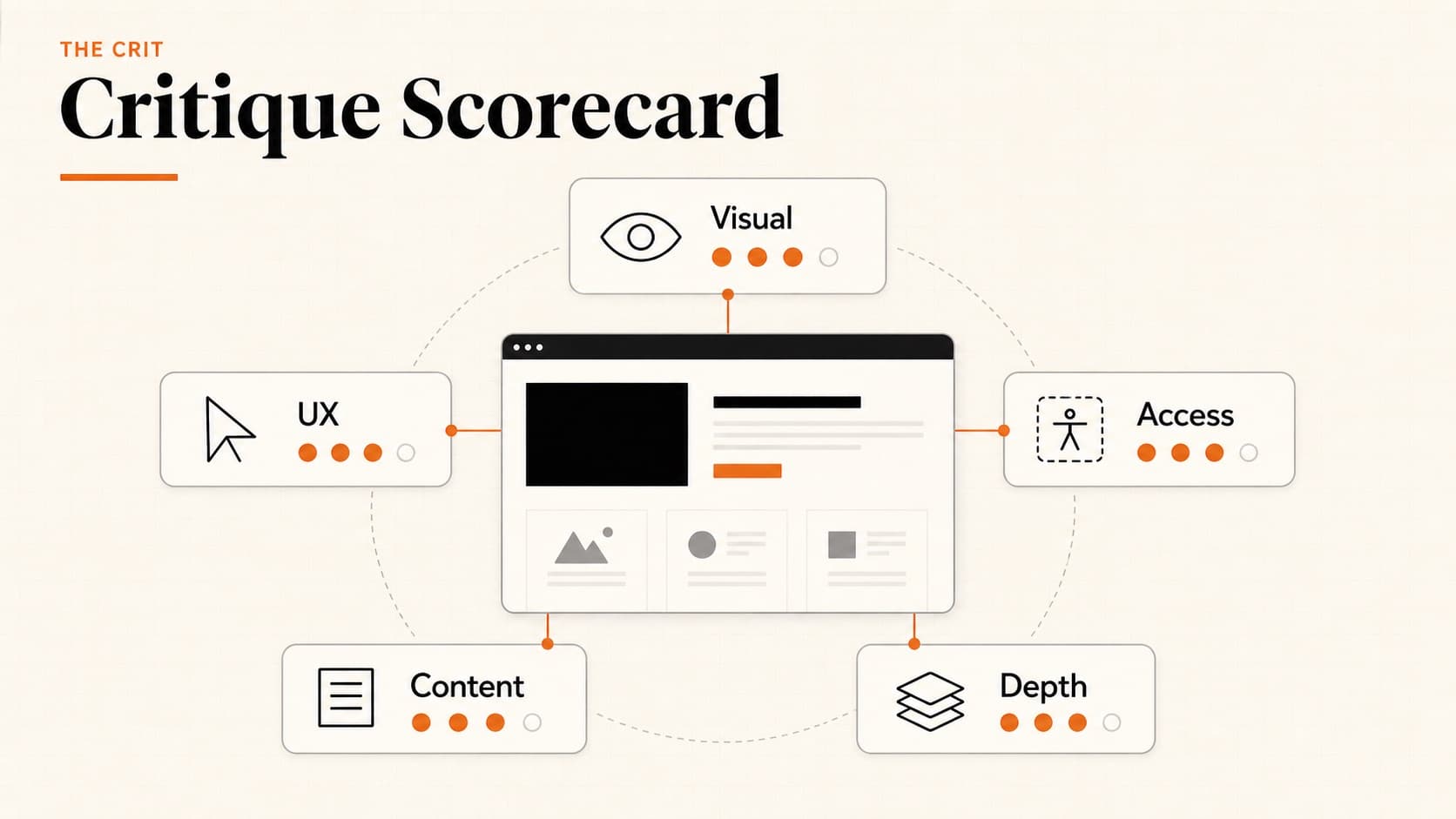
5 dimensions
Visual design, UX patterns, accessibility, content quality, case study depth
Fix order
Prioritized actions based on what blocks the reader first
First Read free
Every new project starts free. See the main issue and first priority move before you pay.
$9 Full Crit
Unlock the complete critique, every finding, tools, and one revision check for that project.
Why We're Telling You This
Most feedback tools are black boxes. You get advice with no idea how it was generated or what it's actually looking at. That makes it hard to trust — and hard to improve.
We think you should know exactly what's being evaluated. If you know the criteria, you can self-audit before submitting. You can focus your energy on the dimensions that matter most for your career stage. And you can decide whether our feedback even applies to your situation.
Here's everything we check, why it matters, and how it affects the order of fixes.
Visual Design & Polish
This is usually the first thing that registers — before anyone reads a word, the visual quality has already made an impression. We're not looking for trendy design. We're looking for intentional design.
What we evaluate
- Typography. Is there a clear hierarchy? Are font choices consistent and body text readable? Our typography guide goes deeper.
- Color usage. Does color support hierarchy, emphasis, or the brand instead of adding decorative noise?
- Spacing and alignment. Do margins, padding, and grid relationships create a deliberate rhythm?
- Image quality. Are screenshots crisp, readable, and presented consistently?
- Overall cohesion. Does the portfolio read as one intentional system?
Why it matters: Your portfolio is a design artifact. If you're applying for design roles, the portfolio itself is work sample #1. A hiring manager looking at a messy portfolio thinks: “If this is how they present their best work...”
UX & Navigation Patterns
Ironic as it sounds, many UX designer portfolios have terrible UX. We check whether your portfolio is actually easy to use.
What we evaluate
- Navigation clarity. Can a visitor find projects, context, and contact information without hunting?
- Information architecture. Does the organization make the site and its priorities understandable?
- Perceived performance. Do large media, layout shifts, or slow-loading elements interrupt the read?
- Mobile behavior. Does the visible layout remain legible and usable on a smaller screen?
- Next steps. Can a visitor tell how to contact you, view another project, or continue the conversation?
Why it matters: When the route to your work is unclear, the portfolio asks the reader to solve the navigation before they can evaluate the projects. Our navigation best practices guide covers clearer patterns.
Accessibility & Inclusivity
Accessibility isn't a nice-to-have — it's a professional expectation. Companies increasingly ask about accessibility in interviews. Your portfolio should demonstrate that you think about it.
What we evaluate when the evidence is visible
- Color contrast. Does text remain readable against its background, including smaller and muted copy?
- Image alternatives. When page markup is available, do meaningful images have useful alternative text?
- Keyboard access. When the live page can be inspected, can interactive elements be reached and understood without a mouse?
- Text sizing. Does copy remain readable without zooming, especially on mobile?
- Semantic structure. When page markup is available, do headings, landmarks, and links communicate the intended structure?
Why it matters: Beyond being the right thing to do, accessibility awareness signals design maturity. A portfolio that fails basic contrast checks suggests the designer doesn't think about the full range of users. Our accessibility guide covers the essentials.
Content & Copy Quality
Words matter. A portfolio with great visuals but vague, generic copy feels hollow. We evaluate whether the writing supports or undermines the design.
What we evaluate
- Clarity of positioning. Does the opening establish who you are, what you do, or what connects the work? See our tagline examples.
- Conciseness. Can a scanning reader find the important idea without working through avoidable repetition?
- Specificity. Are claims supported by concrete projects, decisions, or named capabilities?
- Professional tone. Does the writing feel clear, complete, and intentionally edited?
- Personal context. Does the portfolio reveal enough of the designer behind the work to make the story credible?
Case Study Depth
This is where portfolios are won or lost. Case studies are the reason a hiring manager keeps reading — or closes the tab.
What we evaluate
- Problem framing. Does the opening establish the situation, constraint, and reason the project mattered?
- Role clarity. On team projects, can the reader distinguish your contribution from the group's work?
- Decision evidence. Do research, iterations, or tests explain why the final direction changed?
- Outcomes. Is there credible evidence of what happened—even when that evidence is qualitative? See ways to show impact without metrics.
- Storytelling. Can a reader follow the project from context through decisions to outcome?
Why it matters: Case studies are where hiring managers decide if you can actually do the job. Process shows thinking. Outcomes show impact. Both together are what gets you to the interview. Our case study structure guide has the full framework, or use the Case Study Builder to write one step-by-step.
How Fix Priority Works
Every critique produces a prioritized fix order. The goal is to help you decide what to change first, not to grade the work.
The fix order
- 1. Blockers
- Make the work and its purpose understandable.These issues come before polish.
- 2. Trust gaps
- Add role proof, decision evidence, or credible outcomes.Resolve the questions that make a reader hesitate.
- 3. Hierarchy and scan
- Clarify layout, navigation, type, spacing, and content order.Help the reader see the intended path.
- 4. Refinement
- Tighten copy, transitions, proof placement, and finish.Sharpen the work after the core read is clear.
The order comes from the same five dimensions, but the output is a work plan. Start with the first blocker, make one meaningful change, then re-run the critique when the revised version is ready.
A Useful Critique Does Not Always Mean Changing the Work
Sometimes the useful answer is that a choice is working, the page is ready enough for its current purpose, or the thing you were worried about is not the first problem to solve. Critique can reduce uncertainty as well as create a to-do list.
A useful read can help you
- Validate a decision. Name what is working and why it supports the goal.
- Separate a real issue from general anxiety. A page can feel unfinished without another redesign being the first priority.
- Clarify the next question. The right move may be gathering context or asking someone who knows the audience.
The Crit should not manufacture criticism just to sound useful. The First Read includes a readiness verdict, a strength when there is one, and a priority move. If the system cannot see enough evidence, that limitation should be part of the answer.
How Critiques Are Priced
Every new project gets a free First Read with the main issue and one priority move. If it feels useful, a $9 Full Crit unlocks every finding, the complete critique, tools, and one revision check for that project.
First Read
$0 for each new project
Full Crit
$9 once for that project
No subscription. The Full Crit belongs to that project, so the critique and revision history stay together.
What We Don't Check
Being transparent also means being honest about our limitations:
- Evidence outside the submission
- The Crit evaluates the visible work you share.It cannot validate unseen research, business results, team dynamics, or cultural context.
- A specific role or employer
- Add that context to your question when it matters.Without it, the critique cannot judge fit for one exact job.
- An inaccessible URL
- Upload screenshots or images instead.Private Figma, Canva, and password-protected links may not expose enough reliable visual evidence.
- Subjective taste
- Expect feedback on the effect of a choice, not a declaration that it is ugly.Taste still needs a goal, audience, and context.
How to Get the Most From Your Critique
A few tips to maximize the value of your feedback:
- 1Start with the free First Read.See the main issue and first move before deciding whether to unlock the Full Crit.
- 2Make the first meaningful change.Use the fix order instead of trying to revise every detail at once.
- 3Use the revision check deliberately.Upload the revised version and see whether the read became clearer.
- 4Combine it with human feedback.Ask a friend, mentor, colleague, or intended reader about context and judgment the system cannot know.
Ready? Get a free First Read on a public URL or uploaded images.
QuestionsAnswers
Questions, answered.
A few practical details before you keep going
Share this resource

Written by
Nikki KippleProduct Designer & Design Instructor
Designer, educator, founder of The Crit. I've spent years teaching interaction design and reviewing hundreds of student portfolios. Good feedback shouldn't require being enrolled in my class — so I built a tool that gives it to everyone. Connect on LinkedIn →
Too close to your own work?
Send one screen, case study, or URL. We'll show what's working, what's getting skipped, and what to fix next.