Career & Jobs
Website, PDF, or Deck? Build a Hiring-Ready Portfolio Packet
Choose the connected portfolio pieces that help the next reviewer understand your fit—without turning every possible format into a requirement.

The short read
Core idea
Plan your portfolio as a small set of connected pieces of role-fit proof—not one artifact that must do everything.
Choose deliberately
You may not need every piece. Use the website, brief or PDF, case study, or deck that the next stage requires.
Reviewer test
Use a deliberately fast pass to check whether your target role, strongest proof, main tradeoff, and next click are visible.
Avoid
Do not hide weak judgment behind AI claims, visual polish, or vague strategic positioning.
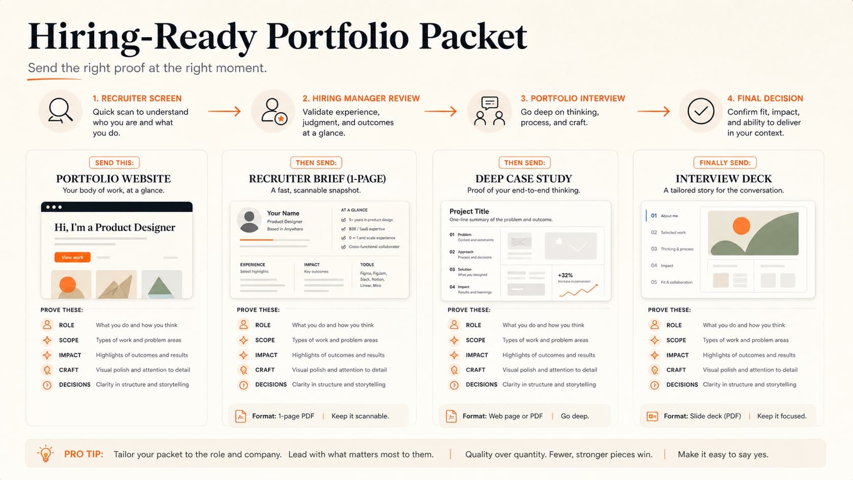
A Useful Way to Plan the Portfolio Packet
Designers often ask whether they need a website, a PDF, or a deck. That question is too small. The real hiring problem is that different people review your work in different contexts. A recruiter scans for fit. A hiring manager looks for enough proof to move you forward. A design lead looks for judgment. An interview panel listens for how you defend decisions when the room pushes back.
One artifact may not serve all of those moments equally well. A useful way to plan is as a packet: a few connected pieces that tell the same story at different depths.
You may not need every piece
Follow the employer's instructions and build only the artifacts that reduce friction for a real reviewer. The packet is a planning model, not a universal four-deliverable checklist.
Earn the click
Website
Role, taste, strongest projects, and a clear next step
Make your fit forwardable
Recruiter brief / PDF
A few clear proof points a non-designer can pass along
Show judgment
Case study
Problem, constraints, decisions, tradeoffs, evidence, and outcome
Control the room
Interview deck
A spoken story that survives questions, interruptions, and screen share
The point is not to create more busywork. The point is to make the same evidence survive handoffs. If the story changes every time someone opens a different artifact, the packet is not doing its job.
The 2-Minute Reviewer Stress Test
Before you redesign anything, run the packet through a deliberately fast two-minute pass. This is a stress test, not a claim that every reviewer spends exactly two minutes. Do not read it like the designer who made it. Read it like someone trying to decide whether to move you forward between meetings.
In two minutes, can the reviewer see:
- The target role: what kind of designer you are and what kind of work you want next.
- The strongest proof: the project, outcome, or decision that makes you credible for that role.
- The main tradeoff: one real constraint or decision that shows judgment, not just execution.
- The next click: exactly where to go next if they want deeper evidence.
This is where a lot of portfolios fail. They may look polished, but the reviewer cannot quickly tell what role the candidate wants, which project matters most, or what decision quality the work proves.
AI, visual polish, and "strategic" positioning do not replace visible judgment, role fit, UI competence, and evidence. If those signals are missing, the packet will feel impressive and still fail the hiring review.
If Your Portfolio Was AI-Built, the Review Bar Is Higher
AI can help you build a portfolio faster, but it can also make the packet feel strangely generic: polished layout, familiar icons, safe gradients, and confident copy that does not quite prove anything. That matters in hiring because reviewers are not only judging whether the site looks finished. They are judging whether the work shows taste, ownership, constraints, and decision quality.
The AI-built portfolio test:
- Does the first screen name a real lane? Not just "product designer," but the kind of product, team, or problem you are credible for.
- Can the reviewer tell what you personally owned? AI-polished copy often hides the difference between your contribution and the team's work.
- Are the visual choices specific to you? Default typography, gradient cards, and generic dashboard screenshots make the packet feel interchangeable.
- Is there proof behind the polish? Screens need constraints, tradeoffs, outcomes, and decisions. Otherwise the packet looks finished but reads empty.
If the site feels AI-built, do not just ask the tool to "make it more unique." Run a critique pass on the decisions and make authorship visible. Start with the AI-built app diagnostic to name the exact design smells, use the vibe-coded app guide for the broader pattern, then use browser fluency for designers to check whether the interface actually holds up outside the canvas. For the career angle, read why polished AI UI is becoming cheap.
What To Send at Each Hiring Stage
The packet works when each artifact has a clear moment. Do not send everything at once just because it exists. Send the smallest set that helps the next reviewer understand your fit and move you forward.
Applying cold
The requested portfolio format plus a tailored resume
Reviewer: Recruiter or hiring coordinator
Proof needed: Role fit, credible project previews, and no friction opening the work
Warm referral or recruiter screen
Website plus a one-page recruiter brief when the fit needs explaining
Reviewer: Recruiter, sourcer, or referrer
Proof needed: Three repeatable reasons you match the role
Hiring manager review
Website and one focused case study
Reviewer: Design manager or product partner
Proof needed: Ownership, constraints, tradeoffs, and decision quality
Portfolio interview
Interview deck or structured walkthrough
Reviewer: Design lead, panel, or cross-functional team
Proof needed: A clear spoken story that survives questions
1. Website: Discovery and Application
When no format is specified, a simple website is often the lowest-friction artifact to link, skim, revisit, and compare. It also reveals more than your project content: navigation judgment, hierarchy, loading discipline, accessibility, mobile behavior, and whether your taste supports comprehension. Some employers will ask for a PDF, deck, or another format instead; follow that request.
Your website should prove:
- Role fit: the first screen should make your lane obvious.
- Edited judgment: the project order should feel intentional, not chronological by default.
- Readable proof: project cards should say what the work was, what you owned, and why it mattered.
- Low friction: no broken links, tiny screenshots, auth gates, or confusing navigation.
If you are not sure whether the homepage is earning the click, run it through the portfolio checklist tool before rewriting every case study.
2. Recruiter Brief or PDF: Forwardable Role-Fit Proof
A recruiter brief is not a second portfolio. It is a short, forwardable summary that helps someone outside your exact discipline explain why you are worth a deeper look.
Use it when the first reviewer may not be a design lead, when your work is under NDA, when the application asks for attachments, or when you want to make the handoff from recruiter to hiring manager easier.
A useful starting brief includes:
- Your target role in one plain sentence.
- A few proof bullets a recruiter can repeat accurately.
- Two or three projects with context, not just titles.
- One short note on constraints, NDA limitations, or collaboration context if needed.
- Links back to the live portfolio and relevant case studies.
The mistake is over-designing the brief until it becomes a worse version of the website. Keep it simple. Its job is to carry the signal, not replace the source.
3. Case Study: Deeper Judgment and Evidence
The case study is where the reviewer should understand how you think. Screens matter, but the hiring signal is in the choices: what you prioritized, what you ruled out, what constraints mattered, and what changed because of your work.
Your case study should make these visible:
- Problem: what was actually hard, not just what the project was called.
- Role: what you owned versus what the team owned.
- Inputs: research, data, stakeholder constraints, support tickets, business goals, or user behavior.
- Tradeoffs: what you chose, what you rejected, and why.
- Outcome: metrics when available, or concrete qualitative evidence when metrics are not available.
If the case study reads like a process archive, tighten it with the case study structure guide. The goal is not to show every artifact. The goal is to prove your decisions were grounded.
4. Interview Deck: Live Narrative and Discussion
The interview deck is the artifact most designers under-prepare. A case study is read alone. A deck is experienced live. That means it needs pacing, conversational room, and slides that support your story instead of swallowing it.
Your deck should prove:
- You can explain the project without reading your website out loud.
- You know which decisions matter most.
- You can handle questions without losing the thread.
- Your screens, captions, and diagrams are readable over video or in a conference room.
- You can reflect honestly on what worked, what did not, and what you would do next.
Follow the employer's brief for timing and scope. It is also useful to practice a focused 10–15 minute version that can expand or contract as questions change the room. For a deeper walkthrough, use the portfolio interview presentation guide.
What Has to Stay Consistent Across the Packet
Each artifact has a different job, but they should all point to the same hiring story. The packet fails when the website says one thing, the PDF says another, and the interview deck reveals a third version of the candidate.
Consistency does not mean flattening a multidisciplinary practice. Interaction, UI, research, service design, and product strategy roles may need different proof. Adapt the packet to the role while keeping your ownership and strongest evidence accurate.
- Same target role: do not sound like a visual designer on the homepage, a UX researcher in the brief, and a product strategist in the deck unless that range is intentionally framed.
- Same proof hierarchy: your strongest project should not be buried in one artifact and featured in another.
- Same ownership language: be precise about your role everywhere.
- Same decision quality: the story should keep returning to judgment, tradeoffs, and evidence.
- Same next step: every artifact should make it obvious how to keep reviewing or contact you.
Common Packet Mistakes
Treating the PDF like a second portfolio
A 30-page PDF with duplicated case studies is hard to forward and easy to ignore. Make the brief shorter and the website stronger.
Using AI claims as proof
An AI-first label is not evidence. Show what the workflow changed, what judgment stayed human, and what shipped or became testable.
Making the deck too dense
If every slide is a case-study page, the interviewer has to read while you talk. Use the deck to pace the story, not archive it.
Hiding weak UI craft behind strategy language
Strategic framing helps only when the interface still feels legible, consistent, accessible, and shippable enough for the role.
Hiring-Ready Packet Checklist
Use this as a menu, not a requirement. Check only the pieces that your application or interview process actually needs.
- Website: first screen names the role, strongest project, and next click.
- Brief: one page or short PDF a recruiter can forward without explaining it for you.
- Case study: one project shows real decision evidence, not just process artifacts.
- Deck: the presentation follows the employer's brief, and a focused version leaves room for questions.
- Consistency: all artifacts agree on role, proof, ownership, and next step.
- Friction: links open, files are not locked, images are readable, and mobile/screen-share views are usable.
If you want a faster diagnostic, use the portfolio checklist tool. If the packet is for an upcoming interview, also review the interview presentation guide.
Sources and Further Reading
Hiring processes vary by company, role, level, and reviewer. These sources support the audience and format principles in this guide without turning any one format into a universal rule.
- Nielsen Norman Group: UX Hiring—Insights from a Design Recruiter explains why the first reviewer may not be a designer and why application materials must work for their actual audience.
- Nielsen Norman Group: 5 Steps to Creating a UX-Design Portfolio compares web, PDF, and slide-deck formats and recommends matching the format to the hiring context.
- Nielsen Norman Group: User Experience Careers report documents the importance of thought process, reasoning, evidence, and business understanding in portfolio review.
QuestionsAnswers
Questions, answered.
A few practical details before you keep going
Share this resource

Written by
Nikki KippleProduct Designer & Design Educator
Designer, educator, founder of The Crit. I've spent years teaching interaction design and reviewing hundreds of student portfolios. Good feedback shouldn't require being enrolled in my class — so I built a tool that gives it to everyone. Connect on LinkedIn →
Before you send it, test the proof path.
Send the artifact you plan to use for applications or interviews. We'll flag unclear role fit, weak evidence, missing tradeoffs, and places reviewers may get lost.