Typography Principles for Designers Font Pairing, Hierarchy & Spacing
A practical guide to choosing fonts, pairing typefaces, building clear hierarchy, fixing spacing, and making layouts easier to read across web, portfolio, and product work.
⚡ TL;DR
- What this covers: Everything about typography that actually affects your designs — from font selection and pairing to spacing, accessibility, and web performance
- Who it's for: Designers who want to make confident typography decisions and understand the why behind the rules
- The reality check: Typography is 95% of web design, yet most designers wing it. This guide gives you the principles that actually matter.
Typography starts with font pairing, hierarchy, and spacing
Most typography advice online is either too basic to help or so precious it stops being usable. Meanwhile, the actual problems designers run into are practical: which fonts go together, how to make headings and body text feel related, why spacing feels cramped, and why a layout falls apart on smaller screens.
Here's the stat that should terrify every designer: 95% of web design is typography. That's not my opinion — it's what users spend most of their time reading, scanning, and trying to understand. Yet most designers spend more time picking colors and debating button shadows than they do thinking about their type system.
Good typography is invisible. Users read your content without friction, scan your headings to find what they need, and never think twice about your font choices. Bad typography is painfully visible — users squint at tiny text, get lost in poor hierarchy, or bounce because something just "feels off" even if they can't articulate why.
The brutal truth? Most typography problems aren't about picking the wrong font. They're about inconsistent sizing, poor spacing, unclear hierarchy, or ignoring how text actually behaves on different devices. You can have the most beautiful custom typeface in the world, but if your line height is wrong or your contrast is too low, it's worthless.
Typography affects three things that matter:
- Readability — Can users actually read your content without strain?
- Hierarchy — Can users scan and find what they're looking for?
- Brand perception — Does your type choice match the feeling you're trying to create?
I've reviewed hundreds of design portfolios, and the pattern is always the same. Junior designers obsess over which trendy font to use. Senior designers obsess over whether their type scale is consistent and their line heights are comfortable. Guess whose work gets them hired?
Use this guide based on what you're fixing:
- • Portfolio typography specifically? Start with typography for portfolios
- • Need stronger visual fundamentals overall? Pair this with 12 design principles explained
- • Choosing fonts for the web? Also read CSS typography best practices
- • Need portfolio inspiration? Open the portfolio examples gallery
This guide covers the typography fundamentals that actually matter: how to choose fonts that work together, create clear hierarchy with any typeface, optimize for different devices, and avoid the mistakes that make your work look amateur. Read it like a system, not a list of random rules.
If the page still feels off, it might be the type.
Upload a screenshot or paste the page. We'll check hierarchy, spacing, contrast, and whether the typography supports the work.
The 5 Font Categories That Matter
Every typeface falls into one of five categories. Understanding these isn't about memorizing font names — it's about matching the right tool to the job. Each category has a personality, a purpose, and situations where it shines or fails completely.
1. Serif Fonts
Serif fonts have those little decorative strokes (serifs) at the end of letters. They feel classic, trustworthy, and established. Times New Roman, Georgia, Garamond, Playfair Display. Originally designed for print, where the serifs help guide your eye along lines of text.
Best for: Editorial content, luxury brands, academic writing, anything that needs to feel authoritative or timeless. They work great for headlines on screens, but use them carefully for body text — some serif fonts lose clarity at small sizes on lower-resolution displays.
Avoid for: Modern tech products, minimalist interfaces, or any context where you need maximum legibility at small sizes.
2. Sans-Serif Fonts
Sans-serif literally means "without serifs" — clean letterforms without decorative strokes. They feel modern, minimal, and approachable. Helvetica, Inter, Roboto, Open Sans, Source Sans Pro. The workhorses of digital design.
Best for: Everything digital. UI design, web body text, mobile apps, modern brands. They're highly legible on screens at any size, which is why they dominate interface design. If you're not sure what to use, a good sans-serif is always a safe bet.
The secret: Many sans-serifs are specifically designed for screens (Inter, Roboto, UI fonts) while others are adapted from print. Choose screen-optimized fonts for better hinting and readability.
3. Monospace Fonts
Every character takes up the same width — an "i" is as wide as an "m". Originally for typewriters, now essential for code and data. Courier, Fira Code, JetBrains Mono, SF Mono. They feel precise, technical, and honest.
Best for: Code blocks, terminal interfaces, tabular data, retro aesthetics. Also surprisingly good for numbers in dashboards since they align perfectly in columns.
Modern trend: Some designers use monospace for headlines or accents to create a tech-forward, systematic feeling. Use sparingly — readability suffers for longer text.
4. Display/Decorative Fonts
Designed for headlines and short bursts of text — high personality but low readability at small sizes. Impact, Bebas Neue, Oswald, custom brand fonts. They grab attention and convey specific moods.
Best for: Hero sections, logos, posters, headlines where you need maximum impact. Each display font has a specific personality — condensed fonts feel urgent, wide fonts feel stable, bold fonts feel confident.
The rule: Never, ever use display fonts for body text. They're designed to work at large sizes where their distinctive features are visible. At small sizes, they become illegible.
5. Script/Handwritten Fonts
Mimic handwriting or calligraphy. Pacifico, Dancing Script, Caveat, Amatic SC. They feel personal, warm, and human — but they're the hardest category to read, especially on screens.
Best for: Invitations, signatures, personal brands, accent text. They work best when you want to convey personality or authenticity. Wedding websites love script fonts for good reason.
Use carefully: Script fonts are like hot sauce — a little goes a long way. Never use them for paragraphs, UI elements, or anything users need to scan quickly. And please, test them on mobile devices.
Quick category selection guide:
- • Need maximum readability? Choose sans-serif
- • Want to feel established/classic? Choose serif
- • Designing something technical? Consider monospace
- • Need attention-grabbing headlines? Use display fonts
- • Want personality/warmth? Add script as an accent
Building Hierarchy That Actually Works
Typographic hierarchy is how you tell users what to read first, second, and third. It's one of the core design principles that separates polished work from amateur hour. Without clear hierarchy, everything competes for attention and nothing wins.
You have three tools to create hierarchy: size (bigger = more important), weight (bolder = more important), and contrast (darker = more important). The key is using all three together consistently throughout your design.
Typography Hierarchy Example
H1 — Page Title (36px, Bold)
H2 — Major Section (24px, Semibold)
H3 — Subsection (20px, Medium)
Body Text — Main content where users spend reading time (16px, Regular). This should be comfortable to read at length with proper line height and spacing.
Small/Caption — Secondary information like timestamps and labels (14px, Regular)
H1 — Page Title (32-48px, Bold)
One per page. This tells users and search engines what the page is about. Should be visible above the fold on desktop. For web, 32-40px is usually plenty — mobile screens can't handle massive headlines.
Common mistake: Making H1s too big for mobile or using multiple H1s per page (confuses screen readers and SEO).
H2 — Section Headers (24-32px, Semibold)
These are scannable landmarks. Users skim H2s to decide if content is relevant to them. They should clearly break up content into digestible sections and be descriptive enough to work as mini-summaries.
Pro tip: Write H2s that make sense when read alone in a table of contents. "Getting started" is vague. "Setting up your first project" is scannable.
H3 — Subsections (18-24px, Medium)
Break up longer sections and group related content. Should be noticeably smaller than H2 but clearly larger than body text. Don't skip levels — don't go from H2 directly to H4.
The test: If you need H4, H5, or H6, your content might be too complex. Consider breaking it into multiple pages or restructuring.
Body Text (16-18px, Regular)
Where users spend most of their reading time. 16px minimum on web, but 18px often feels more comfortable. Use 1.5-1.75 line height for relaxed reading. This is where readability matters most.
Mobile reality check: 16px on desktop might look big, but it's perfect on mobile. Design for the most constrained device first.
Small/Caption Text (12-14px, Regular)
Secondary information like timestamps, labels, and captions. Use sparingly — too much small text causes eye strain. Never go below 12px for accessibility reasons.
Hierarchy best practices:
- • Use a consistent type scale (more on this later)
- • Combine size, weight, AND color for clear levels
- • Test hierarchy by squinting — important things should still be visible
- • Give headings proper spacing — more space above than below
- • Never skip heading levels (H2 → H4 breaks screen readers)
Font Pairing Formulas
Font pairing feels mystical, but it's actually quite systematic. The golden rule: contrast with harmony. You want fonts that are different enough to create visual interest, but similar enough that they feel intentional together.
I've seen too many designers get paralyzed by font pairing. They spend hours browsing Google Fonts, trying random combinations, hoping something "clicks." Here are five formulas that actually work, plus the principles behind them so you can create your own pairings confidently. For portfolio-specific recommendations, check out our 20 curated font pairings for designer portfolios, or preview pairings live with your own content.
Formula 1: Classic Editorial (Serif + Sans-serif)
The pairing: Playfair Display (serif headlines) + Source Sans Pro (body text)
Why it works: High contrast between decorative and functional. The serif brings personality, the sans-serif brings readability.
Best for: Editorial sites, blogs, content marketing, any brand that wants to feel sophisticated but approachable. The pairing has just enough personality to be interesting without being distracting.
Alternatives: Lora + Open Sans, Crimson Text + Roboto, Merriweather + Lato
Classic Editorial Example
Professional Typography Matters
This pairing demonstrates how Georgia, serif headlines work beautifully with -apple-system, BlinkMacSystemFont, 'Segoe UI', Roboto, sans-serif body text. The contrast between decorative and functional creates visual interest while maintaining excellent readability. Notice how the fonts complement each other without competing for attention.
Formula 2: Modern Systematic (Sans-serif Family)
The pairing: Inter (all weights — Black for headlines, Regular for body)
Why it works: Perfect consistency. Same DNA, different expressions. Feels systematic and intentional.
Best for: SaaS products, dashboards, any interface where consistency matters more than personality. This approach never looks wrong, but it can feel bland if you don't use hierarchy well.
Alternatives: Roboto family, Work Sans family, IBM Plex Sans family
Modern Systematic Example
Professional Typography Matters
This pairing demonstrates how -apple-system, BlinkMacSystemFont, 'Segoe UI', Roboto, sans-serif headlines work beautifully with -apple-system, BlinkMacSystemFont, 'Segoe UI', Roboto, sans-serif body text. The contrast between decorative and functional creates visual interest while maintaining excellent readability. Notice how the fonts complement each other without competing for attention.
Formula 3: Bold Contemporary (Display + Clean Sans)
The pairing: Oswald (condensed bold headlines) + Open Sans (body text)
Why it works: The condensed display font grabs attention without being decorative, while the body font stays readable.
Best for: Sports sites, news sites, anything that needs to feel urgent or authoritative. The condensed headlines create vertical efficiency — perfect for content-heavy layouts.
Alternatives: Bebas Neue + Roboto, Anton + Source Sans Pro, Fjalla One + Lato
Formula 4: Warm & Balanced (Contemporary Serif + Friendly Sans)
The pairing: Lora (headlines) + Nunito (body text)
Why it works: Both fonts have slightly rounded characteristics. The serif feels approachable rather than formal, and the sans-serif feels warm rather than corporate.
Best for: Lifestyle brands, wellness sites, personal portfolios. When you want to feel professional but not cold. The combination works especially well for service-based businesses.
Alternatives: Cardo + Karla, Vollkorn + Muli, Cormorant + Rubik
Formula 5: Tech-Forward (Geometric + Monospace Accent)
The pairing: Montserrat (headlines) + Inter (body) + Fira Code (code/accent)
Why it works: The geometric sans feels modern, the screen-optimized body font ensures readability, and monospace adds technical credibility.
Best for: Developer tools, tech startups, any product where you want to feel cutting-edge but not alien. The monospace should be used sparingly — for labels, code snippets, or accent text.
Alternatives: Poppins + Roboto + JetBrains Mono, Raleway + Source Sans Pro + SF Mono
The 4 principles of successful font pairing:
- Create contrast, not conflict. Pair serif with sans-serif, not two similar fonts
- Match x-heights. Fonts with similar x-heights (lowercase letter height) look natural together
- Limit yourself. 2-3 fonts maximum. More choices = more problems
- Test in context. Fonts that look good in isolation might clash in your actual design
When in doubt, steal like an artist. Notice font pairings you love on other sites and analyze why they work. Most successful pairings follow these same formulas. Check out our detailed font pairing guide for 20+ tested combinations with download links.
Spacing & Rhythm
Typography isn't just about the letters — it's about the spaces between them. Get the spacing wrong, and even the most beautiful typeface becomes unreadable. Get it right, and mediocre fonts can look professional.
There are four types of spacing that matter: the space between letters (tracking), between specific letter pairs (kerning), between lines (leading/line-height), and between paragraphs. Each one affects readability differently.
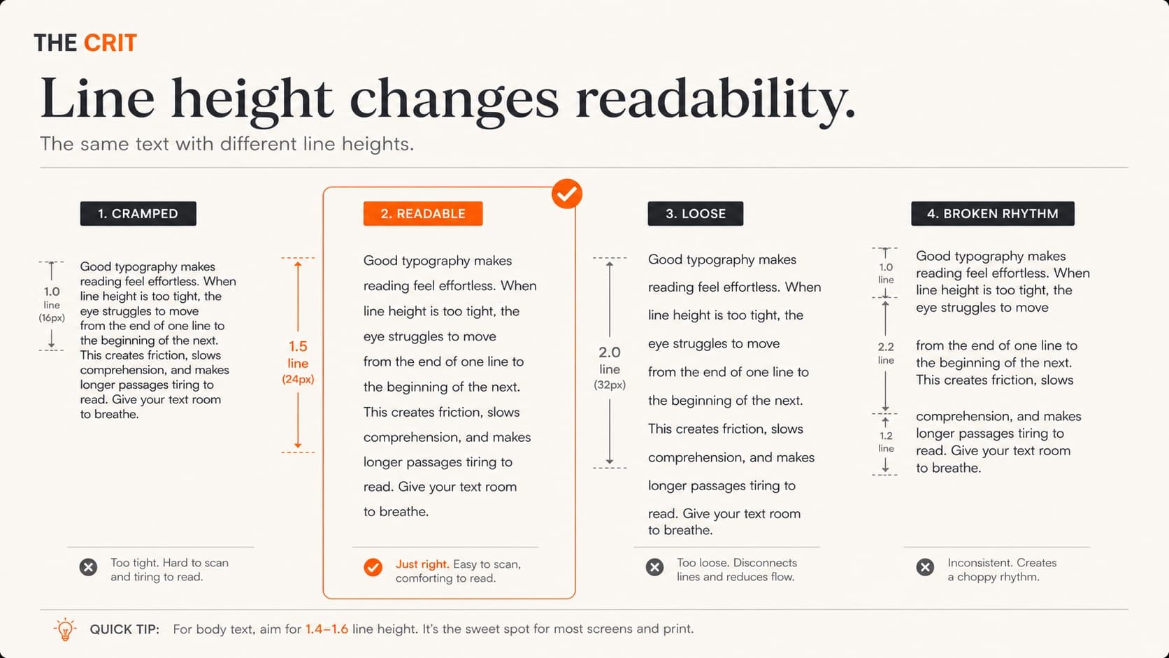
Line Height (Leading)
This is the big one. Line height determines whether text feels cramped or comfortable. Too tight, and lines blur together. Too loose, and you lose the visual connection between lines.
Body text: 1.4-1.6 (1.5 is the sweet spot)
Headlines: 1.1-1.3 (shorter text can be tighter)
Captions: 1.3-1.4 (small text needs breathing room)
The accessibility factor: Tight line height (below 1.4) is especially problematic for dyslexic readers. WCAG guidelines recommend 1.5 minimum for body text.
Line Length (Measure)
The optimal line length is 45-75 characters per line, with 65 being ideal. Too long and readers lose their place jumping to the next line. Too short and the constant line breaks disrupt reading rhythm.
How to control it: Use max-width on your text containers, not percentage widths. For body text, max-width: 65ch (where 'ch' is the width of the '0' character) works perfectly.
Mobile exception: On narrow screens (320-480px), full-width text is usually fine because the screen itself constrains line length naturally.
Letter Spacing (Tracking)
Most body fonts are designed with perfect default spacing. Don't mess with it unless you have a specific reason. The main exceptions: all-caps text (needs more space) and very large headlines (sometimes need tighter spacing).
All-caps rule: Add 0.05-0.1em of letter spacing to all-caps text. Capital letters naturally appear closer together than mixed case.
Large headlines: Sometimes benefit from slightly negative letter spacing (-0.02em) to prevent them from feeling loose. Test this carefully — it's easy to overdo.
Paragraph & Section Spacing
The space between paragraphs should be about 0.5-1em (half to full line height). Between major sections, use more space — 2-3em — to clearly separate different topics.
Heading spacing: Headings should have more space above them than below to visually connect them with the content they introduce. A good rule: 2-3x the space above, 1x below.
White space is not empty space. It's active negative space that helps users process information in digestible chunks. Don't be afraid to use it generously.
Good vs. Bad Spacing
Poor Spacing
Tight Headlines
This body text has insufficient line height making it hard to read comfortably. The cramped feeling makes users work harder to process the content.
No spacing between paragraphs creates a wall of text that's intimidating to scan or read.
Comfortable Spacing
Breathing Room
This body text uses 1.6 line height, making it comfortable to read. The relaxed spacing lets users process content without strain.
Proper paragraph spacing creates natural reading breaks and makes content feel approachable.
Responsive Typography
Typography needs to adapt to different screen sizes, and simply shrinking everything proportionally is the wrong approach. What works on a 27" monitor might be unreadable on a phone. What's comfortable at arm's length on mobile might feel massive on desktop.
The goal isn't just scaling text — it's maintaining readability and hierarchy across every device. Here's how to do it systematically, not randomly.
Fluid Typography with CSS Clamp
CSS clamp() lets font sizes scale smoothly between minimum and maximum values based on viewport width. No more jarring size jumps at breakpoints.
font-size: clamp(1.25rem, 2.5vw, 2rem);This means: minimum 20px, maximum 32px, scaling with viewport width. The font grows and shrinks naturally as users resize their browser or switch devices.
Mobile-First Sizing Strategy
Start with mobile sizes that work well at arm's length, then enhance for larger screens. This prevents the common mistake of desktop-sized text being unreadable on mobile.
Mobile base sizes:
H1: 28-32px | H2: 24-28px | H3: 20-24px | Body: 16-18px | Small: 14px
Desktop enhancement:
H1: 36-48px | H2: 28-36px | H3: 24-28px | Body: 16-18px | Small: 14px
Relative Units for Scalability
Use rem units instead of px for font sizes. This respects user preferences (browser zoom, accessibility settings) and scales proportionally across your entire design.
rem vs em: rem is relative to the root font size (usually 16px). em is relative to the parent element. For most typography, rem is more predictable.
Accessibility bonus: Users who increase their browser's default font size will see your entire design scale proportionally, not just the body text.
Line Length Across Devices
On mobile, full-width text is usually fine because the screen itself constrains line length. On tablets and desktop, you need to actively constrain text width to maintain readability.
The solution: Use max-width: 65ch on text containers for desktop/tablet, but let mobile use full width. The ch unit is perfect for this — it's based on character width.
Responsive typography checklist:
- • Use fluid typography (clamp) for smooth scaling
- • Start with mobile sizes, enhance for desktop
- • Use rem units for scalable, accessible sizing
- • Constrain line length on wide screens (max-width)
- • Test on actual devices, not just browser tools
- • Maintain hierarchy relationships across all sizes
Test early and often. Browser dev tools approximate mobile behavior but don't perfectly replicate it. Font rendering, touch targets, and readability at arm's length all differ on actual devices. Keep a few phones and tablets handy for real-world testing.
Web Fonts & Performance
Web fonts can make your designs unique and on-brand. They can also make your site slow, cause text to flash or disappear, and frustrate users on slow connections. The key is using them thoughtfully, not indiscriminately.
Here's what I've learned after years of loading font failures, FOIT (Flash of Invisible Text) disasters, and performance audits that made me reconsider every typography decision.
System Fonts vs. Web Fonts
System fonts (San Francisco, Segoe UI, Roboto) load instantly because they're already on users' devices. They feel native, perform perfectly, and look professional. The downside: less brand personality and you can't control exactly how they look across operating systems.
Web fonts give you complete control over typography and brand consistency. But they add network requests, loading states, and potential performance issues. Every web font is a trade-off between design control and user experience.
Smart middle ground: Use system fonts for body text (instant loading, maximum readability) and a single web font for headlines. This gives you brand personality where it matters most while keeping performance fast.
Font Loading Strategy
How fonts load affects user experience more than which fonts you choose. There are three loading behaviors: FOUT (Flash of Unstyled Text), FOIT (Flash of Invisible Text), and smooth swapping.
Best practice: font-display: swap
This shows fallback text immediately, then swaps to your web font when it loads. Users can start reading right away instead of staring at blank space.
@font-face {
  font-family: 'Inter';
  font-display: swap;
  /* other font properties */
}
Preload critical fonts: Add <link rel="preload"> for fonts used above the fold. This starts downloading them immediately instead of waiting for CSS to be parsed.
Font File Optimization
Modern font formats are much smaller than older ones. Always use WOFF2 (Web Open Font Format 2) as your primary format — it's supported by all modern browsers and compresses fonts by 30-50% compared to WOFF or TTF.
Subset your fonts: Only include the characters you actually need. If your site is in English, you don't need Cyrillic or Asian character sets. Google Fonts lets you subset automatically with URL parameters.
https://fonts.googleapis.com/css2?family=Inter:wght@400;600&subset=latinLimit weights and styles: Every font weight is a separate file. Only load the weights you actually use. Most sites need Regular (400) and Semibold (600) — that covers 90% of use cases.
Fallback Font Stacks
Always specify fallback fonts that closely match your web font's characteristics. When your web font loads, the text swap should be as subtle as possible.
font-family: 'Inter', -apple-system, BlinkMacSystemFont, 'Segoe UI', Roboto, sans-serif;This fallback stack covers all major operating systems with high-quality system fonts. If Inter fails to load, users still get excellent typography.
Web font performance checklist:
- • Use WOFF2 format for maximum compression
- • Subset fonts to only needed character sets
- • Limit to 2-3 font weights maximum
- • Use font-display: swap for better loading UX
- • Preload critical fonts used above the fold
- • Provide system font fallbacks that match closely
- • Consider using system fonts for body text
Accessibility Guidelines
Typography accessibility isn't just about following WCAG guidelines (though you should). It's about making text readable for people with dyslexia, vision impairments, cognitive differences, or anyone using assistive technology. Good accessibility often makes your typography better for everyone.
I've seen too many beautiful designs become unusable because they prioritized aesthetics over readability. Here are the accessibility principles that matter most for typography, with practical guidelines you can implement immediately.
Color Contrast Requirements
WCAG AA minimum: 4.5:1 contrast ratio for normal text
WCAG AA minimum: 3:1 for large text (18px+ or 14px+ bold)
WCAG AAA enhanced: 7:1 for normal text
Light gray text on white backgrounds is the most common accessibility violation. That subtle gray might look sophisticated, but it's unreadable for many users, especially in bright environments or for people with vision impairments.
Test your colors: Use WebAIM's contrast checker or browser dev tools. Many design tools (Figma, Sketch) now show contrast ratios in color pickers.
Poor Contrast (2.8:1)
This light gray text is hard to read and fails WCAG accessibility standards. Users strain to read it.
Minimum (4.5:1)
This meets WCAG AA standards but could be more comfortable for extended reading.
Excellent (8.2:1)
This high contrast is comfortable for everyone to read, including users with vision impairments.
Text Size and Spacing
16px minimum for body text — anything smaller causes eye strain and forces users to zoom. Many accessibility experts recommend 18px as a more comfortable baseline for extended reading.
1.5 minimum line height for body text (WCAG guideline). Tight line height makes text harder to track, especially for dyslexic readers. 1.6-1.75 is often more comfortable.
Letter and word spacing: Avoid extreme tracking (letter spacing). Very tight or very loose letter spacing impairs readability. If you must adjust tracking, test it with actual users.
Font Choices for Accessibility
Dyslexia-friendly characteristics: Good character differentiation (b, d, p, q look clearly different), adequate spacing, and consistent letter shapes. Sans-serif fonts often work better than serif fonts for dyslexic readers.
Recommended accessible fonts:
• Atkinson Hyperlegible (specifically designed for low vision)
• Inter (excellent character differentiation)
• Open Sans (clear, simple letterforms)
• Source Sans Pro (good spacing and clarity)
Avoid for body text: Very light weights (100-200), condensed fonts, italic text for long passages, and any font where similar characters are hard to distinguish.
All-Caps and Special Formatting
Limit ALL-CAPS text. We read by recognizing word shapes, and all-caps removes those visual cues. Screen readers often spell out all-caps text letter-by-letter. Use it sparingly for labels and short headings only.
Avoid color-only meaning. Don't use color alone to convey information (like red text for errors). Combine color with icons, underlines, or bold text so colorblind users don't miss important information.
Test with screen readers. Use your operating system's built-in screen reader (VoiceOver on Mac, NVDA on Windows) to experience how your text sounds. Proper heading structure and descriptive text make a huge difference.
Quick accessibility audit:
- • Check contrast ratios (4.5:1 minimum for body text)
- • Verify 16px+ font size for body text
- • Use 1.5+ line height for readability
- • Limit all-caps to short labels
- • Don't rely on color alone for meaning
- • Test with screen reader navigation
- • Ensure proper heading hierarchy (H1→H2→H3)
Remember: Accessibility features often benefit everyone, not just users with disabilities. Good contrast helps in bright sunlight. Clear fonts reduce eye strain. Logical heading structure makes content easier to scan. When you design for accessibility, you design for better usability overall.
Type Scale Systems
A type scale creates mathematical harmony in your typography. Instead of picking random font sizes (18px here, 22px there), you use consistent ratios that create natural relationships between text sizes. Think of it like musical intervals — certain ratios just sound right.
The best type scales are barely noticeable to users, but they create a sense of intentionality and polish that separates professional designs from amateur ones. Here's how to choose and implement a type scale that works for your projects.
Popular Type Scale Ratios
Each ratio creates different levels of contrast between text sizes. Smaller ratios feel subtle and refined. Larger ratios create more dramatic hierarchy.
Minor Third (1.2) — Subtle Steps
Best for: Compact interfaces, mobile apps, dashboards where you need distinct levels without dramatic size jumps. Good when space is limited but you still need clear hierarchy.
Major Third (1.25) — The Versatile Choice
Best for: Most web projects. Balanced contrast that works well for both content and interface design. This is the safest choice if you're unsure.
Perfect Fourth (1.333) — Editorial Feel
Best for: Editorial websites, blogs, content-heavy sites where clear hierarchy is essential. The larger jumps make scanning easier.
Golden Ratio (1.618) — Maximum Drama
Best for: Landing pages, posters, designs with few text levels that need maximum impact. Too much contrast for complex interfaces.
Implementing Your Type Scale
Start with your base font size (usually 16px for body text) and multiply by your chosen ratio to get each level. Round to reasonable pixel values — 18.75px can become 19px without breaking the harmony.
:root {
  --font-size-xs: 0.8rem;  /* 12.8px */
  --font-size-sm: 0.875rem; /* 14px */
  --font-size-base: 1rem;    /* 16px */
  --font-size-lg: 1.125rem; /* 18px */
  --font-size-xl: 1.25rem;  /* 20px */
  --font-size-2xl: 1.5rem;  /* 24px */
  --font-size-3xl: 1.875rem; /* 30px */
  --font-size-4xl: 2.25rem;  /* 36px */
}
Pro tip: Tools like type-scale.com generate custom scales and show you how they look with real content. Use them to preview before committing.
Major Third (1.25) Type Scale
When to Break the Scale
Type scales are guides, not laws. Sometimes you need a size that doesn't fit your scale — for captions, labels, or special design elements. That's fine, as long as your main content hierarchy follows the scale.
The 80/20 rule: 80% of your text should use scale sizes. The other 20% can be custom sizes for special cases. This gives you consistency where it matters most, with flexibility when you need it.
Type scale implementation tips:
- • Start with Major Third (1.25) if you're unsure — it works for most projects
- • Define your scale in CSS custom properties for easy adjustments
- • Round calculated sizes to reasonable pixel values (18.75px → 19px)
- • Use the scale for 80% of your text, custom sizes for edge cases
- • Test your scale with real content, not Lorem Ipsum
- • Adjust line heights proportionally — larger text often needs tighter leading
Common Typography Mistakes
These are the typography mistakes that show up in almost every portfolio critique I do — and in almost every portfolio I critique. They're not massive design failures, but they're the details that separate amateur work from professional work.
The good news? Most of these mistakes are easy to fix once you know what to look for. The bad news? They're so common that many designers don't even notice them in their own work.
Using Too Many Fonts
The mistake: Picking different fonts for headlines, subheads, body text, captions, buttons, and labels. This creates visual chaos and makes your design feel scattered.
The fix: Stick to 2-3 fonts maximum. One for headings, one for body text, maybe one for accents. Need variety? Use different weights and sizes of the same font family instead of adding new fonts.
Why it matters: More fonts = more decisions, longer loading times, and more opportunities for inconsistency. Professional designs feel intentional, not random.
Too Many Fonts
IMPACT HEADLINES
Comic Sans Subheads
Times New Roman body text mixed with...
Courier captions = visual chaos
Systematic Approach
Inter Bold Headlines
Inter Semibold Subheads
Inter Regular for body text creates...
Inter Regular for captions = consistency
Poor Color Contrast
The mistake: Light gray text on white backgrounds. It might look "clean" or "minimal," but it's often unreadable, especially on mobile devices in bright light.
The fix: Test your color combinations with a contrast checker. Aim for 4.5:1 minimum for body text. Dark gray (like #374151) often works better than light gray (like #9CA3AF).
Why it matters: Users bounce from sites they can't read comfortably. This isn't just an accessibility issue — it's a usability issue that affects everyone.
Inconsistent Sizing
The mistake: Random font sizes throughout the design — 18px here, 22px there, 19px somewhere else. This makes hierarchy unclear and feels unprofessional.
The fix: Define a type scale and stick to it. If you need a size that's not in your scale, ask yourself why — usually there's a better solution using existing sizes.
Why it matters: Consistent sizing creates visual rhythm and makes your design feel systematic. Random sizes make everything feel arbitrary.
Ignoring Line Length
The mistake: Letting text stretch across the full width of containers, especially on wide screens. 120+ character lines are exhausting to read.
The fix: Constrain body text to 45-75 characters per line using max-width. The ch unit is perfect for this — max-width: 65ch works beautifully.
Why it matters: Comfortable line length reduces eye fatigue and makes content more inviting to read. Long lines make users work harder to track from line to line.
Tight Line Height on Body Text
The mistake: Using 1.2 or 1.3 line height for body text because it "looks tighter" or "saves space." This makes lines blur together and hurts readability.
The fix: Use 1.5 or higher for body text. 1.6-1.75 often feels even more comfortable. Headlines can be tighter (1.1-1.3) because they're shorter.
Why it matters: Adequate line height improves reading comprehension and is especially important for users with dyslexia or vision impairments.
All-Caps for Long Text
The mistake: Using ALL CAPS for paragraphs, long headlines, or navigation menus. This makes text harder to read because we lose word shapes.
The fix: Reserve ALL CAPS for short labels, buttons, or stylistic headers only. For longer text, use proper case with size and weight for emphasis.
Why it matters: Our brains recognize words partly by their shapes. ALL CAPS removes those visual cues and slows reading speed. Screen readers also sometimes spell out all-caps text letter by letter.
Quick mistake audit:
- • Count your fonts — more than 3 is probably too many
- • Check contrast ratios with a tool like WebAIM
- • List all your font sizes — do they follow a system?
- • Measure line length — is body text 45-75 characters?
- • Check line height — is body text at least 1.5?
- • Scan for all-caps text — is it really necessary?
Typography Checklist
Use this checklist before shipping any design project. It covers the fundamentals that actually affect user experience — not academic typography theory, but practical checkpoints that separate professional work from amateur work.
Print this out, bookmark it, copy it into your design system documentation. Whatever works to make sure you're not shipping typography that hurts your users.
Font Selection & Pairing
- Using 2-3 fonts maximum (one for headings, one for body, optional accent)
- Font pairing creates contrast with harmony (serif + sans-serif works well)
- Chosen fonts match the project's mood and purpose
- Web fonts are optimized (WOFF2, subset, limited weights)
- Fallback fonts specified in case web fonts fail
Hierarchy & Sizing
- Clear hierarchy: H1 → H2 → H3 → body → caption
- Following a consistent type scale (not random sizes)
- Body text is 16px or larger (18px+ on mobile)
- Headlines are large enough to establish clear levels
- Using size, weight, AND color to create hierarchy
Spacing & Readability
- Line height is 1.4-1.6 for body text (1.5 recommended)
- Line length is 45-75 characters (use max-width)
- Adequate paragraph spacing (0.5-1em between paragraphs)
- Headings have more space above than below
- White space is used intentionally to group related content
Responsive Design
- Typography scales appropriately across device sizes
- Using fluid typography (clamp) or responsive breakpoints
- Line length is controlled on wide screens
- Tested on actual mobile devices, not just browser tools
- Hierarchy remains clear at all screen sizes
Accessibility & Performance
- Color contrast ratio is 4.5:1 or higher for body text
- Not relying on color alone to convey information
- All-caps text is limited to short labels only
- Font files are optimized and load efficiently
- Proper heading structure (H1→H2→H3) for screen readers
Before you ship:
- Test your typography on actual devices (phone, tablet, different browsers)
- Have someone else read through your content — can they scan and find information easily?
- Check your work at different zoom levels (125%, 150%)
- Use a contrast checker on all text colors
- Navigate with a screen reader to test heading structure
- Validate that your choices support the content, not distract from it
Everything You Need to Know
Quick answers to help you get started
Level Up Your Typography Skills
Ready to go deeper? Check out our Font Pairing Guide for 20+ tested combinations, or learn how to apply these principles to your design portfolio.
Want to master all the fundamentals? Our Design Principles Masterclass covers typography alongside color, layout, and visual hierarchy. Plus, see how these typography principles apply in our Complete Portfolio Guide.
Share this resource

Written by
Nikki KippleProduct Designer & Design Instructor
Designer, educator, founder of The Crit. I've spent years teaching interaction design and reviewing hundreds of student portfolios. Good feedback shouldn't require being enrolled in my class — so I built a tool that gives it to everyone. Connect on LinkedIn →
Typography is usually the first place a design starts to feel unfinished.
Send one page or screenshot. We'll check hierarchy, spacing, contrast, and type personality.
Continue Reading
All resources →Get one actionable portfolio tip every week. No fluff.
Short reads you can use on your site. Unsubscribe anytime.