Career & Jobs
Polished AI UI Is Becoming Cheap. Judgment is not.
AI can get an interface to ‘looks finished’ remarkably fast. The designer’s job is to find the decisions the first draft has not earned yet.

The short read
The first draft got easier
Current tools can generate high-fidelity directions, prototypes, and working interface surfaces quickly.
Polish is not proof
A convincing screen can still hide weak hierarchy, missing states, generic decisions, and a product that has not been tested.
Judgment leaves evidence
Show what you noticed, what you changed, what you tested, and why the final direction fits this product rather than any product.
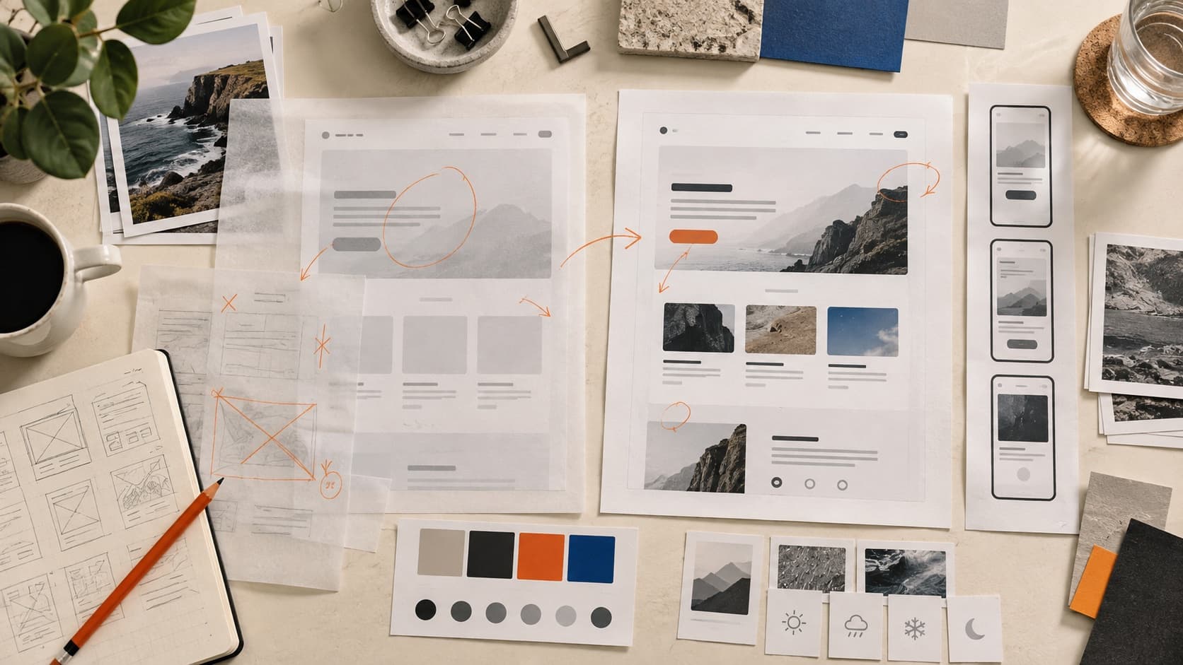
The short answer: the first draft is no longer the expensive part
AI design and coding tools can move from a description to something that resembles a finished interface much faster than the old blank-canvas workflow. That changes who can make a credible first draft and how many directions a team can explore.
It does not make the final decision automatic. Someone still has to decide whether the hierarchy supports the task, whether the product behaves coherently, whether the system survives real content, and whether the result feels specific to the people and constraints behind it.
What changed is the distance between an idea and a convincing screen
Google describes Stitch as an AI-native design canvas that can turn natural-language direction into high-fidelity UI, interactive prototypes, and exports for development workflows. Vercel’s v0 can produce editable app code and deploy it. Lovable offers generated app surfaces plus backend capabilities such as authentication, databases, storage, and serverless functions.
Those are vendor descriptions, not independent quality guarantees. They still establish the meaningful shift: interface production is available to more people, and the distance from prompt to something demonstrable is shorter. Prices and included usage change too often to build the argument around one combined monthly number.
Now easier to produce
A plausible first direction
- Several high-fidelity visual directions
- A clickable flow or working app surface
- Common components and familiar interaction patterns
- A starting system inferred from examples or instructions
Still needs judgment
A direction worth shipping
- The right task, audience, and product priority
- Useful hierarchy under real content and pressure
- States, behavior, accessibility, and system fit
- A defensible reason this direction belongs here
A polished screen can make an unfinished decision harder to see
Visual coherence creates confidence. That is part of its job. It also means a tidy card grid, good-looking type, and a restrained palette can make us stop asking whether the interface is actually helping someone complete the task.
Look past the first impression
- The layout looks balanced
- Replace the placeholder content with long, short, missing, and uncomfortable real examples.A composition built around ideal copy may not contain a usable content system.
- The flow feels complete
- List loading, empty, error, permission, success, and recovery states.The happy path is only one version of the product.
- The components look consistent
- Check whether the rules still hold across breakpoints, priorities, and different contexts.Repeated styling is not the same as a maintainable system.
- The UI feels familiar
- Name which decisions come from the product’s audience, content, brand, or constraints.Familiar patterns can support usability, but default choices alone do not create product specificity.
- The screen appears accessible
- Measure and test the implementation: contrast, focus, keyboard order, reflow, labels, motion, and resize behavior.Accessibility cannot be confirmed from the mood of a screenshot.
The hiring signal is not “craft no longer matters”
Figma’s February 2026 research surveyed design managers around the world. Fifty-eight percent ranked visual polish among the five most important skills for designers. Forty-seven percent ranked systems thinking and service design in their top five. Seventy-three percent reported an increasing need for candidates who are proficient with AI tools.
One vendor-sponsored survey should not be treated as the entire job market. But its pattern is useful: AI fluency, visual craft, systems thinking, collaboration, and product judgment are being requested together. “Use AI” is not the opposite of “be a good designer.” The expectation is increasingly to use the tools without losing the craft or the reasoning.
Critique is how more output becomes better work
Faster generation gives you more options. It does not tell you which option best supports the task. Critique creates that bridge by separating observation, interpretation, and recommendation.
A useful critique names
- What is visibly present in the submitted work.
- How that choice may affect this audience or task.
- Which decision matters most now and why.
- What evidence would confirm or challenge the recommendation.
- Which credible alternative has a different tradeoff.
The opportunity looks different at each career level
- Early career
- Show that you can inspect, revise, and explain a direction instead of presenting generated polish as the result.Reviewers need evidence that you are learning how decisions work, not only operating the tool.
- Mid-level
- Turn one promising direction into a coherent flow, system, and implementation-ready set of decisions.Your leverage is connecting the screen to the wider product and reducing rework for the team.
- Senior or staff
- Set the standards, evaluation criteria, and review loops that help a team use generation without multiplying inconsistency.More drafts create value only when the organization can make good decisions across them.
Figma’s hiring research also reported stronger demand for senior hires than junior hires among its respondents. That makes the early-career path harder, not pointless. It raises the value of portfolios and interviews that make growth, judgment, and contribution legible without pretending one person owned the whole product.
Run a 30-minute review pass before polishing the next prompt
- 1Restate the jobWrite the audience, task, product goal, and one constraint the interface must respect. If you cannot state the job, the tool cannot rescue the brief.
- 2Replace the ideal contentUse real labels, long titles, empty results, error copy, and representative data. Notice what breaks and what becomes hard to scan.
- 3Walk the missing statesCheck the moments before, during, after, and when the action fails. Include focus, keyboard, responsive, permission, and recovery behavior where relevant.
- 4Find the default decisionIdentify the part that could belong to almost any generated product: the same hero, card rhythm, dashboard shell, tone, or visual hierarchy.
- 5Choose one change to proveMake the highest-impact revision, then compare the result against the original task. Keep the before, after, and reason.
In a portfolio, show the judgment the final screen cannot show
A polished final image can establish craft. It cannot tell a reviewer what you noticed, what you rejected, where the tool helped, or which decision changed because of evidence.
Keep the proof that makes authorship credible
- The problem and audience you gave the tool.
- The constraints, examples, or system rules that shaped the direction.
- A generated option you rejected and the reason it was wrong for the product.
- The critique or test that changed the work.
- The specific decision you made after the tool stopped being useful.
- Your contribution, collaborators, and what remains unproven.
This is not an argument for filling a case study with prompt history. Curate the moments that explain the quality of your decisions. For the wider portfolio story, see how the website, case study, recruiter brief, and interview deck do different jobs.
Sources and evidence limits
Tool capabilities and prices change quickly. The vendor pages below support what each product says it can do as of September 2026; they do not prove that every generated result is production-ready. Figma’s hiring findings come from its own 2026 survey of design managers and should be read as one industry signal, not a census of every design role or market.
- Google Labs: Introducing “vibe design” with Stitch — March 18, 2026 product description of the AI-native canvas, high-fidelity UI, prototypes, and design-system context.
- Google Labs: Stitch real-time design updates — May 19, 2026 update covering live steering, code and design-file context, publishing, and export routes.
- v0: Plans and pricing — current plan, deployment, visual-editing, and GitHub-sync details.
- Lovable: Pricing and usage — current build-credit, hosting, ownership, and usage details.
- Lovable: Product support and capabilities — current description of Cloud backend, authentication, storage, functions, connectors, and payments.
- Figma: Why demand for designers is on the rise — February 10, 2026 design-manager survey and hiring-skill findings.
- Figma: Five design skills to sharpen in the AI era — March 10, 2026 synthesis of AI fluency, collaboration, systems thinking, and product judgment.
QuestionsAnswers
Questions, answered.
A few practical details before you keep going
Share this resource

Written by
Nikki KippleProduct Designer & Design Instructor
Designer, educator, founder of The Crit. I've spent years teaching interaction design and reviewing hundreds of student portfolios. Good feedback shouldn't require being enrolled in my class — so I built a tool that gives it to everyone. Connect on LinkedIn →
Want another set of eyes on the generated first draft?
Share the screen or public URL and tell us what you were trying to make. Your free First Read starts with the most useful decision; the $9 Full Crit opens the wider review and one revision check.