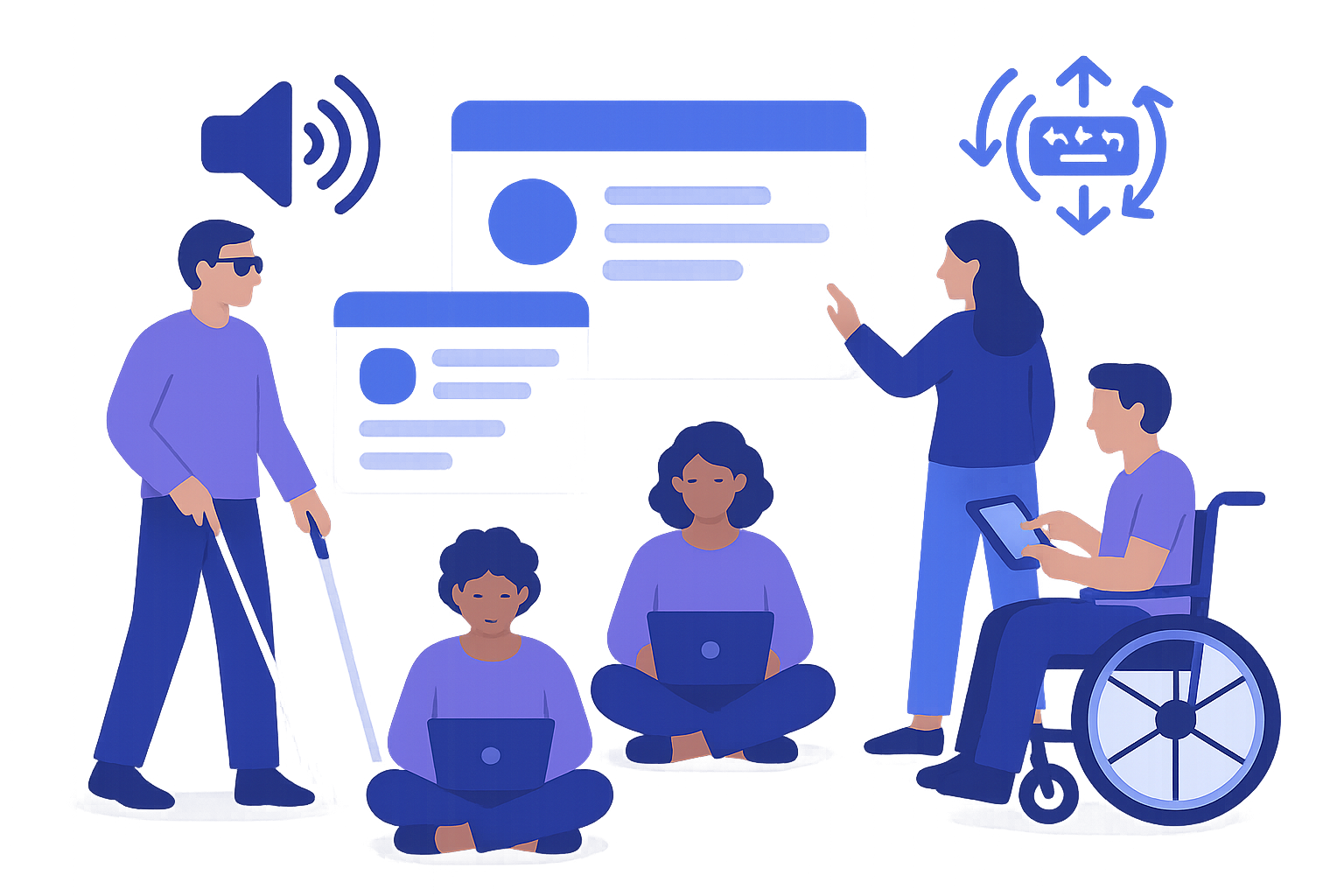
Accessibility for Portfolios
Make your portfolio accessible to everyone with our comprehensive WCAG compliance guide. Cover visual, motor, cognitive, and auditory accessibility needs.
⚡ TL;DR
- WCAG AA compliance: Meet international accessibility standards
- Multi-sensory design: Support visual, motor, cognitive, and auditory needs
- Testing tools: Comprehensive testing and validation resources
- Legal compliance: Understand accessibility requirements and benefits
Your Portfolio Probably Has Issues
Your portfolio might look great to you — but can everyone actually use it? Gray text on white backgrounds, hover-only navigation, auto-playing videos. These common design choices accidentally exclude millions of people.
Making portfolios accessible benefits everyone
The Numbers Don't Lie
1 in 4 adults
Has a disability that affects how they use websites
15% of people
Have some form of color vision deficiency
8% of men
Are colorblind and can't see red-green differences
Many hiring managers
Work at companies that require accessibility compliance
Accessibility isn't charity work. It's about making sure everyone can see your amazing work. Plus, many companies require it anyway.
Colors and Text That Work
If people are squinting at your text, your contrast isn't high enough. Here's how to fix it.
Color Contrast (Most Important)

Good contrast (4.5:1+) vs poor contrast (<3:1) — WCAG AA compliance
✅ Do This
- • Normal text: 4.5:1 contrast minimum
- • Large text (18pt+): 3:1 minimum
- • Use WebAIM's contrast checker
- • Test with actual colorblind users
❌ Common Issues
- • Gray text on white (might not pass contrast)
- • Using only red/green to show status
- • Low contrast for "clean" aesthetics
- • Light text on bright backgrounds
Test Your Color Contrast
Free tool to test if your colors meet WCAG standards
Check contrast while designing in Figma
Typography That Works
Minimum 16px for body text
Smaller text is hard to read for many people. 16px is your friend.
1.5x line height minimum
Tight line spacing makes text harder to track. Give it breathing room.
Left-align body text
Justified text creates weird spacing. Center alignment is for headings only.
Keyboard Navigation Stuff
Try unplugging your mouse and navigating your portfolio with just a keyboard. You might be surprised how far you don't get.
Keyboard Navigation Essentials
Everything needs to be tabbable
Every button, link, and interactive element must be reachable with Tab key.
Visible focus indicators
When someone tabs to something, they need to see where they are. That outline actually helps.
Logical tab order
Tab should move through content in a logical order, not randomly around the page.
Touch and Motor Considerations
✅ Mobile-Friendly
- • Touch targets 44px minimum
- • Spacing between clickable elements
- • No hover-only interactions
- • Works with voice control
❌ Things That Break
- • Tiny click targets
- • Hover menus that disappear
- • Drag-and-drop without alternatives
- • Time limits on interactions
Keep It Simple
Clever navigation is fun to build — but confusing to use. Simple and predictable usually wins.
Use clear, simple language
"I created innovative solutions" → "I designed a mobile app"
Consistent navigation
Put your menu in the same place on every page. Save creativity for your actual work.
Descriptive link text
"Click here" tells people nothing. "View UX case study" is way more helpful.
Clear headings
Use proper H1, H2, H3 hierarchy. Screen readers navigate by headings.
Videos and Audio
Videos without captions leave a lot of people out. Adding them is easier than you think.
Video Accessibility Checklist
Add captions to all videos
YouTube auto-captions are a start, but review and fix them
Provide transcripts
Full text of everything said in the video
Never auto-play audio
Sudden audio is jarring and messes with screen readers
Include volume controls
Let people adjust or mute audio themselves
Tools That Actually Help
Instead of guessing, use these tools to check if your portfolio actually works for everyone.

Essential accessibility testing tools: WAVE, axe DevTools, and Lighthouse
Free Testing Tools
WAVE →
Most recommended accessibility testing tool by designers
axe DevTools →
Browser extension that checks accessibility as you build
Lighthouse →
Built into Chrome DevTools - free accessibility audit
Color Oracle →
Free tool to simulate colorblindness on your screen
Manual Testing
Keyboard only
Unplug your mouse. Can you navigate everything?
Screen reader
Try VoiceOver (Mac) or NVDA (Windows)
Zoom to 200%
Does everything still work when enlarged?
More Testing Resources
WCAG Quick Reference →
Official guidelines for accessibility standards
NVDA Screen Reader →
Free screen reader to test how your site sounds
Need Help With This Stuff?
Drop your portfolio here and we'll check for accessibility issues you might have missed. Real fixes, not theory.
Get Accessibility FeedbackAccessibility Questions
Quick answers to help you get started
More Portfolio Essentials
Share this resource

Written by
Nikki KipplePortfolio Designer & Strategist
Designer, educator, founder of The Crit. I've spent years teaching interaction design and reviewing hundreds of student portfolios. Good feedback shouldn't require being enrolled in my class — so I built a tool that gives it to everyone. Connect on LinkedIn →
Too close to your own work?
Send one screen, case study, or URL. We'll show what's working, what's getting skipped, and what to fix next.
Continue Reading
All resources →Get one actionable portfolio tip every week. No fluff.
Short reads you can use on your site. Unsubscribe anytime.