Color Theory for Designers The Complete 2026 Guide
Master color fundamentals: the color wheel, harmonies, psychology, and accessibility. Build palettes that look great and work for everyone.
⚡ TL;DR
- Color wheel: Primary, secondary, and tertiary color relationships
- Harmonies: 5 proven formulas for palettes that work
- Psychology: What each color communicates and when to use it
- Accessibility: WCAG contrast requirements and colorblind considerations
Why Color Theory Matters
Color is the first thing users notice and the last thing they forget. A study by the University of Loyola found that color increases brand recognition by up to 80%. Yet most designers pick colors based on "what looks good" rather than understanding the science behind visual harmony.
This guide will take you from randomly sampling colors to strategically choosing palettes that:
- Create emotional responses that align with your brand
- Guide users through visual hierarchy
- Remain accessible to all users, including colorblind individuals
- Work harmoniously without "fighting" each other
A palette can look nice and still fail the page.
Upload one screen. We'll check contrast, hierarchy, color meaning, and whether the palette is doing useful work.
The Color Wheel
The color wheel is your map for understanding relationships between colors. Created by Isaac Newton in 1666, it arranges colors in a circle based on their chromatic relationship.
The Three Categories
Primary Colors
Red, yellow, blue. Can't be created by mixing other colors.
Secondary Colors
Orange, green, purple. Created by mixing two primaries.
Tertiary Colors
Yellow-orange, blue-green, etc. Mix of primary + secondary.
Digital Design Note: The traditional RYB (red-yellow-blue) color wheel is based on pigments. In digital design, we often use the RGB (red-green-blue) color model, where the "primaries" are different. Understanding both helps when moving between print and screen.
Color Properties: Hue, Saturation, Value
Every color has three properties. Understanding these lets you create variations of a single hue and build cohesive monochromatic schemes.
Hue
The pure color itself — red, blue, green, etc. It's the position on the color wheel.
Saturation
The intensity or purity of a color. High saturation = vivid. Low saturation = muted, grayish.
High saturation → Low saturation (desaturated)
Value (Brightness)
How light or dark a color is. Add white for tints, add black for shades.
Tint (light) → Base → Shade (dark)
Pro Tip: In Figma, press I to open the eyedropper, then look at the HSB (Hue, Saturation, Brightness) values. Experiment by adjusting just one property at a time.
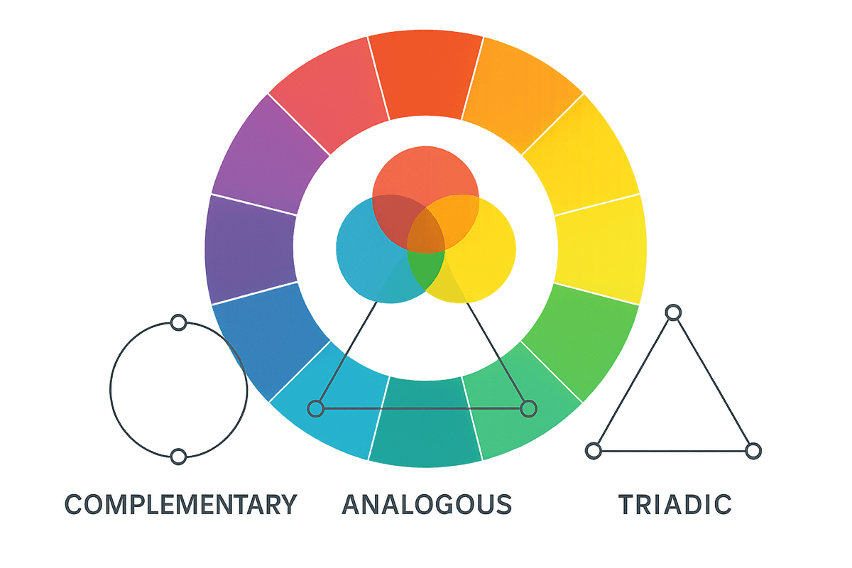
Color Harmonies
Color harmonies are predefined relationships on the color wheel that are mathematically proven to work together. Instead of guessing, use these formulas to build palettes that feel cohesive.
Complementary
Colors opposite each other on the color wheel. High contrast, vibrant, attention-grabbing.
Example: Blue and orange, red and green, purple and yellow
Best for: CTAs, accent colors, making elements pop
Use one as dominant (60%), the other as accent (10%)
Analogous
Three colors side by side on the color wheel. Harmonious, serene, easy on the eyes.
Example: Blue, blue-green, green or red, orange, yellow
Best for: Backgrounds, gradients, creating mood
Pick one dominant color, use others as supporting
Triadic
Three colors equally spaced on the wheel. Balanced, vibrant, playful.
Example: Red, yellow, blue (primary) or orange, green, purple
Best for: Playful brands, children's products, creative projects
Let one color dominate; use others sparingly
Split-Complementary
One color plus the two adjacent to its complement. Contrast with less tension.
Example: Blue with yellow-orange and red-orange
Best for: When complementary feels too harsh
Easier to balance than straight complementary
Monochromatic
One hue in different saturations and values. Cohesive, sophisticated, clean.
Example: Light blue, medium blue, dark blue
Best for: Minimalist designs, professional brands, focus on content
Add a neutral or accent for visual interest
Advanced Color Harmony Techniques
Once you understand the basic harmonies above, advanced color harmony techniques let you create more sophisticated palettes that feel intentional and professional. These go beyond picking colors from a wheel — they're about understanding how colors interact in context.
Split-Complementary Variations
Instead of using a direct complement, pick the two colors adjacent to it. You get the same visual tension with less risk of clashing. This is one of the most reliable advanced color harmony techniques for UI work — high contrast without the aggression.
Temperature Shifting
Every color has a warm and cool variant. Shifting the temperature of your palette colors (warming up a blue, cooling down a red) creates subtle depth that users feel but can't name. Use warm tones for foreground elements and cool tones for backgrounds to create natural visual hierarchy.
Proportional Harmony (60-30-10)
The colors you choose matter less than how much of each you use. The 60-30-10 rule gives you a dominant color (60%), a secondary color (30%), and an accent (10%). Most palette failures aren't bad colors — they're bad proportions. Try mapping your existing palette to these ratios before adding new colors.
Chromatic Gray Palettes
Pure gray is dead. Add a tiny amount of your brand color to your grays (2-5% saturation) and the entire palette feels more cohesive. This technique is everywhere in modern UI design — check any well-designed app and you'll notice their "grays" are actually very slightly tinted.
Color Psychology
Colors trigger emotional and psychological responses. While these associations aren't universal (they vary by culture), understanding common Western associations helps you make intentional choices.
Red
Brands: Netflix, YouTube, Coca-Cola, Target
Use for: CTAs, sales, food brands, warnings
⚠️ Can feel aggressive or alarming if overused
Blue
Brands: Facebook, LinkedIn, IBM, PayPal
Use for: Finance, healthcare, tech, corporate
⚠️ Can feel cold or impersonal
Green
Brands: Spotify, Whole Foods, Starbucks, John Deere
Use for: Eco brands, finance, health, success states
⚠️ Avoid institutional green (hospitals)
Yellow
Brands: McDonald's, IKEA, Snapchat, National Geographic
Use for: Attention-grabbing, children's products, warnings
⚠️ Hard to read on white; can feel cheap if too bright
Purple
Brands: Twitch, Cadbury, Hallmark, Yahoo
Use for: Premium brands, creative industries, spirituality
⚠️ Can feel artificial or immature depending on shade
Orange
Brands: Amazon, Nickelodeon, Fanta, Harley-Davidson
Use for: CTAs, sales, entertainment, food
⚠️ Can look cheap if used carelessly
Black
Brands: Apple, Nike, Chanel, Uber
Use for: Luxury brands, fashion, minimalist design
⚠️ Too much feels heavy; needs balance
White
Brands: Apple, Google, Airbnb, Tesla
Use for: Tech, minimalism, healthcare, backgrounds
⚠️ Pure white (#fff) can feel sterile; warm it up
Cultural Note: Color meanings vary dramatically across cultures. White symbolizes purity in the West but mourning in parts of Asia. Red means danger in the US but luck in China. Always research your target audience's cultural context.
Color Accessibility
Approximately 8% of men and 0.5% of women have some form of color vision deficiency. Designing for accessibility isn't just ethical — it expands your audience and often improves design for everyone. For comprehensive text contrast and readability guidelines, see our typography principles guide.
WCAG Contrast Requirements
Normal text
Required for body text under 18pt (24px) or 14pt bold (19px)
Large text
Required for text 18pt+ (24px) or 14pt bold+ (19px)
UI elements
Required for icons, form borders, focus states
Best Practices
- Don't rely on color alone — Use icons, labels, patterns, or text alongside color
- Test with simulators — Use tools like Stark, Color Oracle, or Figma's colorblind plugin
- Use WebAIM Contrast Checker — Paste your colors and get instant pass/fail
- Avoid red-green combinations — The most common colorblindness makes these indistinguishable
Quick Test: Convert your design to grayscale. If you can still distinguish all elements and understand the hierarchy, your color accessibility is likely solid.
Practical Application
Theory is great, but how do you actually apply this in a real project?
The 60-30-10 Rule
A timeless formula for balanced color distribution:
- 60% Dominant: Backgrounds, large surfaces. Usually neutral.
- 30% Secondary: Cards, sidebars, sections. Your brand color.
- 10% Accent: CTAs, highlights, interactive elements.
Color in UI Patterns
States & Feedback
- Success (green)
- Error (red)
- Warning (yellow/amber)
- Info (blue)
Interactive Elements
- Default: Neutral or brand color
- Hover: Slightly lighter/darker
- Active/Pressed: More dramatic shift
- Disabled: Desaturated, low contrast
- Focus: High contrast ring/outline
Building a Color Palette: Step by Step
Start with Brand Values
What emotions should your brand evoke? Professional? Playful? Trustworthy? Write down 3-5 adjectives and refer to the color psychology section to find matching hues.
Choose a Primary Color
This is your main brand color. It should be the most memorable and distinct. Test it against competitors — you want to stand out, not blend in.
Apply a Color Harmony
Use your primary color as the starting point, then use a harmony rule (complementary, analogous, etc.) to generate 1-2 secondary colors.
Build Out Neutrals
Add a full range of neutrals (50 to 950) for text, backgrounds, and borders. Warm or cool neutrals? Match the temperature of your primary color.
Add Semantic Colors
Include colors for success, error, warning, and info states. These can be standard (green, red, amber, blue) or variations that fit your brand.
Test Everything
Check accessibility, test on real devices, simulate colorblindness, preview in context. A palette that looks great in Figma might fail in production.
Recommended Tools
Palette Generators
- Coolors — Fast palette generation
- Color Hunt — Curated palettes
- Palettte — Fine-tune color scales
Accessibility Testing
- WebAIM Contrast Checker
- Stark — Figma plugin
- Color Oracle — Colorblind simulator
Common Mistakes
❌ Using too many colors
Why it's a problem: Creates visual chaos and dilutes brand recognition
Fix: Stick to 3-5 colors max. One primary, one secondary, neutrals.
❌ Ignoring accessibility
Why it's a problem: 8% of men are colorblind. Low contrast = unreadable.
Fix: Test with WebAIM contrast checker. Use 4.5:1 minimum ratio.
❌ Relying on color alone for meaning
Why it's a problem: Colorblind users miss the message entirely.
Fix: Add icons, labels, or patterns alongside color.
❌ Not considering context
Why it's a problem: Red means "danger" in the West but "luck" in China.
Fix: Research your audience's cultural associations.
❌ Over-saturating everything
Why it's a problem: Neon colors fight for attention and cause eye fatigue.
Fix: Use saturated colors sparingly for emphasis.
❌ Copying brand colors without understanding them
Why it's a problem: Spotify green ≠ finance green. Context matters.
Fix: Understand the why behind color choices before borrowing.
Color Theory Checklist
Use this checklist to audit your color decisions before shipping.
Foundation
Application
Accessibility
Documentation
Everything You Need to Know
Quick answers to help you get started
Related Resources
Design Principles Masterclass
Master the 12 fundamental principles including balance, contrast, and hierarchy.
Portfolio Checklist Tool
Interactive tool to evaluate and improve your portfolio — including color usage.
Design System Templates
Professional templates with color palettes and systems for consistent portfolio designs.
Share this resource

Written by
The CritDesign education & visual fundamentals
Designer, educator, founder of The Crit. I've spent years teaching interaction design and reviewing hundreds of student portfolios. Good feedback shouldn't require being enrolled in my class — so I built a tool that gives it to everyone. Connect on LinkedIn →
Color should guide people, not just decorate the page.
Send one screen or portfolio section. We'll flag contrast issues, confusing accents, and places where color is not helping the work.
Continue Reading
All resources →Get one actionable portfolio tip every week. No fluff.
Short reads you can use on your site. Unsubscribe anytime.