Does Your AI-Built App Look Vibe-Coded?
A practical diagnostic for the moment when your AI-built app works, looks polished, and still somehow feels like every other generated interface.
⚡ TL;DR
- Fast test: If your app looks polished but could belong to any product, it probably needs a design decision pass.
- Main smells: Default type, generic gradients, card soup, weak hierarchy, missing states, and proof-free polish.
- Fix: Stop asking for more polish. Add product-specific hierarchy, density, states, proof, and visual direction.
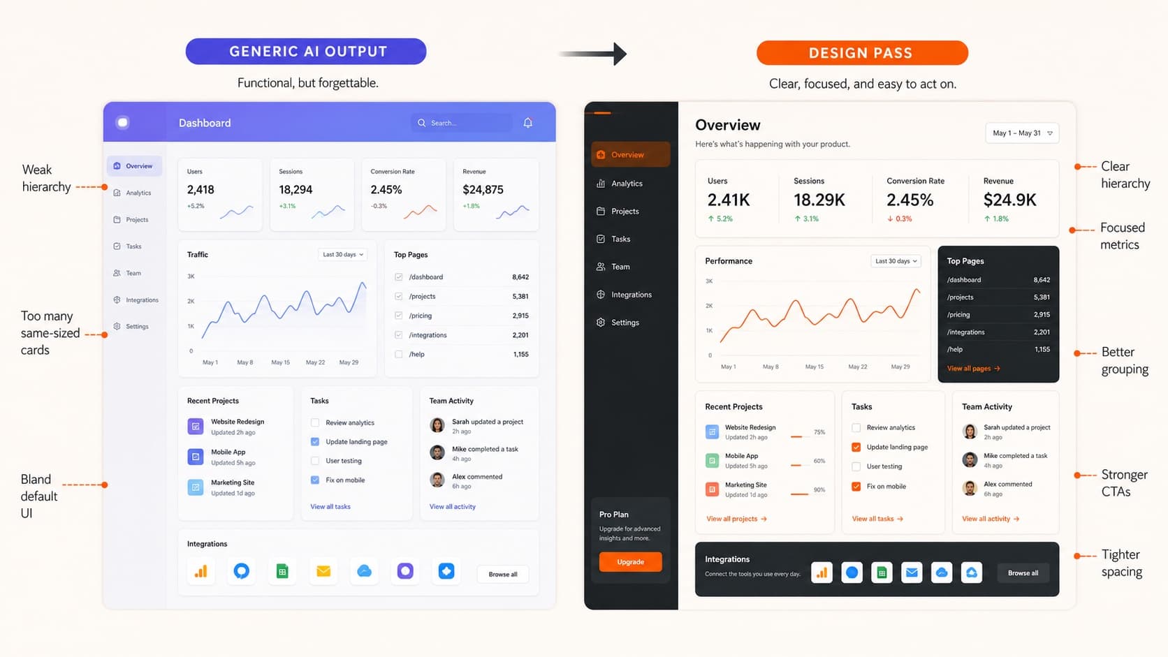
The Diagnostic
An AI-built app does not look vibe-coded because it is ugly. Most of the time, it looks vibe-coded because the tool filled in design decisions you never made.
That is why the output can feel strangely familiar: safe sans-serif type, gradient glow, rounded cards, generic icons, confident copy, and no clear reason this product should look or behave this way.
Use this page as a design pass. Look at one real screen from your app and score the smells below. If several apply, do not ask the AI to "make it better." Give it better decisions.
Already know your app has the default look? Start with the broader vibe-coding design guide, then come back here for the checklist pass.
How to Score It
0-2 smells
Mostly directed
You likely have enough specificity. Tighten the weakest proof or state before shipping.
3-5 smells
Needs a design pass
The app works, but the interface is probably borrowing too many defaults.
6+ smells
Reads generated
Pause visual iteration. Define the product lane, hierarchy, states, and proof before restyling.
The Design Smells
Smell 1
Default typography
Looks like
Everything uses the same safe sans-serif, weight, and scale. The page is readable but has no point of view.
Consequence
Users cannot tell whether this is a finance tool, creative product, developer utility, classroom app, or consumer service.
Replace with
Choose type for the product lane. Then define scale, weight, and rhythm instead of asking for a modern font.
Smell 2
Generic gradient polish
Looks like
Blue-purple gradients, soft glows, glassy panels, and decorative backgrounds carry the visual identity.
Consequence
The app feels trendy before it feels specific. The color system does not help users understand actions, status, or priority.
Replace with
Pick colors that support meaning: action, warning, success, inactive, selected, brand, and emphasis.
Smell 3
Card soup
Looks like
Every idea becomes a rounded card with equal padding, shadow, icon, heading, and short body copy.
Consequence
Nothing feels more important than anything else. The interface becomes a catalog of boxes instead of a workflow.
Replace with
Use cards only when items are repeated or framed. Let main work areas, tables, timelines, and forms breathe without extra containers.
Smell 4
Weak hierarchy
Looks like
The headline, stats, primary action, secondary action, and supporting copy all compete for attention.
Consequence
Users have to inspect the page instead of being guided through it.
Replace with
Name the first thing the user must understand, the first action they should take, and what can become secondary.
Smell 5
Missing states
Looks like
The happy path looks finished, but loading, empty, error, disabled, long-content, mobile, and edge states are absent.
Consequence
The product looks like a mockup. Real usage breaks the illusion quickly.
Replace with
Design the states where trust is won: empty project, failed upload, no results, slow response, narrow screen, and saved change.
Smell 6
Stock iconography
Looks like
The same clean outline icons appear everywhere, often as decoration rather than meaning.
Consequence
The interface feels assembled from a template. Icons do not reduce cognitive load.
Replace with
Use icons where they clarify repeated actions or status. Remove decorative icons that do not help decisions.
Smell 7
Proof-free polish
Looks like
The page claims outcomes with polished copy, but there is no evidence, example, constraint, data, artifact, or before/after.
Consequence
Users may like the surface but not believe the product.
Replace with
Add proof close to the claim: sample output, customer artifact, workflow evidence, metric, comparison, or real scenario.
Smell 8
Mismatched density
Looks like
A serious work tool uses landing-page spacing, or a lightweight consumer app uses dense enterprise controls.
Consequence
The product feels like it was styled without understanding how often or intensely people use it.
Replace with
Match density to the job: repeated work needs tighter scanning; emotional/marketing moments can use more space.
Smell 9
Unclear product lane
Looks like
The first screen could belong to almost any AI productivity, analytics, or dashboard app.
Consequence
Users cannot quickly explain who it is for, what it does, or why this version should exist.
Replace with
Make the first screen name the user, job, artifact, and differentiating constraint. Specific beats broadly impressive.
Want a second set of eyes on the screen?
Upload one screenshot or paste the URL. We will identify the top design smells and the fastest replacement moves.
A Replacement Prompt
Once you know the smells, give the tool a better brief. The goal is not more decoration. The goal is more specific design direction.
Redesign this screen so it feels specific to [user] doing [job]. Prioritize [primary action] and make [secondary content] quieter. Replace generic gradient/card styling with a visual system that supports [product personality]. Include empty, loading, error, and long-content states. Use typography, density, and color to communicate priority instead of decoration. Keep the layout usable on mobile and desktop.
The more fluently you can describe layout behavior, states, and constraints, the better the output gets. That is the point of browser fluency for designers.
The Proof Pass
The strongest AI-built interfaces do not just look better. They prove more. They make the product lane, action, user, constraint, and result easier to understand.
Before you ship, ask five questions:
- 1.Can a new user tell who this is for in five seconds?
- 2.Is the primary action visually obvious?
- 3.Does the visual system support the product lane?
- 4.Are the non-happy-path states designed?
- 5.Is there proof behind the claims?
This is also the career shift behind polished AI UI becoming cheap: polish is easier to generate, so judgment has to become easier to see.
If This Screen Is Going in Your Portfolio
The bar gets sharper when an AI-built screen becomes career evidence. A hiring reviewer is not only asking whether the interface looks finished. They are asking whether the work proves taste, ownership, constraints, and decision quality.
Add these proof notes before you publish it:
- What you directed: the product lane, hierarchy, states, interaction behavior, content model, or visual system you specified instead of accepting defaults.
- What changed after critique: one before/after decision that shows your judgment improved the generated draft.
- What constraint mattered: mobile density, accessibility, trust, repeated use, production feasibility, or the real workflow the screen had to support.
- What makes it ready enough: the high-polish standard it passed, plus any optional refinements that are not blocking the current goal.
That proof belongs in the larger hiring-ready portfolio packet. The website earns the click, but the packet has to show why this AI-assisted work should survive recruiter, hiring manager, and interview review.
Everything You Need to Know
Quick answers to help you get started
Get the actual screen diagnosed
Send the screenshot, URL, or prototype. The Crit will tell you what feels generated and what to fix first.
Critique my AI-built appShare this resource

Written by
Nikki KippleProduct Designer & Design Instructor
Designer, educator, founder of The Crit. I've spent years teaching interaction design and reviewing hundreds of student portfolios. Good feedback shouldn't require being enrolled in my class — so I built a tool that gives it to everyone. Connect on LinkedIn →
Your AI-built app may only need one sharp design pass.
Send the screen, URL, or prototype. The Crit will identify the exact generic choices, hierarchy problems, missing states, and proof gaps.
Continue Reading
All resources →Get one actionable portfolio tip every week. No fluff.
Short reads you can use on your site. Unsubscribe anytime.