Tools & Workflow
You Don’t Need to Be an Engineer You Need Browser Fluency
Use the browser as a design material. Inspect the rendered page, test what changes, and give implementation tools enough direction to preserve the intent.

The short read
Inspect the real page
A canvas shows an intention. The browser shows the content, rules, states, assets, and constraints people actually receive.
Test behavior
Resize, zoom, use a keyboard, slow the network, and replace the tidy content before calling a screen finished.
Direct the tools
AI can produce a first implementation. Fluency helps you identify what the output assumed and ask for the next change precisely.
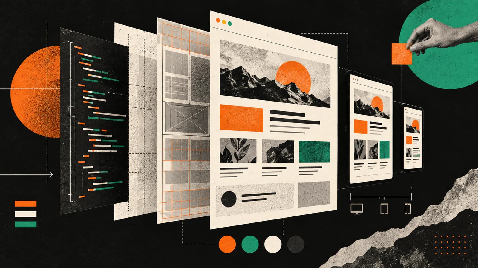
The short answer: learn the medium, not a new identity
“Should designers learn to code?” is too broad to be useful. A more practical question is whether you can follow your work into the browser and make sense of what happened there.
Browser fluency is the ability to inspect a rendered interface, understand the rules shaping it, test important conditions, and describe what needs to change. It can support collaboration, prototyping, critique, and implementation without requiring every designer to become a front-end engineer.
Canvas question
Does the composition express the intent?
Browser question
Does the intent survive real conditions?
What browser fluency actually covers
Fluency is not a list of technologies to collect. It is a small set of questions you can bring to any interface, regardless of the framework behind it.
Five questions to carry into the browser
- Structure
- What is this element, and does the document still make sense without its visual arrangement?Headings, landmarks, links, buttons, labels, and content order carry meaning beyond appearance.
- Layout rules
- What can grow, shrink, wrap, reflow, stick, scroll, or disappear?A frame is one outcome of a rule set—not the rule set itself.
- States
- What happens before, during, after, and when the action fails?Resting, hover, focus, active, disabled, loading, empty, error, and success may all change the experience.
- Inputs and access
- Can someone use the interface with a keyboard, enlarged text, reduced motion, or another input mode?The visible desktop pointer path is only one way someone may reach the task.
- Delivery
- Which assets, fonts, scripts, and requests delay or interrupt the useful content?Loading and failure are product conditions, not just technical footnotes.
Use four passes instead of staring at one perfect viewport
You can learn a great deal without writing an application. Choose a page you understand, open its developer tools, and move through a repeatable set of checks.
A 20-minute browser review
- 1Inspect the structureUse the Elements or Inspector panel to find the main landmarks, heading order, links, buttons, images, and the CSS rules applied to one important section.
- 2Resize until a decision appearsMove slowly between wide and narrow widths. Note where content wraps, hierarchy changes, navigation transforms, or comparison becomes difficult. Add a breakpoint because the content needs one—not because a device list says so.
- 3Leave the happy pathUse the keyboard, enlarge the text, turn on reduced motion, and inspect loading, empty, error, disabled, and long-content states that matter to the task.
- 4Change one rule and explain the effectEdit a width, gap, font size, grid rule, or source-visible label in developer tools. The change is temporary; the point is to connect the rule to the rendered result.
Bring untidy evidence into the test
- The longest real title and the shortest one.
- Images with different aspect ratios and useful alternative text.
- A validation error, slow response, empty result, and completed state when those conditions exist.
- A narrow viewport, a wide viewport, and the awkward widths between them.
- Keyboard focus, text enlarged to 200%, and reduced-motion preferences.
AI tools make evaluation more important, not automatic
The path from design idea to rendered interface is shorter than it used to be. Google describes Stitch as an AI-native canvas for creating and iterating on high-fidelity UI. Vercel says v0 can work against existing GitHub repositories and open pull requests. Figma’s MCP server can give an agent variables, components, layout data, and selected design context.
Those capabilities change the workflow, but they do not make every output correct. Figma’s own documentation explicitly describes its design-context response as input for an agent—not production-ready code. The useful designer role is not to distrust every generated result. It is to inspect what the result assumed and decide what must be tested next.
Vague reaction
“It looks weird on mobile.”
Grounded direction
“The comparison becomes serial below this width.”
Choose what to learn from the work in front of you
There is no fixed syllabus every designer must finish. Start with the layer that keeps causing ambiguity in your work, and go deeper only when the next responsibility or project needs it.
Let the problem choose the lesson
- Layouts keep breaking
- Study normal flow, intrinsic sizing, the box model, flexbox, grid, and content-led breakpoints.
- States arrive late
- Map events, state changes, validation, loading, empty, error, success, and recovery before polishing the resting screen.
- Components feel rigid
- Test content ranges, variants, composition, and which decisions belong to the component versus the page.
- Accessibility feels abstract
- Begin with semantic structure, source order, keyboard operation, focus visibility, text resize, reflow, contrast, and motion preferences.
- You want to ship code
- Add JavaScript, framework, testing, version-control, performance, security, and deployment knowledge in proportion to the production responsibility you want to own.
If implementation itself is the goal, continue with the practical coding-portfolio guide. If the collaboration loop is the problem, use the design handoff guide. Browser fluency is the layer underneath both.
Build fluency through small comparisons
A short, repeated inspection habit is more useful than waiting for the perfect course. Keep a small record of what you expected, what the browser did, and what changed after the revision.
Four sessions you can repeat
- Inspect a familiar page and name the rules behind one section.
- Rebuild or generate one component, then compare it with the real content and states.
- Test one page with keyboard, resize, zoom, reduced motion, and a slow network.
- Write a precise repair brief that connects the observed behavior to the user’s task.
Show the decision, not a list of technologies
A portfolio does not need a badge for every tool you opened. Show where the browser changed your understanding of the problem: a responsive rule you revised, a state you added, a source-order issue you corrected, or an AI-generated assumption you caught before it shipped.
Turn implementation work into design evidence
- Context
- What interface, user task, and production constraint were you working with?
- Observation
- What happened in the rendered page that the original canvas or generated draft did not reveal?
- Decision
- Which rule, content choice, state, or component boundary changed—and why?
- Evidence
- What did you inspect or test, and what remains a judgment rather than a measured result?
That is stronger proof than saying you “know HTML and CSS.” It shows that you can follow a design into its medium, notice a consequence, and make a reasoned change.
Sources and current product references
Product capabilities change quickly. The product descriptions and browser practice in this guide were checked against first-party documentation on September 25, 2026.
- MDN: What are browser developer tools? for inspecting runtime HTML and applied CSS.
- MDN: Media query fundamentals for content-led breakpoints and responsive testing.
- MDN: Accessibility tooling and assistive technology for source-order, keyboard, contrast, and assistive-technology checks.
- Google Labs: Introducing vibe design with Stitch for the March 2026 AI-native canvas and design-agent update.
- Vercel: Introducing the new v0 for repository import, Git branches, previews, and pull-request workflows.
- Figma: MCP server introduction and design-context output guidance for what Figma supplies to agents and why that output is not production-ready code by itself.
QuestionsAnswers
Questions, answered.
A few practical details before you keep going
Share this resource

Written by
Nikki KippleProduct Designer & Design Instructor
Designer, educator, founder of The Crit. I've spent years teaching interaction design and reviewing hundreds of student portfolios. Good feedback shouldn't require being enrolled in my class — so I built a tool that gives it to everyone. Connect on LinkedIn →
The page is live. Does the design still come through?
Share the current screen or URL. We will read the visible result as it exists now and name the most useful next move without pretending a screenshot proves hidden states or code quality.