Portfolio Navigation Best Practices
Master portfolio navigation with proven UX patterns, mobile optimization, and accessibility guidelines. Create intuitive browsing experiences that keep visitors engaged.
⚡ TL;DR
- 3-click rule: Any content reachable in 3 clicks or less
- Mobile-first: Thumb-friendly navigation and touch targets
- Clear hierarchy: Obvious primary vs secondary navigation
- Accessible: Keyboard navigation and screen reader support
Navigation That Actually Works
The Hard Truth About Portfolio Navigation
Creative navigation might win design awards, but hiring managers don't have time to figure out your artistic menu system. If someone needs instructions to navigate your portfolio, it needs work.
The Navigation Reality Check
What Users Actually Do:
- •Decide within 3 seconds if they'll stay
- •Look for "Work" or "Projects" immediately
- •Bounce if navigation is hidden or confusing
What Kills Portfolios:
- •Creative labels instead of clear ones
- •Hidden hamburger menus on desktop
- •Too many options causing decision paralysis
❌ What Doesn't Work
• "Creations" instead of "Work"
• Hidden hamburger menu with 12 options
• Artistic symbols instead of words
Creative but unusable
✅ What Actually Works
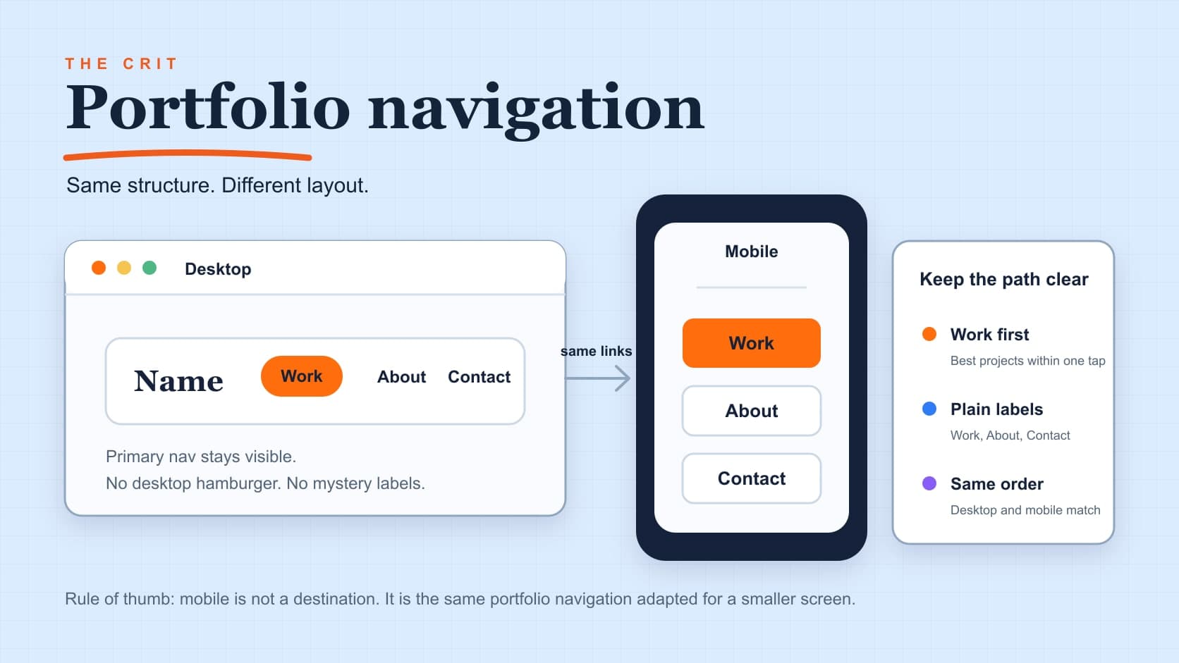
• "Work" • "About" • "Contact"
• Always visible, never hidden
• Clear, descriptive labels
Boring but effective
Keep It Stupid Simple
The Golden Rule of Portfolio Navigation
The best portfolio navigation is invisible. People use it without thinking about it. This principle is backed by extensive UX research from the Nielsen Norman Group on navigation design.
The Magic Number: 3
Most successful portfolios have exactly 3 top-level navigation items
Work
Your projects/case studies
85% of visitors click here first
About
Who you are, what you do
Shows personality & fit
Contact
How to reach you
Conversion goal
Why 3 works: Human brain processes 3 items instantly. 4+ requires conscious evaluation.
How to Organize Your Projects
The right structure depends on how much work you have
6 projects or less
→ No categories needed
Just show them all. Let the work speak for itself. Simple grid or list works perfectly.
7-12 projects
→ Simple categories (3 max)
"Web Design" • "Mobile Apps" • "Branding"
💡 Pro tip: Use filters, not separate pages
13+ projects
→ You have too many
Cut the weak ones. Quality over quantity, always.
⚠️ More projects ≠ better portfolio
🤔 Still Not Sure? Use This Test
Ask yourself:
- • Can someone find my best work in 10 seconds?
- • Would my mom understand this navigation?
- • Does every menu item serve a clear purpose?
If you answered "no" to any:
Your navigation needs work. Simplify it.
The Mobile Reality
Wake-up call: Your desktop navigation doesn't work on phones. Period.
Most people will see your portfolio on mobile first. If it doesn't work there, you've lost them.
Mobile Navigation Rules
Break these and lose 60% of your audience
44px Minimum Taps
Apple's minimum. Anything smaller = frustrated users.
Bottom Navigation Wins
Thumbs naturally reach the bottom. Put important actions there.
Hidden = Dead
If your navigation is hidden in a hamburger menu, it doesn't exist.
Swipes Are Confusing
Not everyone knows your swipe patterns. Use obvious buttons instead.
✅ Mobile Patterns That Actually Work
Steal these proven patterns for your portfolio
Fixed Header Navigation
Always visible, never disappears
Work • About • Contact — Simple and always accessible
💡 Most successful mobile portfolios use this pattern
Sticky Bottom Bar
Thumb-friendly zone
Primary actions like "Contact Me" or "View Resume" always within thumb reach
💡 Bottom third of screen = easiest to tap with thumbs
Large, Obvious Buttons
No guessing what's clickable
No tiny text links. High contrast, clearly defined tap targets
💡 When in doubt, make it bigger and more obvious
🏆 The winning combo: Fixed header + sticky bottom CTA + obvious buttons
Navigation That Kills Portfolios
💀 Portfolio Death by Navigation
These mistakes will tank your portfolio before anyone sees your amazing work. Avoid them at all costs.
Creative Labels That Confuse
❌ "Creations", "Journey", "Playground"
✅ "Work", "About", "Contact"
Creativity in navigation = confusion for users
Too Many Options
12 menu items = decision paralysis
Keep it to 3-5 maximum
More choices = slower decisions = bounces
Hidden Mobile Navigation
🍔 Hamburger menus hide your content
If hidden = doesn't exist to users
60% mobile traffic lost to hidden navigation
No Visual Feedback
No hover states, no active page indicator
Users are lost and confused
Can't tell what's clickable or where they are
Breaking Web Conventions
Logo doesn't go home, weird link styles
Don't reinvent basic web patterns
Users expect certain things to work certain ways
Slow or Glitchy
Laggy hover effects, unresponsive taps
Test on real devices!
Performance = credibility
🚨 Quick Portfolio Navigation Check
Ask 3 people to use your portfolio:
- • Can they find your best work in 10 seconds?
- • Do they know how to contact you?
- • Is it easy to use on their phone?
If they struggle with any of these:
Your navigation is killing your portfolio.
Fix it before showing it to anyone else.
Test With Real People
🧠 The Designer's Curse: You know where everything is. Other people don't.
Test your navigation before it goes live. Save yourself from embarrassing "Where's your work?" conversations.
⏱️ The 5-Second Navigation Test
The fastest way to catch navigation problems
The Process:
- 1
Show portfolio for 5 seconds
Then close/hide it
- 2
"How would you see their work?"
Should say "click Work" immediately
- 3
"How would you contact them?"
Should know exactly where to go
- 4
"What would you click first?"
Most should say "Work" or your main CTA
Success Looks Like:
✅ Instant Answers
No hesitation, no "um, maybe..."
✅ Consistent Responses
Everyone gives similar answers
✅ Confident Actions
They know what they'd click first
🚨 Red Flags:
- • "I'm not sure..."
- • "Maybe that thing there?"
- • Different answers from everyone
📱 Mobile Thumb Test
Hand someone your phone. Watch them navigate with one thumb. Do they struggle to reach anything?
If they use two hands or struggle to tap anything, your mobile nav needs work.
👁️ The Squint Test
Squint at your homepage. Can you still tell what's navigation and what's content?
Navigation should be visually distinct even when blurred.
Need Help Fixing Your Navigation?
Confusing navigation kills portfolios before anyone sees your amazing work. Get specific, actionable feedback on what to fix and how to fix it.
Related Resources
Everything You Need to Know
Quick answers to help you get started
Share this resource

Written by
Nikki KipplePortfolio Designer & Strategist
Designer, educator, founder of The Crit. I've spent years teaching interaction design and reviewing hundreds of student portfolios. Good feedback shouldn't require being enrolled in my class — so I built a tool that gives it to everyone. Connect on LinkedIn →
Too close to your own work?
Send one screen, case study, or URL. We'll show what's working, what's getting skipped, and what to fix next.
Continue Reading
All resources →Get one actionable portfolio tip every week. No fluff.
Short reads you can use on your site. Unsubscribe anytime.