Fundamentals
Why Your Vibe-Coded App Looks Like Every Other AI App (And How to Fix It)
Vibe coding can get a working interface on screen quickly. Here’s how to keep familiar defaults from making the result feel interchangeable — and give the tool clearer creative direction.

The short read
The problem
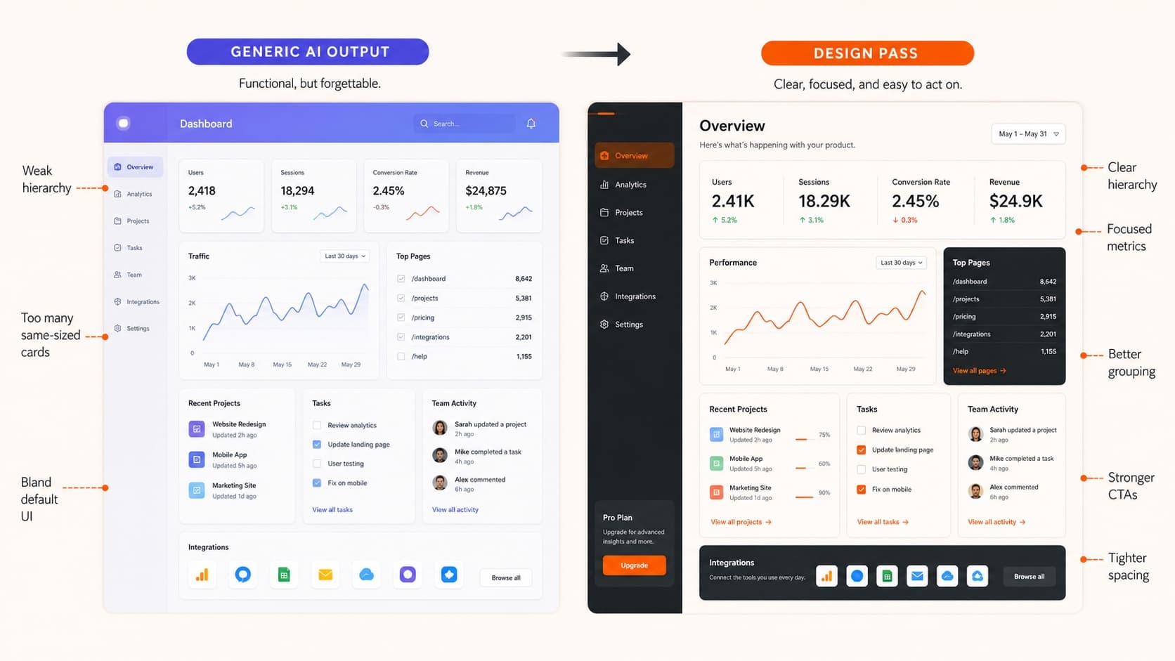
Vague prompts often produce familiar UI defaults: neutral type, stock icons, soft gradients, and interchangeable cards
The solution
Apply design fundamentals: typography, color theory, visual hierarchy
Better workflow
Sketch first, define visual identity, use design language in prompts
The Pattern I Keep Noticing
I keep seeing impressively functional, AI-assisted apps that are difficult to tell apart at first glance.
Same Inter font. Same Lucide icons. Same blue-to-purple gradients. Same rounded corners everywhere. Same "modern" layout that screams "I prompted an AI to build this."
Don't get me wrong — the ability to describe an interface and watch it materialize is genuinely useful. The trouble starts when fast generation is treated as finished design.
The problem isn't the tools. It is the missing design decisions that connect an interface to this product, this audience, and this job.
Why AI-Generated Design Can Look the Same
Coding agents and app builders can produce a competent interface from a short description. When that description leaves the visual direction open, familiar patterns are an easy place for the output to land:
The Generic Vibe-Coded UI Recipe:
- 1.Typography: Inter for everything (it's safe, readable, everywhere)
- 2.Icons: Lucide or Heroicons (clean, consistent, common libraries)
- 3.Colors: Blue-to-purple gradient backgrounds (a familiar visual shortcut)
- 4.Layout: Centered cards with excessive padding
- 5.Components: Rounded buttons, subtle shadows, blur effects
This isn't inherently bad design — these patterns are popular because they work. But when everyone uses the same patterns, your app disappears into the crowd.
When an app feels interchangeable, the prompt often describes what to build without saying enough about what the experience should communicate or why its visual choices belong together.
The solution isn't better AI tools. It's better creative direction.
The Missing Design Foundation
I've been teaching design fundamentals for years, and I notice the same gap in vibe-coding conversations: developers focus on implementation but skip the creative strategy.
When designers approach a project, we start with questions like:
- •What personality should this interface have? (Playful? Professional? Edgy?)
- •Who's the target user and what do they expect?
- •What's the most important action on each screen?
- •How can typography, color, and spacing reinforce these decisions?
Vibe coders tend to jump straight to "build me a dashboard" without defining the visual identity first. The AI generates something generic because it doesn't have creative constraints to work with.
But here's the thing: adding these constraints isn't complicated. You don't need years of design school. You just need to understand a few fundamentals and how to communicate them to AI.
If your AI app has the default look, catch it now.
Upload one screen. We'll point out the generic choices, the missed hierarchy, and the fastest changes that make it feel designed.
Fix #1: Typography That Actually Has Personality
Inter is common because it is neutral and highly usable. That can be exactly right, or it can leave a product feeling anonymous. Type is one of the fastest ways to make that decision visible.
I'm not saying to avoid Inter. Ask whether its voice supports this product. If the experience needs more editorial, playful, technical, or expressive character, a different type choice may carry that work better.
Instead of: "Use a clean, modern font"
Try this in your prompts:
Here's my quick typography personality guide for vibe coding:
For SaaS/B2B tools:
Inter + Geist Sans, or try Satoshi for something warmer
For creative/portfolio apps:
Instrument Serif, GT America, or Fraunces for headlines
For fintech/serious tools:
IBM Plex Sans or JetBrains Mono for that technical feel
For consumer/lifestyle apps:
Manrope, DM Sans, or even a Google Font like Lexend
Pairing is one option, not a requirement. One typeface can create hierarchy through size, weight, and spacing; a second can add useful contrast when each face has a clear job. Read more in my complete typography principles guide.
Fix #2: Color Strategy Beyond Generic Gradients
I see many vibe-coded apps land on the same blue-to-purple gradient. The gradient is not the problem by itself; the problem is using it without a reason connected to the product.
Instead of defaulting to gradients, think about what colors actually make sense for your app:
Finance apps:
Would a restrained palette support the seriousness of the task, or would it make the product disappear into the category?
Creative tools:
Could one expressive color clarify the tool's character without competing with the work people are making?
Productivity apps:
Which surfaces should recede so the current task and its status are easier to find?
Social/community apps:
What visual cues make participation feel clear and welcoming for this particular community?
Better Color Prompts:
Instead of:
"Use a modern gradient background"
Try:
"Use a warm, muted orange (#F4A261) as the primary color with cream (#F9F7F3) backgrounds. Add dark charcoal (#2F3E46) for text. This creates an approachable, earthy feel that's less corporate than blue."
The more specific you are about color choices and their reasoning, the more distinctive your app becomes. Check out my complete color theory guide for more strategic color decisions.
Fix #3: Visual Hierarchy That Guides Users
A frequent weakness in vibe-coded interfaces is unclear hierarchy: too many elements receive the same emphasis, so the intended starting point is hard to find.
Good hierarchy guides attention intentionally. What's the most important element on each screen? That should dominate visually through size, color, contrast, or position.
Primary action (CTA button):
Highest contrast, bold color, prominent size
Main heading:
Largest text, darkest color, plenty of space around it
Supporting content:
Medium size and contrast, easy to scan
Secondary actions and details:
Smaller, lighter, less prominent
Hierarchy Prompt Example:
When you're specific about hierarchy in your prompts, AI can create interfaces that actually guide users instead of overwhelming them. Learn more about creating effective hierarchy in my design principles guide.
Fix #4: Thoughtful Spacing and Layout
I notice a lot of vibe-coded interfaces either cramped or swimming in white space. AI tends to generate layouts with uniform padding everywhere, which feels mechanical.
Professional interfaces use varied spacing intentionally:
Tight spacing
Groups related elements together (form fields, navigation items)
Medium spacing
Separates different sections without breaking the flow
Generous spacing
Creates breathing room around important elements
The same principle applies to layout width. Not everything needs to be centered in a narrow column. Consider:
- •Data tables need room to breathe — use full width
- •Reading content works best in narrower columns (60-80 characters)
- •Hero sections can use asymmetrical layouts for visual interest
Better Spacing Prompts:
Thoughtful spacing makes interfaces feel more intentional and less AI-generated.
Fix #5: Better Prompting with Design Language
The biggest improvement in my vibe-coded results came from learning to speak design language in my prompts. Instead of vague requests, I give specific creative direction.
❌ Vague Prompt
"Create a modern landing page for my SaaS app"
✅ Specific Design Direction
"Create a landing page that feels trustworthy and professional for a B2B analytics tool."
Typography: Use Satoshi for headings (friendly but professional) and Inter for body text.
Colors: Primary navy blue (#1B365D) with bright orange (#FF8A00) for CTAs. Cream backgrounds (#FEFCF8) instead of pure white.
Layout: Asymmetrical hero with text left, screenshot right. Clean data visualization style throughout.
Mood: Think Stripe meets Notion — clean but not sterile, professional but approachable.
Notice how the specific prompt gives AI clear creative constraints: personality, typography choices, color palette, layout preference, and even reference points.
Design Vocabulary That Works in Prompts:
The more design language you use, the more control you have over the output. AI responds well to specific creative direction.
A Better Vibe-Coding Workflow
Based on what I've learned from successful vibe coders and design fundamentals, here's a workflow that creates more distinctive results:
Step 1: Define Visual Identity (5 minutes)
- • What personality should your app have?
- • Who's your target user and what do they expect?
- • What colors feel appropriate for your brand?
- • What typography style matches your personality?
- • Find 2-3 reference sites you admire
Step 2: Rough Wireframe (10 minutes)
- • Sketch key screens on paper or use Excalidraw
- • Focus on layout and user flow, not visual details
- • Decide what's most important on each screen
- • This prevents getting lost in implementation details
Step 3: Detailed Design Prompt
- • Include your visual identity decisions
- • Reference your wireframe structure
- • Use specific design vocabulary
- • Mention reference sites for style guidance
Step 4: Iterate with Design Feedback
- • "The hierarchy is unclear — make the CTA more prominent"
- • "The spacing feels cramped — add more breathing room"
- • "This feels too corporate — soften the colors"
- • Use design vocabulary to guide iterations
This workflow takes more time upfront but creates dramatically better results. You're directing the AI instead of hoping for the best.
Why Designers Have the Advantage (And You Can Too)
Designers aren't better at vibe coding because we're naturally more creative. We just think in terms of visual systems and creative constraints.
When I approach a new project, I automatically consider typography, color relationships and context, visual hierarchy, and user flow. These aren't mysterious skills — they're learnable frameworks.
The developers creating distinctive vibe-coded apps aren't accepting AI defaults. They're making intentional design decisions and communicating them clearly to their tools.
You don't need to become a designer to improve your vibe-coded results. You just need to understand enough design fundamentals to give better creative direction.
Start here:
- • Read about typography fundamentals to choose better fonts
- • Learn basic color theory to create cohesive palettes
- • Study visual hierarchy to guide user attention
- • Explore design fundamentals for a complete foundation
The goal isn't to become a professional designer. It's to understand enough about visual communication to create apps that don't look like everyone else's.
Vibe coding is powerful, but it's only as creative as the direction you give it. Master the fundamentals, and your AI-generated interfaces will start standing out from the crowd.
QuestionsAnswers
Questions, answered.
A few practical details before you keep going
Share this resource

Written by
Nikki KippleDesign Educator & Builder
Designer, educator, founder of The Crit. I've spent years teaching interaction design and reviewing hundreds of student portfolios. Good feedback shouldn't require being enrolled in my class — so I built a tool that gives it to everyone. Connect on LinkedIn →
If your AI app looks like every other AI app, check it before you ship it.
Send one screen or prototype. We'll flag the generic defaults, weak hierarchy, and fastest fixes.