Portfolio Development
Portfolio Mistakes That Hide Good Work
A portfolio can contain strong projects and still make the evidence difficult to find. Review the path a reader actually takes, then fix the first place where meaning, confidence, or momentum breaks.

The short read
Review the path
Start at the homepage and follow one project without filling in missing context from memory.
Protect the evidence
Make the role, constraints, decisions, artifacts, and honest outcomes easy to connect.
Fix the first break
Repair the earliest point that makes a reader stop, guess, or distrust the story before polishing everything else.
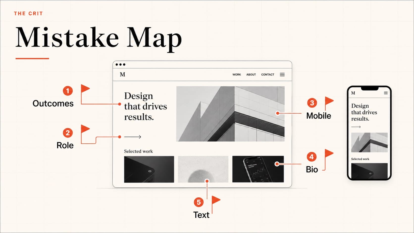
Follow the path before counting mistakes
A generic checklist can make every portfolio look equally broken. Instead, choose a real review question—such as whether the work supports a product design role—and move through the site as a new reader. Record where you can answer the question and where you have to guess.
This separates consequential friction from personal preference. A font choice you would not make may be harmless. A project card that gives no clue what the work is can prevent the relevant case study from being opened at all.
| Homepage | Who is this designer, what kind of work is here, and where should I begin? |
|---|---|
| Project choice | Can I distinguish the projects and choose one relevant to my question? |
| Case-study opening | What was the situation, what did this person own, and what changed? |
| Evidence | Can I connect claims to artifacts, research, constraints, or decisions? |
| Next action | Can I find another project, understand availability, or make contact without hunting? |
The opening makes the reader decode your direction
A vague headline such as “designer solving meaningful problems” does not tell someone what kind of work follows. You do not need to reduce yourself to one permanent title, but the current page should give the reader a useful frame.
Try this structure
What you design + the kind of problem or environment you know + the work you want next.
Support that statement immediately with relevant projects. If the first screen promises product strategy and the visible work is event posters, the mismatch—not the poster quality—is the first issue to solve.
Project cards show style but not enough reason to click
A project image and a brand name may be meaningful to you but opaque to everyone else. Give each entry enough information to distinguish the problem, your contribution, or the kind of artifact inside.
Name the work
Use a plain-language project title or a short descriptor beside the brand name.
Signal your role
Clarify whether the work involved research, product design, brand, motion, front-end, or another contribution.
Choose an informative image
Show an artifact that helps someone predict the project—not a decorative mockup that makes unlike projects look the same.
The case study hides the assignment or your contribution
Begin with the situation, audience, constraints, team, your role, and the state of the work. A reader should not have to reach the final screen before learning that the project was a two-week class exercise or that six people shared the design work.
Specificity builds trust. “I led interaction design for checkout and partnered with a researcher on five moderated sessions” is more useful than “we followed a human-centered process.” If your contribution changed across phases, say where.
Where does a new reader lose the thread?
Share the homepage and target role. Your free First Read identifies one consequential point of friction.
The case study documents activities instead of decisions
Personas, journey maps, wireframes, and workshops are not proof by themselves. For each artifact, explain what question it helped answer, what you noticed, and what changed because of it. Remove process imagery that does not advance the story.
A stronger caption
Finding → decision → remaining uncertainty
“Three of five participants looked for delivery timing before choosing a plan, so I moved that information into the comparison. The sample was small, so the next test would check whether the pattern holds with returning customers.”
The outcome is missing—or more certain than the evidence
A case study should close the loop, but that does not mean every project needs a conversion lift. State what happened: shipped scope, test result, stakeholder decision, operational change, classroom critique, or the fact that the concept stopped before implementation.
If a metric changed, explain the source, comparison period, and your work's relationship to it. If no outcome is available, write what the team learned and what would need to be measured next. An honest limit is stronger than borrowed certainty.
For more approaches, see how to write a case study without metrics.
The site gets between the reader and the work
- Mobile breaks the order: headings wrap awkwardly, images crop away the evidence, or the next action disappears.
- Media slows the page: oversized images or autoplay video delay the part someone came to see.
- Navigation loses position: a reader cannot return to the project list or understand where the case study ends.
- Access blocks the review: passwords, broken prototypes, private files, and expired links fail without a useful fallback.
- Contact is hidden: the next step depends on finding an icon, downloading a resume, or guessing whether you are available.
Test while signed out, on a phone, and on a slower connection. Use real project titles and long copy. The goal is not a perfect score; it is a reliable path to the evidence.
Fix the first break, then retest
Can the reader choose the right project?
If not, fix positioning, project labels, and entry imagery before rewriting every case study.
Can the reader understand your role and decisions?
If not, repair the project opening and remove process that does not explain a choice.
Can the reader trust the evidence?
If not, label constraints, collaborators, research limits, and outcomes more precisely.
Can the reader complete the path?
If not, repair mobile behavior, loading, navigation, sharing, and contact before adding decorative polish.
QuestionsAnswers
Questions, answered.
A few practical details before you keep going
Share this resource

Written by
Nikki KippleProduct Designer & Design Instructor
Designer, educator, founder of The Crit. I've spent years teaching interaction design and reviewing hundreds of student portfolios. Good feedback shouldn't require being enrolled in my class — so I built a tool that gives it to everyone. Connect on LinkedIn →
You know the work. A new reader does not.
Share the homepage and target role. We will look for the first consequential gap between the evidence you have and the story the page tells.