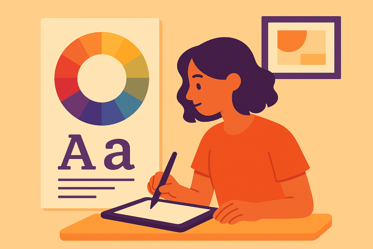
Design Fundamentals for Students Master the Essential Principles
Learn the 7 core design principles that separate amateur work from professional designs. With practice exercises and common mistakes to avoid.
⚡ TL;DR
- 7 Core Principles: Balance, contrast, emphasis, proportion, movement, white space, unity
- Visual Hierarchy: The most important skill — use size, color, and space to guide the eye
- Typography Basics: 2 fonts max, use a type scale, left-align body text
- Common Mistakes: 6 amateur mistakes that are easy to fix once you know them
Why Design Fundamentals Matter
Here's an uncomfortable truth: most student portfolios look amateur. Not because students lack creativity or effort, but because they skip the fundamentals. If you're building your first portfolio, our complete portfolio guide shows exactly how to apply these principles.
Design fundamentals are like grammar for writers. You can have brilliant ideas, but if your grammar is wrong, you'll never be taken seriously. The same applies to design — brilliant concepts fail when wrapped in poor execution.
What Fundamentals Actually Do:
- Create instant credibility (hiring managers spot amateur work in 3 seconds)
- Make your ideas clearer (good design serves the message)
- Speed up your work (principles = decisions already made)
- Enable creativity (rules give you something to break intentionally)

The 7 Core Design Principles
Every design decision you make ties back to these seven principles. Master them, and you'll have a framework for evaluating any design — including your own. For a deeper dive with interactive examples, see our complete design principles masterclass.
Balance
Visual equilibrium in your design — symmetrical or asymmetrical
Example: A centered heading with equal margins creates symmetrical balance
Quick tip: Squint at your design. Does it feel weighted to one side?
Contrast
Difference between elements that creates visual interest and hierarchy
Example: Dark text on light background, large heading vs small body text
Quick tip: If two things aren't the same, make them very different
Emphasis
Creating a focal point that draws the viewer's eye first
Example: A bright CTA button on a muted background
Quick tip: Every design needs ONE thing that demands attention first
Proportion
The size relationship between elements
Example: Headlines 2-3x larger than body text
Quick tip: Use a type scale (1.25x, 1.5x, or 1.618x) for consistent sizing
Movement
Guiding the viewer's eye through the design
Example: F-pattern or Z-pattern reading layouts
Quick tip: Use alignment, color, and size to create a visual path
White Space
Empty space that gives elements room to breathe
Example: Generous padding around text blocks and images
Quick tip: When in doubt, add more space. Crowded designs feel amateur
Unity
Consistent visual language throughout the design
Example: Same colors, fonts, and spacing patterns on every page
Quick tip: Limit yourself: 2-3 colors, 2 fonts, consistent spacing
Want to go deeper? Our Design Principles Masterclass covers each principle with visual examples and practical exercises.
Read the full masterclassVisual Hierarchy
Visual hierarchy is the single most important skill for any designer. It determines where users look first, second, and third.
Without clear hierarchy, users feel lost. They don't know what's important, where to start, or what action to take. With clear hierarchy, your design guides them effortlessly.
The Hierarchy Toolkit:
The Squint Test
Here's a quick way to check your hierarchy: squint at your design until it's blurry. Can you still tell what's most important? If everything blurs into equal blobs, your hierarchy needs work.
Typography Basics
Typography is often where student work falls apart. The fix is simple: use fewer fonts, better.
The Student Typography Rules:
Go deeper on typography: Our Typography Principles Guide covers font pairing, type anatomy, and 5 proven font combinations.
Read the typography guideColor Fundamentals
Color is powerful but dangerous. Used well, it creates mood, guides attention, and builds brand recognition. Used poorly, it screams amateur.
The 60-30-10 Rule:
Master color theory: Learn the color wheel, harmonies, and psychology in our comprehensive Color Theory Guide.
Read the color guidePractice Exercises
Reading about design doesn't make you a designer. Doing design does. Here are exercises that will accelerate your learning:
Daily UI Challenge
Design one UI element every day for 30 days
Redesign Ugly Websites
Find poorly designed websites and redesign them
Copy Great Designs
Recreate designs you admire pixel-for-pixel
Typography Study
Redesign a page of text using only typography changes
Common Student Mistakes
These mistakes show up in 90% of student work. Avoid them and you'll instantly look more professional. For a comprehensive list of design pitfalls and solutions, check our complete design mistakes guide.
Using too many fonts
Designs look scattered and unprofessional
Fix: Stick to 2 fonts maximum: one for headings, one for body
Ignoring alignment
Creates visual chaos and reduces trust
Fix: Align everything to a grid. If edges don't line up, fix them
Low contrast text
Users can't read your content
Fix: Ensure 4.5:1 contrast ratio minimum for body text
Cramped spacing
Designs feel claustrophobic and hard to scan
Fix: Double your padding. Then add 50% more
Inconsistent sizing
Looks unintentional and sloppy
Fix: Use a type scale and spacing system
Centering everything
Hard to read and looks like a party invitation
Fix: Left-align body text. Reserve centering for short headings
Not sure if you're making these mistakes? Get objective feedback on your design work with The Crit.
Get design feedbackNext Steps
You now have a solid foundation in design fundamentals. Here's how to keep growing:
Common Questions
Quick answers to help you get started
Share this resource

Written by
The CritDesign education & portfolio critique
Designer, educator, founder of The Crit. I've spent years teaching interaction design and reviewing hundreds of student portfolios. Good feedback shouldn't require being enrolled in my class — so I built a tool that gives it to everyone. Connect on LinkedIn →
Too close to your own work?
Send one screen, case study, or URL. We'll show what's working, what's getting skipped, and what to fix next.
Continue Reading
All resources →Get one actionable portfolio tip every week. No fluff.
Short reads you can use on your site. Unsubscribe anytime.