Design Trends That Will Actually Matter in 2026
Skip the hype. The trends actually shaping products this year — motion, AI-native interfaces, neumorphism, and the death of flat design.
⚡ TL;DR
- Top trend: Motion design as a core design language
- Biggest shift: AI-native interfaces replacing traditional UI patterns
- Fading: Flat minimalism, hamburger menus, trend-chasing
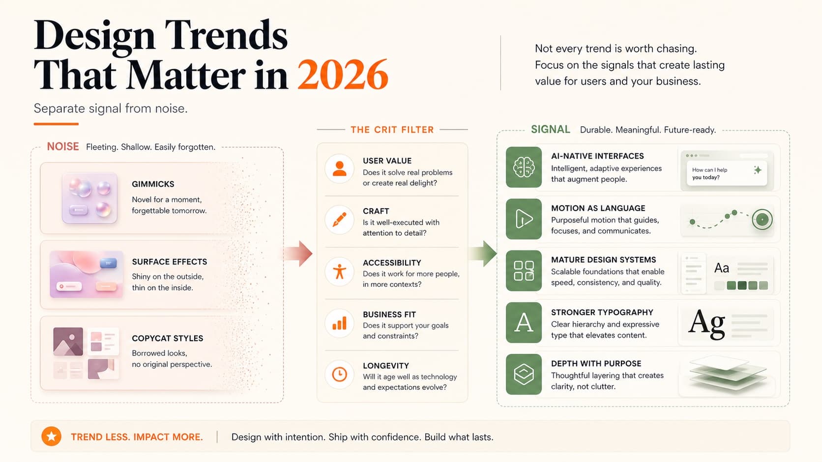
Separating Signal from Noise
Every January, design blogs publish trend predictions. Most are recycled from the previous year with new screenshots. “Bold typography” has been a “trend” every year since 2018.
Real trends aren't things you see on Dribbble shots. They're shifts in how products actually work — driven by new browser capabilities, evolving user expectations, and tools that change what's possible. You notice them when you use a product and think “that feels different.”
Here's what's actually happening in 2026, separated from the noise.
Motion as Design Language
Motion has moved from “nice to have” to “expected.” The shift happened gradually — Apple's interface animations set the standard, Framer made motion accessible to designers, and CSS scroll-driven animations removed the need for JavaScript in many cases.
In 2026, motion isn't decoration. It's communication:
- • Entrance choreography. Elements don't just appear — they arrive. Staggered animations create reading hierarchy, telling users where to look first, second, third.
- • Scroll-driven narratives. Content transforms as you scroll, creating a guided experience rather than a static page. This works especially well for portfolio case studies.
- • Physics-based interactions. Spring dynamics, momentum, and friction that make interfaces feel tactile. Buttons that bounce, cards that spring into place, menus that decelerate naturally.
- • Spatial transitions. Page navigations that maintain spatial context — elements that morph from one view to another rather than hard-cutting.
The practical implication: if your portfolio is static in 2026, it reads as dated. You don't need to be an animation expert, but basic scroll animations and hover interactions are now table stakes. Our design principles guide covers the fundamentals that underpin good motion design.
AI-Native Interfaces
We're past the “slap a chatbot on it” phase. The interesting AI interfaces in 2026 don't look like chat at all. They look like regular products that happen to be smarter.
The patterns emerging:
- • Ambient intelligence. The AI works in the background. You don't prompt it — it just makes the product better. Smart defaults, auto-organization, predictive actions.
- • Inline generation. Instead of a separate AI panel, generation happens where you're working. Text fills in contextually, images generate in-place, layouts adapt automatically.
- • Confidence indicators. Showing users how certain the AI is about its suggestions. Not a percentage — subtle visual cues like opacity, emphasis, or ordering that communicate reliability.
- • Graceful fallbacks. What happens when AI fails? The best products handle this invisibly — falling back to manual input without acknowledging the AI was even involved.
For portfolio designers: understanding how to design AI-integrated experiences is becoming a differentiator. If you can demonstrate AI-native design thinking in a case study, you're speaking the language hiring managers want to hear.
Neumorphism's Quiet Return
Neumorphism was declared dead in 2021 — too many accessibility problems, too hard to implement, too limited. But it's back in 2026, and it's learned from its mistakes.
The new neumorphism isn't the extreme embossed look from 2020. It's subtler — soft shadows that create gentle depth without destroying contrast ratios. Think of it as flat design that breathes.
What works in 2026:
- • Soft inset shadows on active/pressed states (buttons, toggles)
- • Subtle elevation for interactive elements on muted backgrounds
- • Combined with solid colors for text and icons (no all-gray interfaces)
- • Used sparingly as accent, not as the entire visual language
What still doesn't work:
- • Full-page neumorphic interfaces (contrast nightmare)
- • Neumorphic text (unreadable)
- • Neumorphism without dark mode consideration
The takeaway: don't redesign your portfolio in neumorphism. But understanding how soft shadows and depth cues work gives you another tool for creating interfaces that feel physical and responsive.
Depth and 3D Elements
Flat design dominated for a decade. In 2026, we're adding depth back — but in a controlled, purposeful way.
This isn't skeuomorphism redux. It's about using depth as an information hierarchy tool:
- • Layered interfaces. Content at different z-levels, with parallax and perspective creating spatial relationships. Background → content → actions → overlays, each at a distinct depth.
- • 3D product renders. CSS 3D transforms and WebGL making product showcases more immersive. Particularly effective for e-commerce and portfolio hero sections.
- • Dimensional cards. Cards that respond to cursor position with tilt effects, creating a physical-feeling interface without actual 3D rendering.
- • Gradient depth. Using gradient backgrounds and mesh gradients to create atmospheric depth behind flat content.
The performance consideration is real — 3D effects need to be lightweight or they'll tank your Core Web Vitals. CSS transforms are cheap; WebGL is not. Choose your depth techniques based on what your audience's devices can handle.
Typography Is Getting Weird (in a Good Way)
For years, the safe bet was Inter, system fonts, or whatever geometric sans-serif was popular that quarter. That era is ending. Typography in 2026 is a differentiator again.
The shift started with variable fonts becoming truly mainstream. When a single font file can smoothly animate between weights, widths, and optical sizes, designers get creative. And they have been.
What's happening with type:
- • Expressive display fonts are back. Serif headlines, hand-drawn accents, and custom typefaces that give brands actual personality. The “every SaaS looks the same” problem is driving companies toward distinctive type choices.
- • Variable font animations. Weight transitions on hover, width shifts on scroll, optical size adjustments based on viewport. Typography that responds to interaction rather than sitting static.
- • Kinetic typography. Text that moves — not just fading in, but morphing, splitting, and reassembling. It is showstopper work in portfolios when done with restraint.
- • Mixed-weight hierarchies. Rather than using one font at different sizes, designers are pairing drastically different weights (100 with 900) to create visual tension and clear hierarchy.
The practical impact for your portfolio: your type choices say something about you now. A portfolio set in Inter says “I played it safe.” A portfolio with a carefully chosen serif headline and clean body copy says “I think about details.” Neither is wrong, but one is more memorable.
If typography isn't your strength, our typography fundamentals guide covers everything from pairing to hierarchy — the foundation you need before experimenting with trends.
Design Systems Hit Maturity
Design systems aren't new. But how companies think about them in 2026 has fundamentally shifted.
The first generation of design systems was about consistency — making sure buttons look the same everywhere. The second generation was about efficiency — tokens, components, variants. The current generation is about intelligence.
What mature design systems look like now:
- • AI-assisted component selection. Systems that suggest the right component for a given context. Instead of browsing a library, designers describe what they need and the system recommends patterns from its own library.
- • Code-first design tokens. The source of truth has flipped. Design tokens now live in code, and Figma syncs from code rather than the other way around. This means designers need to understand token architecture, not just use it.
- • Multi-brand systems. One system that supports multiple brands through theming layers. Semantic tokens (color.action.primary) that resolve differently per brand. This is the standard at scale now.
- • Documentation as product. Design system docs that are themselves well-designed products — interactive examples, live code playgrounds, decision trees for choosing patterns. Storybook is table stakes; the bar has risen.
Why this matters for your career: “design systems experience” is on nearly every senior-level job description. But what they mean by that has evolved. It's not enough to say you used a design system — they want to know if you can build one, maintain one, or improve one.
If you're showcasing design systems work in your portfolio, focus on the decisions you made, not just the components you built. Why that token structure? How did you handle dark mode? What broke and how did you fix it? That's the case study structure that resonates with hiring managers who actually work with systems daily.
Anti-Trends: What's Fading
Not everything that was popular last year deserves to continue:
- • Pure flat minimalism. Interfaces with zero depth, zero texture, zero personality. It had its moment. Users now expect more warmth and dimensionality.
- • Hamburger menus on desktop. They were always a compromise. Now they're just lazy. If your desktop portfolio hides its navigation behind a hamburger icon, that's a red flag for portfolio navigation.
- • Cookie-cutter SaaS layouts. Hero → features grid → testimonials → pricing → CTA. Users are numb to this pattern. Differentiation requires breaking the template.
- • Gratuitous dark mode. Dark mode is expected, but “everything on black” without proper consideration for contrast and readability is not a design choice — it's a shortcut.
What to Actually Learn
Trends are context. Skills are currency. Here's where to invest your learning time in 2026:
- • CSS animations and transitions. Native browser capabilities that don't require JavaScript libraries. Scroll-driven animations are the biggest unlock.
- • Figma prototyping. Advanced prototyping with variables and conditionals. Your prototypes should feel like products, not slide decks.
- • AI prompt design. Not just for text — for layout generation, content strategy, and user research synthesis. Understanding how to direct AI tools is becoming a core design skill.
- • Systems thinking. Building scalable design systems, not just pretty pages. The market rewards designers who can think in components, tokens, and patterns.
The common thread: these are all multiplier skills. They don't just make you better at one thing — they make everything you design better.
A concrete 90-day plan if you want to level up:
Month 1: Motion foundations
- • Learn CSS transitions and @keyframe animations
- • Build 3 micro-interactions (button hover, card entrance, page transition)
- • Study one motion-heavy portfolio daily — note what works and what feels excessive
Month 2: Depth and systems
- • Experiment with variable fonts and scroll-triggered effects
- • Build or contribute to a small design system (even for a personal project)
- • Practice designing AI-adjacent features — what does an intelligent default look like?
Month 3: Portfolio application
- • Apply what you learned to your actual portfolio
- • Add motion to your case studies and hero sections
- • Get external feedback — fresh eyes catch what you can't
If you're updating your portfolio to reflect current trends, start with motion and depth. They're the most visible improvements and the ones hiring managers notice first. Then get a portfolio critique to see how your work reads to fresh eyes.
Everything You Need to Know
Quick answers to help you get started
Share this resource

Written by
Nikki KippleProduct Designer & Design Instructor
Designer, educator, founder of The Crit. I've spent years teaching interaction design and reviewing hundreds of student portfolios. Good feedback shouldn't require being enrolled in my class — so I built a tool that gives it to everyone. Connect on LinkedIn →
Too close to your own work?
Send one screen, case study, or URL. We'll show what's working, what's getting skipped, and what to fix next.
Continue Reading
All resources →Get one actionable portfolio tip every week. No fluff.
Short reads you can use on your site. Unsubscribe anytime.