The 4-Step UI Design Framework That Actually Ships
Design system → real data → polish → ship. A practical framework for designers who want to stop tweaking and start shipping.
⚡ TL;DR
- Framework: 4 steps: system → data → polish → ship
- Key insight: Most designers get stuck between steps 3 and 4
- Time saved: Cuts revision cycles by 40-60%
Why Frameworks Matter
Here's a pattern I've noticed watching designers work: the ones who ship consistently aren't necessarily more talented. They just have a better process.
A framework isn't a cage — it's a runway. It gives you a predictable path from blank canvas to live product, so your creative energy goes into solving real design problems instead of figuring out what to do next.
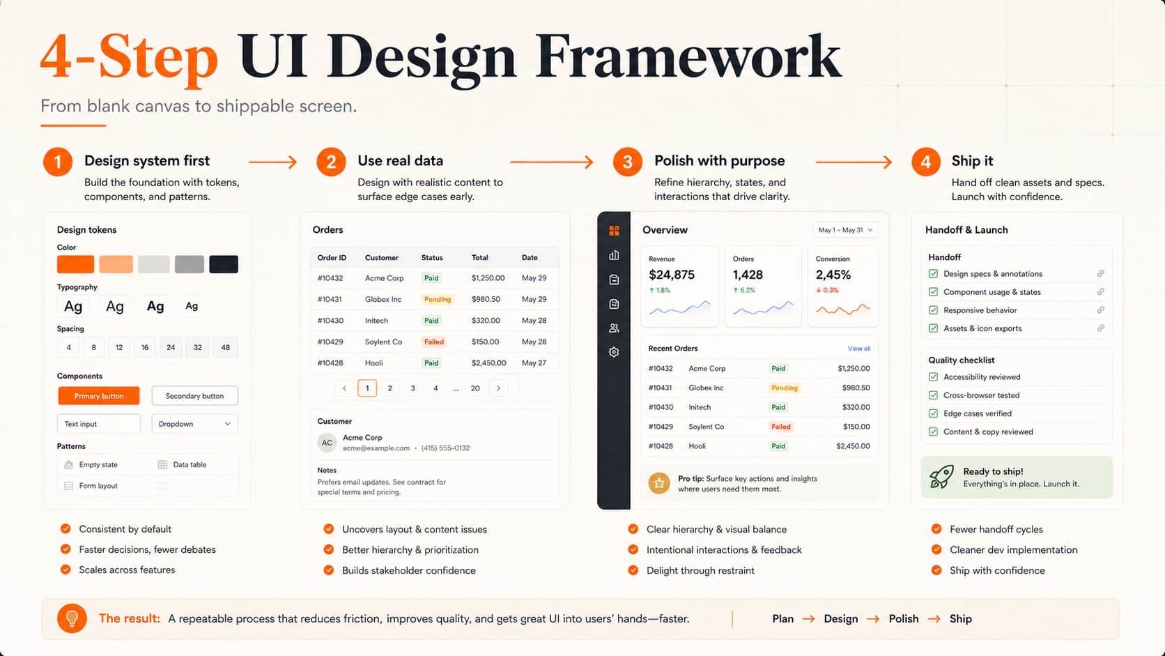
The 4-step framework that's been making rounds in design circles is deceptively simple: design system → real data → polish → ship. Each step builds on the last, and skipping one almost always creates problems downstream.
Let's break down each step and — more importantly — the mistakes designers make at each stage.
Step 1: Design System First
Before you design a single screen, establish your foundations. This doesn't mean building a comprehensive design system with 200 components. It means nailing the basics:
Your minimum viable system:
- • Type scale. 4-6 sizes with clear hierarchy. Our typography guide covers how to build one that actually works.
- • Color palette. Primary, secondary, neutrals, and semantic colors (success, warning, error). Refer to our color theory guide for building palettes with purpose.
- • Spacing scale. An 8px grid with consistent increments (8, 16, 24, 32, 48, 64).
- • Base components. Buttons, inputs, cards — the building blocks you'll use everywhere.
Think of it like mise en place in cooking. Professional chefs don't start cooking and then scramble for ingredients. They prepare everything first, then execution is smooth.
The time investment is small — 1-2 hours — but the compound savings are enormous. Every screen you design after this point inherits consistency automatically. No more eyeballing spacing or picking colors from memory.
Step 2: Use Real Data
This is where most portfolios diverge from real products — and where the framework gets its power.
Lorem ipsum is a lie. It makes everything look neat because it's perfectly proportioned. Real data is messy. Names are different lengths. Descriptions overflow. Numbers have varying digit counts. And that's exactly why you need it.
Real data reveals:
- • Text truncation issues you never expected
- • Empty states nobody designed for
- • Loading states that matter for real users
- • Edge cases that break your layout (very long names, zero results, error states)
- • Content density problems — too much information or too little
Where do you get real data? For side projects, scrape it from similar products. For work projects, pull it from the API or staging environment. For portfolio pieces, create realistic sample data that reflects actual use cases — not “John Doe” with a perfect 3-line bio.
This step alone separates portfolio projects that look professional from ones that look like student exercises. Hiring managers notice. If you want your portfolio to stand out, designing with real data is one of the fastest ways to level up your work.
Step 3: Polish with Purpose
Polish is not decoration. It's the layer of craft that makes a UI feel intentional rather than assembled. But here's the trap: polish is where most designers get stuck forever.
Purposeful polish focuses on things users actually feel:
High-impact polish:
- • Micro-interactions. Button hover states, form focus transitions, toggle animations. These create responsiveness — the feeling that the interface is alive.
- • Consistent elevation. Shadows should tell a spatial story. Cards float at one level, modals at another, tooltips above both.
- • Typography refinement. Line heights, letter spacing, and font weights that create scannable hierarchy.
- • Color contrast. Not just for accessibility (though that matters — check the accessibility guide) but for visual clarity.
Low-impact polish (time sinks):
- • Adjusting border radius by 2px
- • Debating between two nearly identical shades of gray
- • Pixel-perfecting elements that will shift in responsive layouts anyway
- • Adding decorative elements that don't serve the content
The rule of thumb: if a user wouldn't notice the change, it's not polish — it's procrastination.
Step 4: Ship It
Shipping is a skill. Not a moment, not a button click — a skill you develop through practice.
Most designers who struggle with shipping have one thing in common: they're waiting for the design to feel “done.” It never will. Every shipped product has compromises, known issues, and things the designer wishes they had time to fix. That's normal.
What separates shippers from tweakers:
- • They define “done” before they start. Clear acceptance criteria mean you know when to stop.
- • They time-box polish. “I have 2 hours for polish” forces prioritization.
- • They get feedback before they're ready. Showing work in progress builds confidence that the direction is right. A design critique at 80% done is worth more than a perfect review at 100%.
- • They iterate post-launch. Version 1 is a starting point, not a monument.
If you're building portfolio pieces, shipping means deploying them live. A case study about a project nobody can visit is less convincing than one with a working URL. Our case study guide covers how to present shipped work effectively.
Where Designers Get Stuck
The framework is simple. Following it consistently is hard. Here's where each step breaks down:
- • Step 1 trap: Over-engineering the system. You don't need 50 components before your first screen. Start with tokens and build components as you need them.
- • Step 2 trap: Skipping it entirely. “I'll add real data later” means you won't. Do it now.
- • Step 3 trap: Polish as avoidance. If you've been polishing for longer than you spent building, you're stalling.
- • Step 4 trap: Perfectionism. Waiting for “one more thing” before shipping. That one more thing will always exist.
The fix for all four: time constraints. Give each step a budget. When time runs out, move to the next step with whatever you have. You'll be surprised how often “good enough” is actually great.
Framework in Practice
Here's what this looks like for a real project — say you're designing a dashboard:
- • Day 1 (System): Set up type scale, color tokens, spacing grid. Build card, button, and input components. 2-3 hours.
- • Day 2 (Real Data): Pull actual metrics, user names, real notifications. Design all screens with this data. Discover 3 layout issues you wouldn't have found otherwise. 4-5 hours.
- • Day 3 (Polish): Add hover states, transitions, loading skeletons. Refine spacing and alignment. Time-box to 3 hours.
- • Day 4 (Ship): Hand off to dev (or build it yourself). Deploy. Collect feedback. Plan v2. 2-3 hours.
Four days from blank canvas to live product. Not every project fits this timeline exactly, but the sequence stays the same whether it's a 4-day sprint or a 4-month initiative.
The framework doesn't replace creativity — it channels it. When you're not burning mental energy on “what should I do next,” you have more bandwidth for the design decisions that actually matter.
Want to see how your current work stacks up? Submit your portfolio or a project for a design critique — we'll tell you exactly where your UI shines and where the framework can tighten things up.
Everything You Need to Know
Quick answers to help you get started
Share this resource

Written by
Nikki KippleProduct Designer & Design Instructor
Designer, educator, founder of The Crit. I've spent years teaching interaction design and reviewing hundreds of student portfolios. Good feedback shouldn't require being enrolled in my class — so I built a tool that gives it to everyone. Connect on LinkedIn →
Too close to your own work?
Send one screen, case study, or URL. We'll show what's working, what's getting skipped, and what to fix next.
Continue Reading
All resources →Get one actionable portfolio tip every week. No fluff.
Short reads you can use on your site. Unsubscribe anytime.