Design Resume Guide
Your resume gets 10-30 seconds of attention before someone decides to read your portfolio or move on. Here's how to make those seconds count — format, content, and the mistakes that silently kill your applications.
⚡ TL;DR
- Format: One page, clean typography, no gimmicks
- Key rule: Lead with impact metrics, not job descriptions
- Must-have: Clickable portfolio link near the top
Resume vs Portfolio: They Do Different Jobs
Your resume and your portfolio serve fundamentally different purposes, and many designers confuse them. The resume is a door opener — its job is to get your portfolio viewed. The portfolio is the closer — its job is to get you an interview.
The resume says: “Here's my career trajectory, impact, and relevant skills — quickly.” The portfolio says: “Here's how I think, design, and solve problems — in depth.”
This means your resume should not be a mini-portfolio. No case study summaries, no process diagrams, no UI screenshots. Those belong in your portfolio. Your resume should be lean, scannable, and optimized for the 10-30 seconds someone spends deciding whether to click your portfolio link.
What Gets Scanned First
Eye-tracking studies on resumes consistently show the same scanning pattern: name/title → current or most recent role → company names → dates (checking for tenure and gaps) → skills keywords → education (briefly). The entire scan takes under 30 seconds.
What hiring managers look for in the first scan:
- 1. Your title and current/recent role. Does it match what they're hiring for? “Product Designer at [Recognizable Company]” → immediate interest. “Creative Visionary / Digital Artisan” → immediate skepticism.
- 2. Company names. Not because big names are required, but because they provide instant context. Startups, agencies, and lesser-known companies are fine — but you may need stronger bullet points to compensate for less name recognition.
- 3. Impact signals. Numbers, percentages, outcomes — anything that suggests you made a measurable difference. “Redesigned checkout flow, reducing abandonment by 23%” grabs attention faster than “Responsible for checkout flow redesign.”
- 4. Portfolio link. If it's not immediately visible, many reviewers won't search for it. Put it right under your name.
- 5. Tenure and trajectory. Are you growing in responsibility? Are there unexplained gaps? Is there a pattern of very short stints?
Format and Layout
Your resume is itself a design exercise. The way you handle typography, hierarchy, whitespace, and information density says something about your design sensibility. This doesn't mean it should be flashy — it means it should be well-designed.
Layout guidelines:
- One page. If you can't condense your career into one page, that itself signals a prioritization problem. Edit ruthlessly.
- Clean typeface. Inter, Helvetica, or a similar clean sans-serif. 10-11pt body, 12-14pt for section headers. Don't use more than 2 typefaces. Our typography guide covers selection principles.
- Generous margins. 0.5-0.75 inch margins minimum. Cramming content edge-to-edge makes it look desperate and hard to read.
- Clear visual hierarchy. Your name should be the largest element. Section headers should be clearly distinguished from body text. Use weight, size, and spacing — not color or decoration — to create hierarchy.
- Subtle accent color. One accent color for links and light emphasis is fine. A rainbow of colors is not. The resume should feel polished, not like a branding exercise.
- PDF format. Always export as PDF. Name it
FirstName-LastName-Resume.pdf.
What to avoid:
- Skill progress bars or pie charts (meaningless — what does “85% Figma” mean?)
- Infographic layouts (hard to parse, ATS-hostile)
- Profile photos (not standard in the US, takes up space)
- Icons for every bullet point (visual noise)
- Two-column layouts (can confuse ATS and make scanning harder)
Writing Your Experience Section
This is the most important section of your resume. Each role should have 3-5 bullet points that communicate impact, not just responsibilities. The difference:
❌ Responsibility-based (tells nothing):
- • Responsible for the design of the checkout flow
- • Conducted user research and created wireframes
- • Collaborated with cross-functional teams
✅ Impact-based (tells a story):
- • Redesigned the checkout flow, reducing cart abandonment by 23% and increasing completion rate from 62% to 81%
- • Led user research (12 interviews, 3 usability tests) that identified a critical trust barrier, informing a design pivot that doubled conversion
- • Partnered with engineering to ship a design system that reduced new feature development time by 40%
The impact bullet point formula:
Action verb + what you did + measurable result
- Strong action verbs for designers: Designed, Led, Shipped, Reduced, Increased, Launched, Established, Partnered, Identified, Simplified, Rebuilt, Tested, Validated
- Weak verbs to avoid: Helped, Assisted, Worked on, Was responsible for, Participated in
What if you don't have metrics? Use the best available proxies: “Shipped to 50K+ users,” “Reduced support tickets by ~30% (estimated from team feedback),” “Adopted by 3 product teams within first quarter.” Qualitative outcomes work too: “Design system became the standard for all new feature development.” For more on how to think about impact, our case study guide covers the same principle for portfolios.
Order your bullets strategically. Lead with the most impressive accomplishment, not the most recent task. The first bullet under each role gets the most attention — make it count.
Skills Section (Done Right)
The skills section serves two purposes: helping ATS match your resume to job descriptions, and giving a quick snapshot of your toolkit. Keep it factual and skip the self-assessment.
How to structure it:
- Design: UI Design, UX Design, Interaction Design, Design Systems, Prototyping, User Research, Usability Testing, Information Architecture, Wireframing
- Tools: Figma, FigJam, Miro, Adobe Creative Suite, Framer, Maze, UserTesting, Jira
- Methods: User Interviews, Usability Testing, A/B Testing, Journey Mapping, Card Sorting, Competitive Analysis, Heuristic Evaluation
Only list skills you can discuss confidently in an interview. If someone asks about your “A/B Testing” skill and you've never actually run one, that's a credibility problem.
Never include:
- Skill progress bars or percentages (“Figma: 90%” — meaningless)
- Soft skills as bullet points (“Communication, Teamwork, Problem-Solving” — show, don't tell)
- Beginner/Intermediate/Expert labels (subjective and unhelpful)
- Microsoft Office (assumed for any professional in 2026)
Education and Certifications
Education goes at the bottom of your resume unless you're a recent graduate (in which case, put it near the top). Keep it brief.
What to include:
- Degree + institution + year. “MFA Interaction Design, Academy of Art University, 2020.” No GPA unless it's exceptional and you're a recent graduate.
- Relevant certifications. Google UX Certificate, Nielsen Norman Group certifications, or similar. Only include ones that are recognized in the industry.
- Bootcamps. Include if relevant and from a recognized program. Frame it as education, not as a disclaimer.
Don't list every online course you've taken. A Coursera certificate in “UX Basics” doesn't add value to a resume with 3+ years of professional experience.
Resume Tips for Career Changers
Transitioning into UX from another field is common, and your previous experience is an asset — not a liability. The key is framing it correctly. Our career transition framework covers the overall strategy.
- Lead with a summary statement. “Product designer with 2 years of UX experience and 5 years in [previous field]. Background in [relevant skill] gives me a unique perspective on [design specialty].” This contextualizes your non-design experience immediately.
- Reframe previous roles in design terms. If you were a project manager, you have experience with stakeholder management, requirements gathering, and cross-functional collaboration. If you were a teacher, you have experience with user empathy, information architecture, and iterative feedback. Use the language of design.
- Lead with design experience, even if it's newer. Put your design roles first (even if they're freelance or personal projects), then your previous career in a “Previous Experience” section with briefer bullet points.
- Include a strong portfolio link. For career changers, the portfolio does even more heavy lifting than usual. Make sure it's polished — see our beginner portfolio guide.
Getting Past ATS (Applicant Tracking Systems)
At large companies, your resume likely passes through an ATS before a human sees it. The ATS parses your resume into structured data and matches it against the job description. If it can't parse your resume or finds insufficient keyword matches, a human may never see it.
ATS-friendly resume tips:
- Use standard section headers: “Experience,” “Education,” “Skills” (not creative alternatives like “Where I've Made Impact”)
- Include keywords from the job description naturally in your bullet points
- Use standard date formats (Jan 2023 – Present)
- Avoid text in headers/footers (many ATS skip these)
- Use real text, not images of text
- Spell out acronyms at least once (“User Experience (UX) Design”)
- Avoid tables, columns, and complex layouts (ATS reads linearly)
- Avoid special characters, icons, and emojis in section headers
The tension: ATS-friendly formatting can feel plain compared to what a designer wants to create. The solution: keep the structure ATS-compatible but elevate it with excellent typography, spacing, and subtle visual hierarchy. You can have a beautiful resume that also parses correctly — it just requires restraint.
Common Resume Mistakes
Describing responsibilities instead of impact
“Responsible for the design of the mobile app” could mean anything from leading the entire product vision to moving pixels someone else specified. Lead with what you accomplished, not what you were assigned.
Using a creative title instead of a standard one
“Digital Experience Architect” or “Creative Problem Solver” means nothing to an ATS and confuses human reviewers. Use the standard title for your role: Product Designer, UX Designer, Senior Designer, Design Lead. If your actual company title was non-standard, use the closest industry equivalent.
Listing every job since college
Your barista job from 2015 doesn't belong on your design resume. Include the last 10-15 years of relevant experience. Older or non-relevant roles can be summarized in a single line or omitted entirely.
No portfolio link (or a broken one)
The portfolio is how you get hired. If a reviewer can't find or access your portfolio from your resume, you've lost the opportunity. Test the link. Put it prominently. Make sure it works on mobile too — reviewers often check on their phones.
Typos and inconsistent formatting
A designer's resume with typos or inconsistent spacing is the professional equivalent of a chef serving a burnt steak. It immediately undermines your credibility. Have someone else proofread — you're blind to your own errors after the 10th read.
The same resume for every application
At minimum, reorder your bullet points so the most relevant experience for each specific role is first. If the job posting emphasizes research, lead with your research accomplishments. If it emphasizes visual design, lead with those. 10 minutes of customization per application makes a real difference.
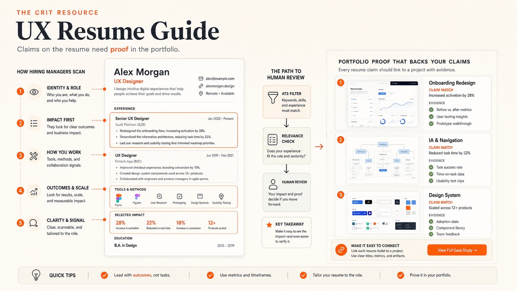
Connecting Your Resume to Your Portfolio
Your resume and portfolio should tell a consistent story. The projects mentioned in your resume bullet points should appear as case studies in your portfolio. The skills you claim should be demonstrated in your work. The impact metrics on your resume should be substantiated in your case study narratives.
The resume → portfolio pipeline:
- Resume bullet: “Redesigned checkout flow, reducing abandonment by 23%”
- Portfolio case study: Full narrative of the checkout redesign — research, exploration, solution, metrics
- Interview: You walk through the case study with detail and nuance
Each stage goes deeper. The resume is the headline, the portfolio is the article, and the interview is the conversation.
Portfolio link placement: Include it in your contact header — right after your email. Format: yourname.com (not the full https:// — save space). If submitting digitally, make it a clickable hyperlink.
Also include your LinkedIn URL (customized to linkedin.com/in/yourname). Our LinkedIn optimization guide covers how to make your profile as strong as your resume.
Before sending applications, make sure your portfolio is in good shape — a great resume that leads to a mediocre portfolio does more harm than good. If you're not sure where your portfolio stands, get a critique before applying. And if you want AI-powered feedback on the resume itself, try our free resume review tool.
Everything You Need to Know
Quick answers to help you get started
Share this resource

Written by
Nikki KippleProduct Designer & Design Instructor
Designer, educator, founder of The Crit. I've spent years teaching interaction design and reviewing hundreds of student portfolios. Good feedback shouldn't require being enrolled in my class — so I built a tool that gives it to everyone. Connect on LinkedIn →
Too close to your own work?
Send one screen, case study, or URL. We'll show what's working, what's getting skipped, and what to fix next.
Continue Reading
All resources →Get one actionable portfolio tip every week. No fluff.
Short reads you can use on your site. Unsubscribe anytime.