AI Design Check
Does your AI-built app look vibe-coded?
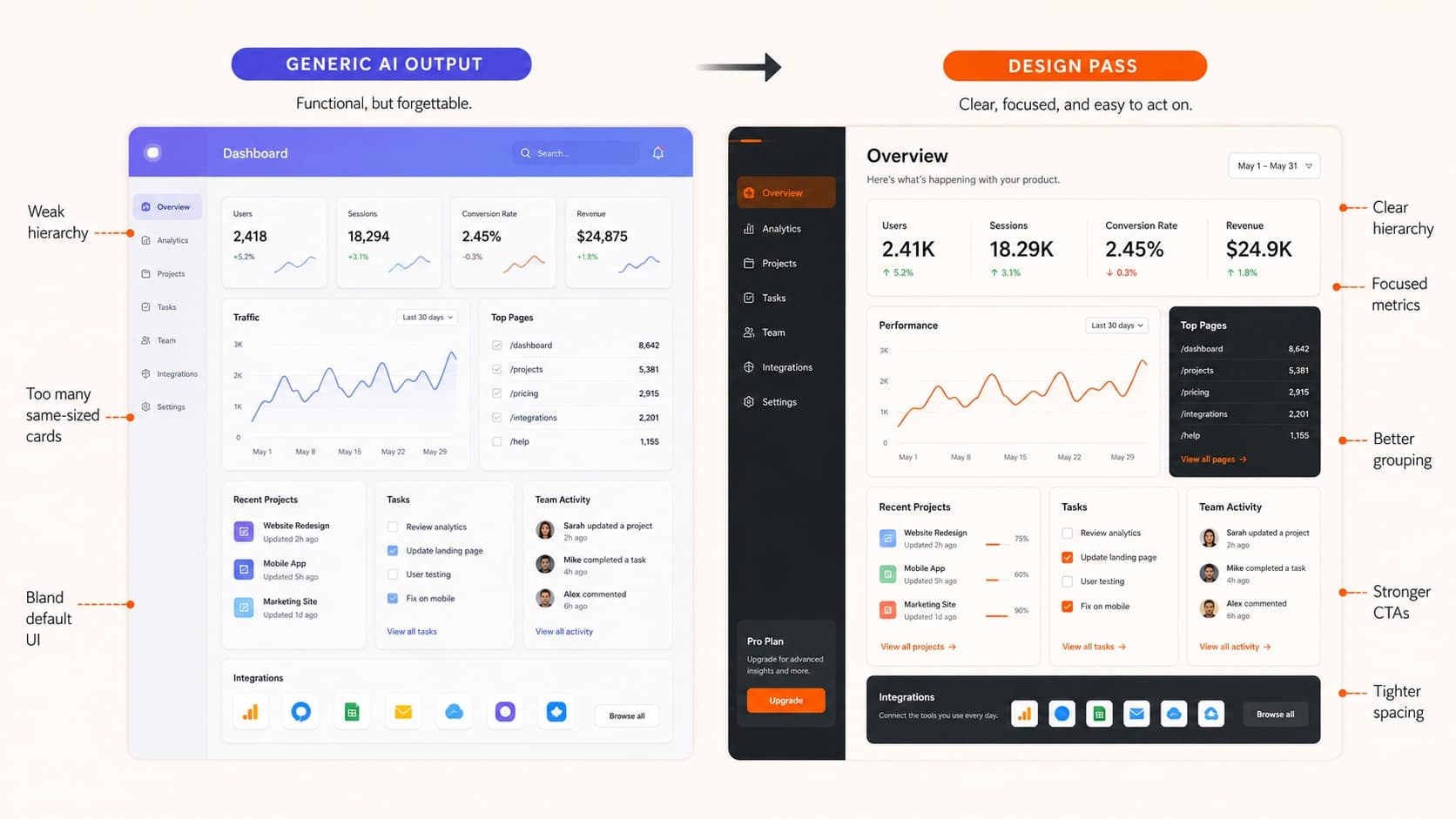
A quick first-pass read for one AI-built screen or page that feels generic, untrustworthy, or unfinished. It turns the concern into a sharper critique brief and one concrete next move.
This is a visible-design self-check, not a verdict on the product. It will not know your users, constraints, roadmap, or code quality.
Defaults
Type, color, cards
Signal
Lane, proof, action
Usage
States, density, copy
Start with the real question
The check should answer the thing you would actually ask a designer.
Main worry
This sets the frame for the first-pass read.
Mark the visible clues
Optional evidence for the result. Leave anything alone if you are not sure.
Brief the next pass
Copy this into the tool or send it with the artifact.
Review this not sure / mixed artifact and answer this question: "My site looks too vibe-coded. How can I make it look less AI?" Check whether the artifact feels too AI, too generic, or not intentionally designed. Make the primary action and first decision visually obvious while reducing secondary emphasis. Reduce unnecessary cards and create a clearer layout hierarchy with fewer equal containers. Replace generic gradient styling with a restrained color system for actions, status, and emphasis. Give one concrete next move first: what reads wrong, why it reads that way, and what to change before adding more polish.