Logo Critique Checklist What Makes a Logo Work in 2026
The definitive guide to evaluating logo design — whether you're a designer reviewing your own work or a business owner assessing proposals.
The 4 Pillars of Effective Logo Critique
Every logo that works serves four fundamental purposes. Miss one, and you've got a pretty picture instead of a brand mark. Here's how to evaluate each:
1. Readability — Can People Actually See It?
✅ What to Check:
- Size testing: Does it work at 16px (favicon size)?
- Contrast: Can you read it on both light and dark backgrounds?
- Font clarity: If it includes text, is it legible at business card size?
- Shape distinction: Are individual elements clearly defined?
🚩 Red Flags:
- Thin lines that disappear when small
- Low contrast between elements
- Overly stylized fonts that sacrifice clarity
- Too many small details crowded together
💡 Pro Tip: Print it at 1 inch wide. If you can't make out the details, neither can your customers.
2. Scalability — Works Everywhere, Every Size
Real Example: Nike's swoosh works embroidered tiny on a golf ball or 50 feet tall on a building. That's scalable design.
3. Memorability — Sticks in Your Head
The Memory Test: Show it to someone for 3 seconds, then ask them to describe it an hour later.
4. Brand Fit — Matches the Business Reality
Design decisions must serve business goals, not just follow design principles.
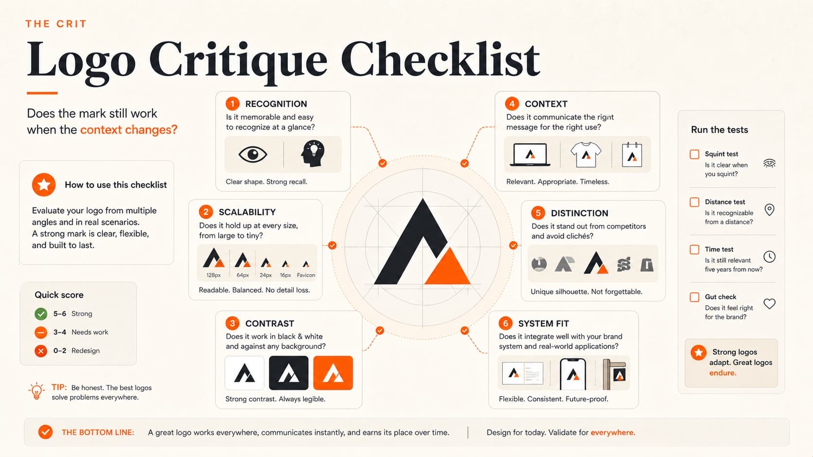
The 20-Point Logo Critique Framework
Use this checklist for systematic evaluation. Rate each item 1-5, then focus improvement on the lowest scores.
Visual Foundation (5 Points)
- □Clarity: All elements clearly defined and readable
- □Balance: Visual weight distributed appropriately
- □Proportion: Elements sized relative to their importance
- □Spacing: Proper breathing room between elements
- □Alignment: Everything feels intentionally placed
Technical Execution (5 Points)
- □Scalability: Works from favicon to billboard
- □Reproducibility: Clean at any size, any medium
- □Versatility: Multiple format options (horizontal, stacked, icon-only)
- □Color independence: Strong in single color
- □File quality: Vector-based, properly constructed
Brand Strategy (5 Points)
- □Industry fit: Appropriate for the business sector
- □Audience appeal: Resonates with actual customers
- □Differentiation: Stands apart from direct competitors
- □Personality match: Reflects authentic brand character
- □Timelessness: Will age well over 5-10 years
Functional Performance (5 Points)
- □Recognition speed: Instantly identifiable as a logo
- □Memory retention: Distinctive enough to remember
- □Application flexibility: Works across needed contexts
- □Production feasibility: Can be manufactured/printed cost-effectively
- □Legal clarity: No obvious trademark conflicts
Common Logo Mistakes (And How to Spot Them)
The "Design Student Special"
What it looks like:
Overly complex, tries to show everything the business does
Why it fails:
Memorable logos focus on one strong idea, not a visual inventory
How to fix:
Pick the most important element and build around that
The "Trend Trap"
What it looks like:
Heavy use of current design trends
Why it fails:
Trends expire, brands need longevity
How to fix:
Use trends as accents, not foundations
When to Revise vs. Start Over
Revise If:
- Core concept is strong but execution needs refinement
- One or two specific issues (usually technical)
- Client/stakeholders love the direction but want adjustments
Start Over If:
- Fundamental concept doesn't fit the brand
- Multiple major issues across different categories
- Looks too similar to existing competitors
The Bottom Line
A logo succeeds when it helps the business succeed. It's not about winning design awards or impressing other designers — it's about creating recognition, building trust, and supporting business goals.
The best logo critiques ask: Does this mark help or hurt the business it represents? Everything else is secondary.
Need a professional critique of your logo design? Upload it to The Crit and get specific feedback in under 60 seconds — what's working, what's not, and exactly how to improve it.
Share this resource
Too close to your own work?
Send one screen, case study, or URL. We'll show what's working, what's getting skipped, and what to fix next.
Continue Reading
All resources →Get one actionable portfolio tip every week. No fluff.
Short reads you can use on your site. Unsubscribe anytime.