CSS Typography Best Practices The Complete 2026 Guide
Every CSS typography technique that matters — fluid type scales, font loading, variable fonts, dark mode, and accessibility. Production-ready code you can copy.
⚡ TL;DR
- What this covers: Production-ready CSS for typography — fluid scales, font loading, variable fonts, dark mode, accessibility, and performance
- Who it's for: Frontend developers and designers who write CSS and want typography that works across every device and context
- The key takeaway: Modern CSS has eliminated most typography hacks. clamp(), variable fonts, and a few smart defaults handle 90% of what used to require JavaScript or preprocessors.
Fluid Type Scales with clamp()
Hard-coded font sizes with media queries are dead. CSS clamp() gives you fluid typography that scales smoothly between any two viewport widths — no breakpoints needed.
The function takes three values: a minimum, a preferred (fluid) value, and a maximum. The browser picks whichever is appropriate for the current viewport.
A production-ready type scale:
:root {
  --text-sm: clamp(0.8rem, 0.75rem + 0.25vw, 0.875rem);
  --text-base: clamp(1rem, 0.9rem + 0.5vw, 1.125rem);
  --text-lg: clamp(1.125rem, 1rem + 0.75vw, 1.375rem);
  --text-xl: clamp(1.25rem, 0.9rem + 1.5vw, 1.75rem);
  --text-2xl: clamp(1.5rem, 1rem + 2vw, 2.25rem);
  --text-3xl: clamp(1.875rem, 1rem + 3vw, 3rem);
  --text-4xl: clamp(2.25rem, 1rem + 4vw, 4rem);
}
The magic is in the preferred value — the middle argument. A higher vw coefficient means faster scaling. Body text should scale slowly (0.5vw), headlines can scale aggressively (3-4vw).
One common mistake: using only vw without a rem anchor in the preferred value. Writing clamp(1rem, 3vw, 2rem) means at exactly 33.33vw your text will be 1rem regardless of the user's font size preference. Adding a rem component like clamp(1rem, 0.5rem + 1.5vw, 2rem) respects accessibility settings.
Why clamp() beats media queries for type:
- Smooth scaling — no jumps at breakpoints
- Less CSS — one line replaces 3-4 media queries
- Works with user zoom and font preferences
- Container query friendly — works inside any layout
Font Loading Strategy
How you load fonts matters more than which fonts you pick. A poorly loaded Google Font degrades performance more than a well-loaded custom font. Here's the hierarchy of approaches, from simplest to most optimized.
Level 1: font-display (minimum viable)
Every @font-face rule should have a font-display value. Without it, browsers default to auto, which usually means invisible text for up to 3 seconds while the font downloads.
@font-face {
  font-family: 'Inter';
  src: url('/fonts/inter-var.woff2') format('woff2');
  font-weight: 100 900;
  font-display: swap; /* Show fallback immediately, swap when ready */
}
font-display values and when to use each:
- swap — Best for body text. Shows fallback immediately, swaps when font loads. Small layout shift possible.
- optional — Best for non-critical fonts. Only uses web font if it loads within ~100ms (usually from cache). Zero layout shift after first visit.
- fallback — Middle ground. Short invisible period (~100ms), then fallback, then swap within 3 seconds or give up.
- block — Almost never the right choice. Invisible text for up to 3 seconds. Only for icon fonts where fallback text would be confusing.
Level 2: Preloading critical fonts
Preloading tells the browser to start downloading a font file before it discovers the @font-face rule in your CSS. This can shave 100-300ms off font load time.
<!-- In your <head> — preload only 1-2 critical fonts -->
<link rel="preload" href="/fonts/inter-var.woff2"
      as="font" type="font/woff2" crossorigin>

<!-- crossorigin is REQUIRED even for same-origin fonts -->
Only preload fonts you use above the fold. Preloading 4+ fonts actually hurts performance because they compete with other critical resources. One body font and one heading font is the sweet spot.
Level 3: Fallback font matching
The biggest cause of Cumulative Layout Shift (CLS) from fonts is metric differences between your fallback and web font. CSS now lets you adjust fallback fonts to match:
/* Adjust system font to match Inter's metrics */
@font-face {
  font-family: 'Inter Fallback';
  src: local('Arial');
  size-adjust: 107.64%;
  ascent-override: 90%;
  descent-override: 22.43%;
  line-gap-override: 0%;
}

body {
  font-family: 'Inter', 'Inter Fallback', system-ui, sans-serif;
}
Tools like Fallback Font Generator calculate these override values automatically. Next.js does this out of the box with next/font.
Line Height & Vertical Rhythm
Line height is the single CSS property with the biggest impact on readability. Too tight and text feels cramped. Too loose and your eye loses track between lines. The right value depends on the context.
Recommended line-height values by context:
:root {
  --leading-tight: 1.1;    /* Large headings (3rem+) */
  --leading-snug: 1.25;    /* Small headings, UI labels */
  --leading-normal: 1.5;   /* Body text (WCAG minimum) */
  --leading-relaxed: 1.65; /* Long-form reading */
  --leading-loose: 1.8;    /* Small text, captions */
}

h1 { line-height: var(--leading-tight); }
h2, h3 { line-height: var(--leading-snug); }
p, li { line-height: var(--leading-normal); }
.article-body p { line-height: var(--leading-relaxed); }
Always use unitless line-height values. Writing line-height: 1.5 means "1.5 times the font size" — it scales proportionally. Writing line-height: 24pxis a fixed value that won't scale, creating cramped text at larger sizes and wasted space at smaller sizes.
Vertical rhythm with spacing
Consistent vertical spacing makes text feel organized even before someone reads a word. The simplest system: set paragraph margin to match your line-height.
/* Spacing that creates visual rhythm */
p { margin-bottom: 1.5em; }        /* Matches line-height */
h2 { margin-top: 2.5em; margin-bottom: 0.75em; }
h3 { margin-top: 2em; margin-bottom: 0.5em; }

/* Remove top margin on first child */
:first-child { margin-top: 0; }

/* Tighter spacing between heading and first paragraph */
h2 + p, h3 + p { margin-top: 0; }
Using emfor margins (not rem) means spacing scales with the text it's attached to. A heading with larger font-size automatically gets proportionally larger spacing.
Variable Fonts
Variable fonts are the biggest practical improvement in web typography since @font-face. One file gives you every weight, width, and optical size — replacing 4-8 separate font files.
Browser support hit 95%+ globally in 2024. Unless you're supporting IE11 (please don't), variable fonts are production-ready.
Loading and using a variable font:
@font-face {
  font-family: 'Inter';
  src: url('/fonts/Inter-VariableFont.woff2')
       format('woff2-variations');
  font-weight: 100 900;  /* Full weight range */
  font-display: swap;
}

/* Now use ANY weight — not just 400, 500, 700 */
.body { font-weight: 400; }
.subtitle { font-weight: 450; }  /* Between regular and medium */
.bold-heading { font-weight: 750; }  /* Between bold and extra-bold */

/* Animate weight on hover */
.nav-link {
  font-weight: 400;
  transition: font-weight 0.2s ease;
}
.nav-link:hover { font-weight: 600; }
The performance win is significant. Inter as separate files (Regular, Medium, SemiBold, Bold) totals ~280KB. Inter Variable is ~100KB. That's one HTTP request instead of four, and 64% less data.
Best variable fonts for web projects (2026):
- Inter — The default choice for UI. Clean, highly readable, extensive character set.
- Plus Jakarta Sans — Warmer geometric alternative to Inter. Great for portfolios.
- Source Serif 4 — The best variable serif for long-form reading.
- JetBrains Mono — Best variable monospace. Perfect for code blocks.
- Fraunces — Variable display serif with an "optical size" axis. Beautiful for headlines.
Advanced: Custom axes
Some variable fonts include custom axes beyond weight and width. You control these with font-variation-settings:
/* Recursive font — weight, casual, monospace axes */
.code-comment {
font-variation-settings:
'wght' 400,
'CASL' 0.5, /* Half-casual */
'MONO' 1; /* Monospace mode */
}
/* Fraunces — optical size adjusts with font-size */
h1 {
font-family: 'Fraunces';
font-optical-sizing: auto; /* Browser adjusts axis automatically */
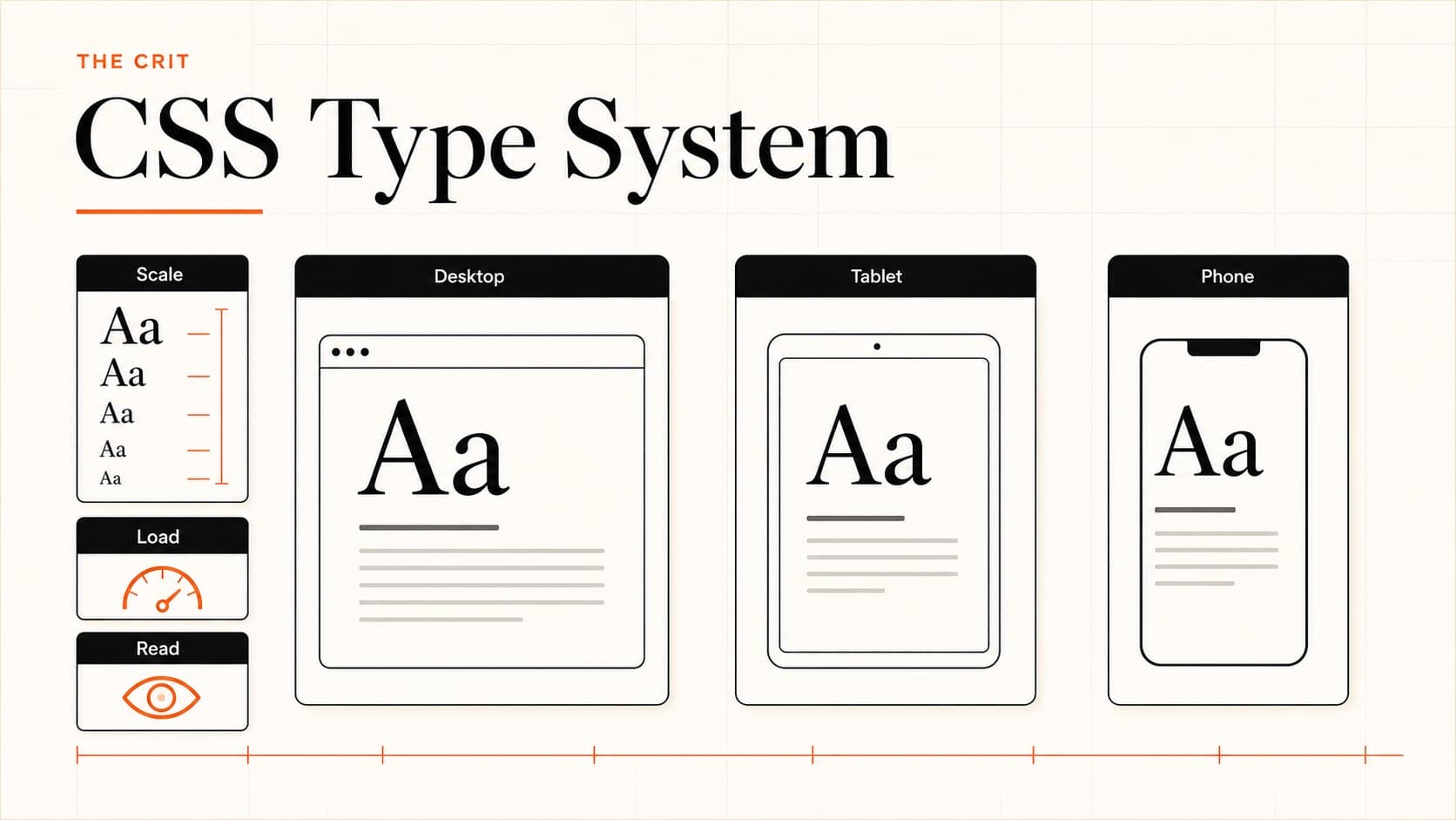
}Responsive Typography Without Breakpoints
Between clamp() and a few smart defaults, you can build typography that adapts to any screen without writing a single media query.
Complete responsive type system:
/* 1. Never override the root font-size */
html {
  /* Let the browser default (16px) stand */
  -webkit-text-size-adjust: 100%; /* Prevent iOS text inflation */
  text-size-adjust: 100%;
}

/* 2. Fluid type scale */
body { font-size: clamp(1rem, 0.9rem + 0.5vw, 1.125rem); }
h1 { font-size: clamp(2rem, 1.2rem + 3vw, 3.5rem); }
h2 { font-size: clamp(1.5rem, 1rem + 2vw, 2.5rem); }
h3 { font-size: clamp(1.25rem, 1rem + 1vw, 1.75rem); }
small { font-size: clamp(0.75rem, 0.7rem + 0.25vw, 0.875rem); }

/* 3. Measure (line length) control */
p, li {
  max-width: 65ch; /* Optimal reading length */
}

/* 4. Responsive letter-spacing for headings */
h1 { letter-spacing: clamp(-0.04em, -0.02em + -0.005vw, -0.01em); }
The ch unit is underrated for responsive typography. max-width: 65chmeans "65 characters wide" — it automatically adjusts to the font and size being used. Research consistently shows 45-75 characters per line is optimal for reading speed and comprehension.
Container queries for component typography
When a component lives inside different layouts (sidebar vs main content vs modal), viewport-based sizing doesn't work. Container queries let text respond to its actual available space:
.card-container { container-type: inline-size; }

.card h3 {
  font-size: 1.25rem; /* Default */
}

@container (min-width: 400px) {
  .card h3 { font-size: 1.5rem; }
}

@container (min-width: 600px) {
  .card h3 { font-size: 1.75rem; }
}
Dark Mode Typography
Dark mode isn't just inverting colors. Text rendering behaves differently on dark backgrounds, and ignoring this makes your dark theme feel off even when the colors technically pass contrast checks.
The three dark mode typography rules:
- Reduce font weight. Light text on dark backgrounds appears heavier than dark text on light backgrounds (called "halation"). Drop body text from 400 to 350 or 300.
- Avoid pure white on pure black. #ffffff on #000000 causes eye strain. Use #e5e5e5 on #171717 (or similar) for comfortable reading.
- Increase letter-spacing slightly. The halation effect also makes text appear tighter. Adding 0.01-0.02em of tracking compensates.
/* Dark mode typography adjustments */
@media (prefers-color-scheme: dark) {
  body {
    color: #e5e5e5;
    background: #171717;
    font-weight: 350;  /* Slightly lighter (variable font) */
    letter-spacing: 0.01em;
  }

  h1, h2, h3 {
    color: #f5f5f5;
    font-weight: 600;  /* Was 700 in light mode */
  }

  /* Reduce contrast for secondary text */
  .text-muted {
    color: #a3a3a3;  /* Not too dim — maintain 4.5:1 on #171717 */
  }

  /* Code blocks need different treatment */
  code {
    background: #262626;
    color: #d4d4d4;
  }
}
Variable fonts make dark mode weight adjustments trivial. Without them, you're stuck jumping between 300 and 400 — with a variable font you can dial in exactly the right weight for your specific color combination.
Typography Accessibility in CSS
Accessible typography isn't a separate concern — it's just good typography. Most of the rules you should follow for aesthetics also happen to be WCAG requirements. Here are the CSS-specific ones.
Never set root font-size in pixels
This is the single most common accessibility failure in CSS typography. When you write html { font-size: 16px; }, you override the user's browser font size preference. Someone who set their default to 20px for visual impairment is now stuck at 16px.
html { font-size: 16px; }
Overrides user preference. Breaks accessibility.
html { font-size: 62.5%; }
The "10px trick" — still overrides user settings.
html { font-size: 100%; }
Respects user preference (or just don't set it at all).
WCAG text spacing requirements
WCAG 2.1 Success Criterion 1.4.12 requires that content works when users override these text properties:
/* Your CSS must not break when users apply these overrides: */
/* Line height: at least 1.5x font size */
/* Paragraph spacing: at least 2x font size */
/* Letter spacing: at least 0.12x font size */
/* Word spacing: at least 0.16x font size */

/* Design with these as minimums and you're safe: */
p {
  line-height: 1.5;
  margin-bottom: 1.5em;
  letter-spacing: normal;  /* Don't tighten body text */
  word-spacing: normal;
}

/* Test: Apply these overrides and check nothing overflows */
.accessibility-test {
  line-height: 1.5 !important;
  letter-spacing: 0.12em !important;
  word-spacing: 0.16em !important;
  p { margin-bottom: 2em !important; }
}
Zoom handling
WCAG requires your site to work at 200% zoom. If you've built with rem units and fluid sizing, this usually works automatically. The common failure: fixed-width containers that cause horizontal scrolling at zoom.
/* This breaks at 200% zoom on narrow viewports */
.container { width: 1200px; }

/* This handles zoom gracefully */
.container { max-width: 75rem; width: 100%; }
Performance Optimization
Font files are often the largest render-blocking resource on a page. A few targeted optimizations can cut font-related load time by 50-80%.
Font performance checklist:
- Use WOFF2 format — 30% smaller than WOFF, 50% smaller than TTF. Browser support is 97%+.
- Subset your fonts — If you only use Latin characters, a subset can be 60-80% smaller than the full file.
- Self-host over CDN — Google Fonts adds a DNS lookup + connection. Self-hosting eliminates both and enables HTTP/2 multiplexing with your other assets.
- Limit to 2-3 font files max — Each file is an HTTP request. Variable fonts help here.
- Use unicode-range — Load Latin characters first, extended characters only if needed.
unicode-range for progressive loading:
/* Load Latin first (covers 95%+ of English content) */
@font-face {
  font-family: 'Inter';
  src: url('/fonts/inter-latin.woff2') format('woff2');
  unicode-range: U+0000-00FF, U+0131, U+0152-0153, U+02BB-02BC,
                 U+02C6, U+02DA, U+02DC, U+2000-206F;
  font-display: swap;
}

/* Extended Latin loaded only if characters appear */
@font-face {
  font-family: 'Inter';
  src: url('/fonts/inter-latin-ext.woff2') format('woff2');
  unicode-range: U+0100-024F, U+0259, U+1E00-1EFF, U+2020;
  font-display: swap;
}
Common CSS Typography Mistakes
These are the issues I see in almost every portfolio review. They're easy to fix once you know what to look for.
Using px for font-size
Breaks accessibility. Use rem. The "62.5% trick" (setting root to 10px) is equally bad — it still overrides user preferences.
No max-width on text blocks
Text that spans 120+ characters per line is hard to read. Always set max-width: 65ch on paragraphs, or constrain the content container.
Loading 4+ font weights as separate files
Switch to a variable font. One file, infinite weights, better performance. Inter, Plus Jakarta Sans, and Source Sans 3 all have excellent variable versions.
Pixel line-height values
line-height: 24px doesn't scale. Use unitless values like line-height: 1.5 so spacing adjusts with font-size.
Missing font-display on @font-face
Without it, text is invisible until the font loads (up to 3 seconds). Always add font-display: swap at minimum.
Same font weight in light and dark mode
Light text on dark backgrounds looks heavier. Reduce weight by 50-100 in dark mode (400→350 body, 700→600 headings).
The Complete Starter Stylesheet
Here's everything above condensed into a single stylesheet you can drop into any project. It handles fluid type, font loading, dark mode, and accessibility out of the box.
/* ========================
   CSS Typography Starter
   ======================== */

/* 1. Font Loading */
@font-face {
  font-family: 'Inter';
  src: url('/fonts/Inter-VariableFont.woff2') format('woff2-variations');
  font-weight: 100 900;
  font-display: swap;
}

@font-face {
  font-family: 'Inter Fallback';
  src: local('Arial');
  size-adjust: 107.64%;
  ascent-override: 90%;
  descent-override: 22.43%;
  line-gap-override: 0%;
}

/* 2. Base */
html {
  -webkit-text-size-adjust: 100%;
  text-size-adjust: 100%;
}

body {
  font-family: 'Inter', 'Inter Fallback', system-ui, sans-serif;
  font-size: clamp(1rem, 0.9rem + 0.5vw, 1.125rem);
  line-height: 1.6;
  color: #262626;
  -webkit-font-smoothing: antialiased;
}

/* 3. Type Scale */
h1 {
  font-size: clamp(2rem, 1.2rem + 3vw, 3.5rem);
  font-weight: 700;
  line-height: 1.1;
  letter-spacing: -0.03em;
}

h2 {
  font-size: clamp(1.5rem, 1rem + 2vw, 2.5rem);
  font-weight: 700;
  line-height: 1.2;
  letter-spacing: -0.02em;
}

h3 {
  font-size: clamp(1.25rem, 1rem + 1vw, 1.75rem);
  font-weight: 600;
  line-height: 1.3;
}

small, .text-sm {
  font-size: clamp(0.8rem, 0.75rem + 0.25vw, 0.875rem);
}

/* 4. Spacing & Measure */
p, li { max-width: 65ch; }
p { margin-bottom: 1.5em; }
h2 { margin-top: 2.5em; margin-bottom: 0.75em; }
h3 { margin-top: 2em; margin-bottom: 0.5em; }
:first-child { margin-top: 0; }

/* 5. Dark Mode */
@media (prefers-color-scheme: dark) {
  body {
    color: #e5e5e5;
    background: #171717;
    font-weight: 350;
    letter-spacing: 0.01em;
  }
  h1, h2, h3 { color: #f5f5f5; font-weight: 600; }
}
This covers maybe 80% of what most projects need. Customize the type scale ratios and font choice for your project, but the structural patterns — fluid sizing, unitless line-heights, rem units, font loading strategy — stay the same.
Want to see how typography choices affect a real portfolio? Get a portfolio critiqueand we'll tell you what's working and what needs attention — including your typography.
Keep reading
- Typography Principles: The Complete 2026 Guide — the design theory behind these CSS techniques
- Best Font Pairings for Designer Portfolios — 20 curated Google Font combinations with CSS
- Font Pairing Tool — preview pairings live with your own content
- Complete Portfolio Guide — everything that makes a portfolio work, including typography
Everything You Need to Know
Quick answers to help you get started
Share this resource

Written by
Nikki KippleProduct Designer & Design Instructor
Designer, educator, founder of The Crit. I've spent years teaching interaction design and reviewing hundreds of student portfolios. Good feedback shouldn't require being enrolled in my class — so I built a tool that gives it to everyone. Connect on LinkedIn →
Too close to your own work?
Send one screen, case study, or URL. We'll show what's working, what's getting skipped, and what to fix next.
Continue Reading
All resources →Get one actionable portfolio tip every week. No fluff.
Short reads you can use on your site. Unsubscribe anytime.