Portfolio Development
A Small Portfolio Design System: Consistency Without Sameness
Define the decisions that should repeat—then give each project enough room to tell its own story.

The short read
Start with repetition
Systemize the decisions that recur across the portfolio; leave project-specific storytelling flexible.
Name by purpose
Use roles such as text/secondary or space/section instead of names tied to one color or pixel value.
Test the real site
Check responsive states, keyboard focus, long content, image behavior, and actual color pairs—not just a tidy library page.
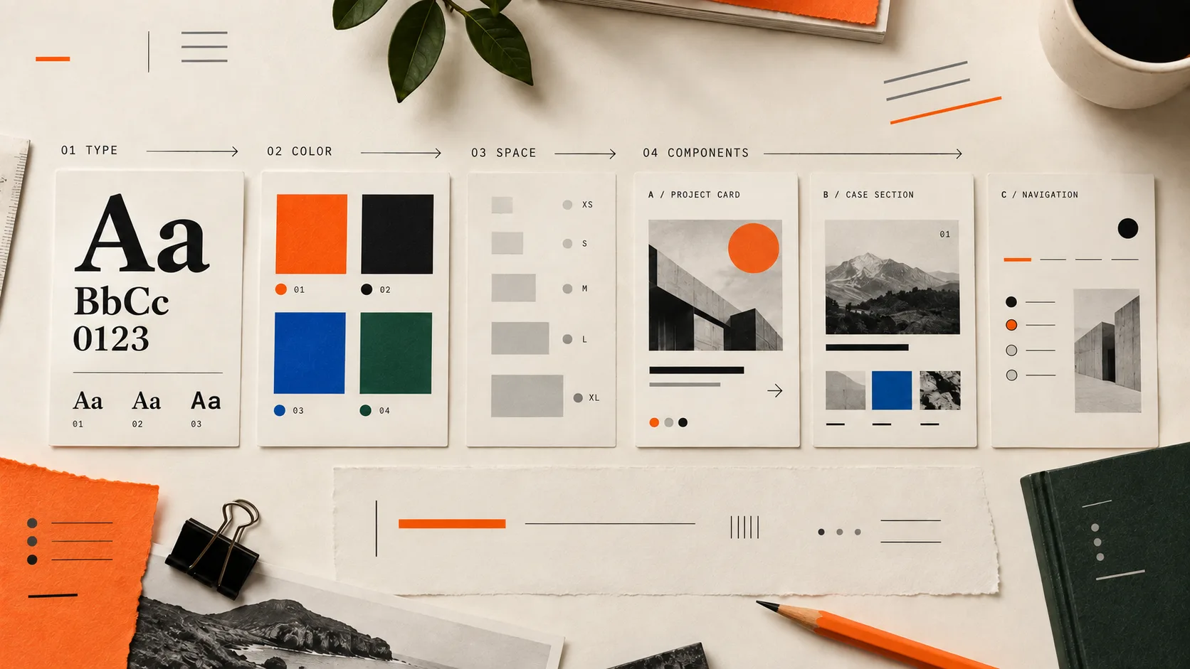
The short answer: build rules around repetition, not decoration
A portfolio design system is the small set of decisions that keeps the experience coherent as the work changes. It answers the recurring questions once: How does a project begin? How wide is the reading column? What distinguishes a caption from body copy? How do links, buttons, images, and navigation behave? What happens on a narrow screen?
It is not a giant component library, four fashionable palettes, or a template that makes every case study interchangeable. The goal is to reduce accidental inconsistency so the differences that matter—your projects, evidence, and judgment—can be easier to see.
Know whether you have a style guide or a working system
A style guide records visual choices. A design system connects those choices to reusable roles, patterns, states, and rules. Your portfolio may begin with a style guide and grow into a system as you build real pages.
Style inventory
“Here are my fonts, colors, and buttons.”
Working system
“These rules keep the reading experience coherent.”
What deserves a shared rule
- It appears across pages
- Create a reusable rule for navigation, project metadata, image captions, content widths, links, and buttons.
- It changes by context
- Define the role and state: default, hover, focus, selected, narrow screen, wide screen, or reduced motion.
- It is unique to one story
- Keep it local unless the pattern proves useful elsewhere.A one-off research diagram or project-specific color treatment does not need to become a global component.
Build the minimum portfolio system first
Begin with enough structure to publish one complete project well. Let the second and third projects reveal what actually repeats before you formalize more.
A useful first version
- Two type families at most, with named roles for display, headings, body, labels, and captions.
- A small role-based color set for page surfaces, text, muted text, actions, focus, success, and warning.
- A spacing scale plus two intentional content widths: one for reading and one for media or layouts.
- Navigation, project card, project header, content section, figure, caption, link, button, and contact pattern.
- Narrow and wide layouts, plus hover, focus, active, loading, empty, and error states where they apply.
- One short usage note for the rule people are most likely to misuse—even if the only “team” is future you.
Name tokens by what they do
Design tokens turn repeated values into named decisions. The U.S. Web Design System describes them as limited, discrete choices for color, spacing, typography, and other style properties. The practical benefit is not the vocabulary itself; it is reducing arbitrary choices and making the same decision reusable.
Separate a foundation value from the role it plays. A raw value might be orange-700. A semantic role might be action-default. If the brand color changes, the role can keep its meaning.
From brittle names to useful roles
- Avoid
light-gray,big-gap,blue-button- Prefer
surface-subtle,space-section,action-default- Use aliases when needed
text-linkcan referenceaction-defaultuntil the two roles need different values.Aliases keep the relationship visible without forcing unrelated roles to share a name forever.
:root {
  /* Foundations */
  --font-display: "Newsreader", Georgia, serif;
  --font-body: "Inter", system-ui, sans-serif;

  --space-1: 0.5rem;
  --space-2: 1rem;
  --space-3: 1.5rem;
  --space-4: 2rem;
  --space-section: clamp(4rem, 8vw, 7rem);

  /* Roles */
  --surface-page: #fbf8f2;
  --surface-subtle: #f0ece4;
  --text-primary: #171717;
  --text-secondary: #57534e;
  --action-default: #c83e08;
  --focus-ring: #0b63ce;

  --content-reading: 68ch;
  --content-wide: 76rem;
}
The Design Tokens Community Group published its first stable format in 2025. That matters when you need tokens to move between tools. A personal portfolio does not need a standards project on day one; it needs names you can understand, use consistently, and map cleanly between design and code.
Let typography and spacing carry the structure
Portfolios often accumulate one-off sizes while the designer tunes each page by eye. The result can look polished in isolated screenshots and still feel unstable as a site. A short role-based type set and spacing scale make hierarchy easier to repeat.
- 1Choose roles before sizes.Define what display, section heading, body, label, and caption need to accomplish in the portfolio.
- 2Set the reading conditions.Choose a comfortable line length, body size, and line height for case-study reading before scaling headlines around them.
- 3Use a small spacing scale.Make relationships visible: tight inside a component, moderate between related blocks, and generous between sections.
- 4Test difficult content.Try the longest project title, a dense process section, a short caption, a narrow viewport, and 200% zoom.
Standardize the patterns readers must learn
Components earn their place when they make orientation or maintenance easier. For a portfolio, the most important patterns are usually the ones that help someone discover work, understand a project, inspect evidence, and contact you.
A component set tied to real portfolio tasks
- Project discovery
- Navigation, featured-project module, project card, tag or discipline label, and clear link behavior.
- Project orientation
- Project title, one-sentence frame, role, team, timeline, status, and the most relevant outcome or constraint.
- Evidence reading
- Section heading, figure, caption, comparison, quote, decision note, metric, and source or limitation.
- Next action
- Next project, contact route, résumé link, and any case-study navigation that helps the reader continue.
Over-systemized
Every project must fit the same 12-section template.
Consistent shell
Readers know where they are; the evidence sets the structure.
A component is not finished until its states are designed
The clean card on a component page is only one condition. Portfolio patterns also need to survive interaction, content pressure, and different screens.
Test the states people will actually encounter
- Keyboard focus that remains visible against every surface where the component appears.
- Hover and active styles that do not carry meaning through color alone.
- Long titles, missing metadata, portrait and landscape media, and captions that wrap.
- Narrow screens, wide screens, zoom, and reflow without clipped content or horizontal scrolling.
- Loading, empty, unavailable, and error states for forms, media, or dynamic work samples.
- Reduced-motion behavior when transitions or animated prototypes are part of the portfolio.
Test accessibility on the combinations you ship
A palette cannot be “accessible” by itself. Contrast belongs to a foreground-and-background pair at a specific text size, and that is only one part of the experience. WCAG 2.2 sets a 4.5:1 minimum for most text and 3:1 for qualifying large text; user interface boundaries and meaningful graphics have related non-text contrast requirements.
- 1List the real pairings.Body text on the page, muted metadata on a subtle surface, link text in paragraphs, button text on its fill, focus ring against adjacent colors, and text over images.
- 2Measure the specified values.Use the foreground and background colors from the design or code; do not estimate contrast from a compressed screenshot.
- 3Inspect beyond the ratio.Check focus, semantics, heading order, alt text, link purpose, touch targets, zoom, reflow, motion, and whether meaning survives without color.
- 4Test the component in context.A token can pass in one pairing and fail in another. Validate each state where the role is actually used.
Connect Figma and code through roles, not matching folder names
Figma variables can hold reusable color, number, string, and boolean values; variables can also alias other variables and use modes for defined contexts. In code, CSS custom properties can express the same roles. The tools do not need identical interfaces, but the shared decisions should remain traceable.
A lightweight handoff for one portfolio
- Figma foundation
- Keep one variables collection for shared foundations and group values by color, space, size, and radius only when useful.
- Semantic layer
- Alias roles such as text/primary, surface/page, action/default, and space/section to the foundation values.
- Component layer
- Apply the semantic roles to the small set of portfolio components and document any exception where it occurs.
- Code layer
- Map the same roles to CSS properties or theme tokens; verify the rendered page instead of assuming a name guarantees parity.
If you are still choosing the shape of the site, compare the portfolio layout patterns before turning one into a system. If the work itself is not yet convincing, use the complete portfolio guide before polishing more components.
Audit an existing portfolio before rebuilding it
Do not begin by recreating every component. Begin by finding where inconsistency creates friction and where sameness weakens the work.
- 1Capture the recurring screens.Collect the homepage, project index, two case studies, about page, contact path, and narrow-screen versions in one view.
- 2Inventory decisions, not just assets.Mark type roles, content widths, spacing, colors, links, buttons, image treatment, captions, metadata, and navigation behavior.
- 3Find the costly drift.Prioritize differences that confuse orientation, weaken hierarchy, create accessibility risk, or make updates harder.
- 4Extract one shared rule at a time.Choose the strongest existing instance, improve it against the real content, then reuse it where the same job appears.
- 5Recheck the stories.Make sure the new consistency did not erase project-specific evidence, pacing, or visual character.
Sources and implementation references
- Design Tokens Community Group for the current vendor-neutral token specification and terminology.
- Figma: variables, collections, aliases, and modes for the current behavior of variables in Figma libraries.
- U.S. Web Design System: Design tokens for a practical explanation of limiting visual choices through discrete, reusable values.
- W3C: Understanding text contrast and non-text contrast for the specific evidence behind contrast checks.
QuestionsAnswers
Questions, answered.
A few practical details before you keep going
Share this resource

Written by
Nikki KippleProduct Designer & Design Instructor
Designer, educator, founder of The Crit. I've spent years teaching interaction design and reviewing hundreds of student portfolios. Good feedback shouldn't require being enrolled in my class — so I built a tool that gives it to everyone. Connect on LinkedIn →
See where the system holds—and where it gets in the way
Share the current portfolio. We will look at the visible hierarchy, recurring patterns, and project-to-project consistency, then give you one clear next move.