Portfolio Layout Examples
Your layout is the first thing recruiters judge — before they see a single project. Here are the 7 patterns that work, when to use each, and the mistakes that kill most portfolios.
⚡ TL;DR
- 7 layout patterns: Each with when to use and when to avoid
- Recruiter scan patterns: What they look at first (and skip)
- Mobile-first: Half your audience is on phones
What Recruiters Actually Scan (And Skip)
Before we get into specific layouts, let's talk about how your portfolio actually gets viewed. Eye-tracking studies on portfolio reviews are consistent: recruiters spend 6-10 seconds on your homepage before deciding to dig deeper or bounce. In those seconds, they're not reading your bio. They're scanning for signals.
What they look at first:Your name and title (are you a designer?), your strongest project thumbnail (is the work good?), and any recognizable company logos. That's it. Everything else — your philosophy, your tools list, your personal story — comes later, if at all.
What they skip:Long introductions, skill bar charts, tool icon grids, testimonials from people they don't recognize, and anything that requires scrolling before they see actual work.
This means your layout has one job: get your best work in front of someone's eyes in under 6 seconds. Every layout pattern below is evaluated against that standard. If you want the full picture on what makes a portfolio effective beyond layout, our complete portfolio guide covers everything from content strategy to presentation.
1. The Gallery Grid
The most common portfolio layout — and for good reason. A grid of project thumbnails, each linking to a detailed case study. Think Pinterest meets portfolio. Examples: Brittany Chiang, Sara Soueidan, most Squarespace portfolios.
Why it works:
- • Instant overview — visitors see all your work at a glance
- • Visual-first — thumbnails sell better than descriptions
- • Flexible — easy to add/remove projects without restructuring
- • Mobile-friendly — grids stack naturally to single columns
Common mistakes:
- • Inconsistent thumbnail sizes or aspect ratios — looks sloppy
- • Too many projects (15+) — dilutes your strongest work
- • No hover state or preview — thumbnails feel dead
- • Generic mockups instead of real screenshots
Best for: Visual/UI designers, anyone with 4-8 strong projects, portfolios that need frequent updates. If your work is visually impressive at thumbnail size, this is your layout.
Avoid if:Your work is process-heavy and doesn't thumbnail well (research portfolios, service design), or you only have 1-2 projects — a grid of two looks sparse.
2. The Story Scroll
A single long page where projects flow vertically, often with brief previews that expand into full case studies. The homepage is the portfolio — no clicking into separate pages. Think of it as a curated scroll through your career highlights.
Why it works:
- • Natural reading flow — scroll is the most intuitive interaction
- • Narrative control — you choose what they see in what order
- • Shows progression — career growth becomes visible
- • Deep engagement — visitors who scroll invest more time
Common mistakes:
- • No anchor nav — visitors can't jump to specific projects
- • Too much content per project — becomes overwhelming
- • Weak visual breaks between sections — everything bleeds together
- • Slow loading — all images on one page tanks performance
Best for: Product designers with detailed case studies, career changers telling a transformation story, anyone with a clear narrative thread connecting their projects. If you're good at writing about your work, this layout rewards that. Our case study structure guide can help you nail the narrative for each section.
Avoid if: You have lots of small projects (better as a grid), or your case studies are very long — nobody will scroll through 5 full case studies on one page.
3. The Business Card
Everything on one screen: name, title, 3-4 project links, contact info. No scrolling required. It's a digital business card — minimal, fast, impossible to get lost in.
Why it works:
- • Zero friction — everything is immediately visible
- • Fast — loads instantly, nothing to figure out
- • Memorable — simplicity stands out in a sea of complexity
- • Easy to build — can be done in an afternoon
Common mistakes:
- • Too minimal — no personality, feels like a placeholder
- • No visual work shown — links alone don't build confidence
- • Looks unfinished rather than intentionally minimal
- • Missing contact information
Best for:Developers who design, freelancers with strong external case studies (Medium, Behance), specialists who are known in their niche, and “I need a portfolio by tomorrow” situations.
Avoid if:You're junior and need to prove yourself — minimal layouts work when your reputation precedes you. If nobody knows your name yet, you need to show more.
4. The Magazine
Editorial-style layout with a hero project at the top, supporting projects below in varying sizes. Think newspaper front page — one big story, several smaller ones. This creates natural visual hierarchy without you having to explicitly say “this is my best project.”
Why it works:
- • Built-in hierarchy — big project naturally gets attention first
- • Visually dynamic — asymmetry is more engaging than uniform grids
- • Flexible — works with 3-8 projects easily
- • Professional feel — looks polished and intentional
Common mistakes:
- • Responsive breakdowns — asymmetric layouts are harder on mobile
- • Hero project is weak — the layout amplifies whatever's at the top
- • Inconsistent spacing — asymmetry without a grid looks messy
Best for: Designers with one standout project and several supporting ones, anyone who wants their portfolio to feel editorial and curated. Requires more design skill to pull off than a uniform grid.
5. Case Study First
Skip the homepage entirely. Your portfolio opens directly on your strongest case study, with navigation to other projects in a sidebar or header. The thinking: if recruiters only read one thing, make it your best thing.
Why it works:
- • Immediate depth — recruiter is reading your work in seconds
- • Strongest first impression — your best work, immediately
- • Reduces bouncing — no “overview” page to lose people on
Common mistakes:
- • No way to see other projects — visitors feel trapped
- • Lead case study is too long — loses people before they see anything else
- • Missing personal context — who made this?
Best for:Designers with one incredibly strong case study, senior designers applying for a specific role where one project perfectly matches, anyone who's been told “your portfolio homepage undersells you.”
7. The Minimal
Text-heavy, almost no imagery on the homepage. Your name, a short paragraph about what you do, and a list of project titles (linked). Let the writing sell it. Examples: Rauno Freiberg, some agency sites.
Why it works:
- • Blazing fast — almost nothing to load
- • Confident — implies the work speaks for itself
- • Timeless — won't look dated in 2 years
- • Accessible — text is the most accessible format
Common mistakes:
- • Boring — minimal without personality is just empty
- • No visual evidence of design skill — ironic for a designer
- • Can feel lazy rather than intentional
- • Project titles alone aren't compelling enough to click
Best for: Senior designers, people with strong personal brands, writing-focused portfolios (UX writing, content design), and anyone who can make typography do the heavy lifting. Risky for juniors — you need reputation or exceptional writing to pull this off.
How to Pick Your Layout
Don't overthink this. Answer four questions and you'll have your answer:
- 1. How many strong projects do you have?
1-2 projects → Story Scroll or Case Study First. 3-6 → Gallery or Magazine. 7+ → Sidebar Nav or Gallery with filtering.
- 2. Is your work visually impressive at thumbnail size?
Yes → Gallery or Magazine. No (research-heavy, strategy work) → Story Scroll or Minimal.
- 3. Are you senior or junior?
Senior → Minimal or Business Card can work. Junior → Show more, prove more. Gallery or Story Scroll.
- 4. How often do you update it?
Frequently → Gallery (easy to swap projects). Rarely → Story Scroll or Magazine (more effort per update but more polished).
Still stuck? Go with the Gallery Grid. It's the safest choice for a reason — it works for nearly every designer, scales well, and is forgiving if your content isn't perfect. You can always evolve into a more distinctive layout later. If you want feedback on which layout works for your specific situation, our portfolio checklistcan help you evaluate what you've got.
Layout Mistakes That Kill Portfolios
I review portfolios constantly — as an instructor, through The Crit, and informally. These are the layout problems I see most often:
Splash screens and “Enter” buttons
Every click between someone arriving and seeing your work is a chance to lose them. A full-screen animation with “Enter Portfolio” is a relic from 2010. Show the work immediately.
“Creative” navigation that requires instructions
If a recruiter needs to figure out how your nav works, they won't. Clever navigation impresses designers; clear navigation gets you hired. Use standard patterns — they exist for a reason.
No visual hierarchy on the homepage
When every project thumbnail is the same size, same style, same visual weight — nothing stands out. Use size, position, or a featured treatment to guide eyes to your best work first. This is literally Design Principles 101.
20 projects when you should show 5
More projects doesn't mean more impressive. It means the recruiter has to work harder to find your best work — and they won't. Curate ruthlessly. If you wouldn't be excited to talk about it in an interview, don't put it on your homepage.
Desktop-only layouts
If your layout doesn't work on mobile, it doesn't work. Period. Our mobile portfolio guide covers the specifics, but the short version: test on a real phone before you ship anything.
The Mobile Reality Check
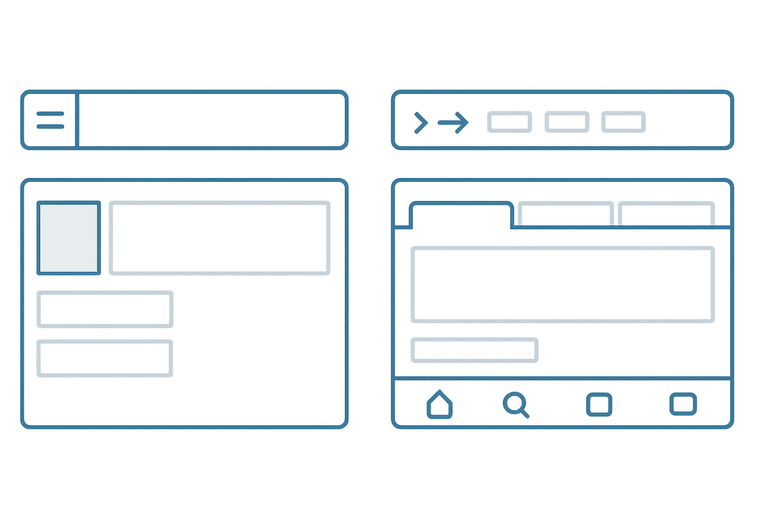
Roughly half of portfolio views happen on phones. Recruiters check your link on the train, between meetings, during coffee breaks. If your beautiful desktop layout turns into a broken mess at 375px wide, you're losing half your audience.
Mobile layout essentials:
- Single column. Multi-column grids should stack to one column. Don't try to preserve 2-col layouts on narrow screens.
- Thumb-friendly navigation. Tap targets of at least 44×44px. Bottom-of-screen navigation is easier to reach than top hamburger menus.
- Readable without zooming. 16px minimum body text. If anyone has to pinch-zoom, your font is too small.
- Fast-loading images. Lazy load everything below the fold. Use responsive image sizes (srcset). Compress aggressively.
- Test on a real phone. Browser DevTools mobile view lies. It doesn't simulate touch, bandwidth, or actual rendering. Open your portfolio on your phone and try to use it with one thumb.
The easiest way to nail mobile: design mobile-first, then expand to desktop. It's much easier to add complexity than to remove it. Every layout pattern in this guide works on mobile — the question is how gracefully it degrades. Gallery grids stack. Sidebars collapse. Business cards barely need to change. Choose your layout with mobile in mind from the start.
Everything You Need to Know
Quick answers to help you get started
Share this resource

Written by
Nikki KippleProduct Designer & Design Instructor
Designer, educator, founder of The Crit. I've spent years teaching interaction design and reviewing hundreds of student portfolios. Good feedback shouldn't require being enrolled in my class — so I built a tool that gives it to everyone. Connect on LinkedIn →
Too close to your own work?
Send one screen, case study, or URL. We'll show what's working, what's getting skipped, and what to fix next.
Continue Reading
All resources →Get one actionable portfolio tip every week. No fluff.
Short reads you can use on your site. Unsubscribe anytime.