Coding Your Portfolio from Scratch (2026)
You've decided to build your portfolio with real code instead of dragging blocks around in Squarespace. Good. Here's the honest, opinionated guide to doing it without losing your mind.
⚡ TL;DR
- Recommended stack: Next.js + Tailwind CSS + Vercel — best balance of power and simplicity
- Timeline: 1–2 weekends if you know basics, 3–6 weeks if learning as you go
- The real flex: Not animations — fast loads, clean typography, and case studies that tell stories
Why a Custom Portfolio Is Worth the Pain
Let's skip the motivational speech. You already decided to code your portfolio — you don't need me to convince you it's a good idea. But it helps to know specifically what you're getting for the extra effort, so you can focus on the things that actually matter. (If you're still debating whether to code custom or use a builder, our complete portfolio guide walks through all the platform options.)
A custom portfolio tells hiring managers something a Squarespace site never can:you understand the medium you design for. When a product design lead sees your portfolio loads in 0.8 seconds, has clean semantic HTML, and handles responsive breakpoints thoughtfully — they notice. They probably won't say anything about it. But they notice.
Look at Lee Robinson's portfolio — it's restrained, fast, and every interaction feels intentional. Or Gavin McFarland's site, which is basically a masterclass in typography and white space. These sites don't scream “I know code.” They whisper it — and that confidence is what makes them memorable.
The practical benefits matter too: no monthly fees to Squarespace, no fighting a page builder when you want a layout it doesn't support, and complete control over performance. But honestly? The biggest benefit is the learning. Building your portfolio teaches you more about how the web works than any course. And that knowledge makes you a better designer for every project after.
Choosing Your Tech Stack (Without Overthinking It)
This is where most designers get stuck for weeks. Let me save you the agonizing:
The short answer:
Next.js + Tailwind CSS + Vercel.This is the stack. It's what most design-forward companies use, the docs are phenomenal, and the deployment story is “push to GitHub and it's live.” If you learn one stack in 2026, make it this one.
But let me be more nuanced, because your situation matters:
Plain HTML + CSS + a little JS
Don't let anyone tell you this is “outdated.” A well-crafted static HTML site with clean CSS will outperform 90% of bloated React portfolios. This is the right choice if you've never coded before and want to learn the fundamentals. You can always migrate to a framework later — and you'll understand why frameworks exist, which makes learning them much easier.
Good for: First-time coders, simple 3–5 page portfolios, learning fundamentals. Deploy on Netlify or GitHub Pages.
Next.js + Tailwind CSS
This is my recommendation for most designers. Next.js gives you file-based routing (create app/about/page.tsx, and boom — you have an /about page). Tailwind lets you style inline without context-switching to CSS files, which honestly feels more like using a design tool than writing code. You get server-side rendering for SEO, image optimization built in, and the React ecosystem when you need it.
Good for: Designers who want a career-relevant stack, portfolios with multiple case study pages, anyone who wants a blog or dynamic content later.
Astro
The dark horse pick. Astro is built specifically for content-heavy sites — portfolios, blogs, marketing pages. It ships zero JavaScript by default (your site is pure HTML/CSS until you explicitly add interactivity), which means insane performance. You can use React, Vue, or Svelte components inside Astro pages, so it's flexible. The trade-off: smaller community than Next.js and fewer job-relevant skills.
Good for: Performance obsessives, content-heavy portfolios with lots of case studies, designers who want the fastest possible site.
What about Vue, Svelte, or SvelteKit?
All great frameworks. Svelte is arguably easierto learn than React. Vue has the best documentation in the game. But here's the thing: the goal isn't to pick the “best” framework. It's to pick one that (a) you can actually learn, (b) has good docs and community support, and (c) ideally overlaps with tools your future team uses. In 2026, React/Next.js wins on point (c) by a wide margin.
Setting Up Your Project (The First 30 Minutes)
I'm going to walk through the Next.js + Tailwind setup because it's what I recommend. If you chose a different stack, the concepts transfer — you'll just Google different commands.
First, make sure you have Node.js installed (grab the LTS version) and a code editor. VS Code is the standard for a reason — it's free, fast, and the extension ecosystem is unmatched. Install the Tailwind CSS IntelliSense extension immediately. It autocompletes class names and shows you color previews inline. Life-changing.
Open your terminal and run:
npx create-next-app@latest my-portfolio
# When prompted:
# ✔ TypeScript? → Yes (trust me, the autocomplete alone is worth it)
# ✔ ESLint? → Yes
# ✔ Tailwind CSS? → Yes
# ✔ src/ directory? → Yes
# ✔ App Router? → Yes
# ✔ Import alias? → Yes (default @/* is fine)

cd my-portfolio
npm run dev
Open localhost:3000 in your browser. You should see the Next.js starter page. Congratulations — you have a running web app. That took about 90 seconds.
Now let's clean it up. Open src/app/page.tsx and replace everything with:
export default function Home() {
  return (
    <main className="min-h-screen flex items-center justify-center">
      <div className="max-w-2xl text-center">
        <h1 className="text-5xl font-bold tracking-tight text-neutral-900">
          Your Name
        </h1>
        <p className="mt-4 text-xl text-neutral-600">
          Product Designer · San Francisco
        </p>
      </div>
    </main>
  )
}
Save, and your browser auto-refreshes. You now have a clean starting point. No boilerplate, no junk. Just your name and your title, centered on the screen. This is your portfolio's first heartbeat.
💡 Git tip for designers:
Initialize a Git repo right now (git init) and make your first commit. Get in the habit of committing after every meaningful change — “added homepage layout,” “styled case study cards,” “fixed mobile nav.” It's your undo history on steroids. And when something inevitably breaks, you can roll back instead of panic-deleting things.
Layout & Structure: Think in Pages, Not Pixels
Your portfolio needs three types of pages. That's it. Resist the urge to add more until these three are solid.
Homepage
Your elevator pitch + a grid of your best 4–6 projects. That's it. No hero carousels, no mission statements, no “I'm passionate about creating meaningful experiences.” Just: who you are, what you do, and proof. (Need help nailing that elevator pitch? Our tagline examples show what works.)
Case Study Pages
Where the real work lives. Each project gets its own page with the full story: the problem, your process, the outcome. This is what gets you hired. More on these below.
About Page
A photo, a few paragraphs about your background and approach, and clear contact info. Let your personality come through. This page is secretly the most-read page on your portfolio after someone likes your work.
In Next.js, your file structure maps directly to your URL structure. Here's what it looks like:
src/
  app/
    page.tsx           → yoursite.com/
    about/
      page.tsx         → yoursite.com/about
    work/
      page.tsx         → yoursite.com/work (optional project index)
      project-one/
        page.tsx       → yoursite.com/work/project-one
      project-two/
        page.tsx       → yoursite.com/work/project-two
    layout.tsx         → Shared layout (nav + footer on every page)
  components/
    Navigation.tsx
    Footer.tsx
    ProjectCard.tsx
The layout.tsxfile is where your shared layout lives — your navigation and footer. Everything nested inside inherits it automatically. Here's a minimal one:
// src/app/layout.tsx
import { Inter } from 'next/font/google'
import './globals.css'
import Navigation from '@/components/Navigation'
import Footer from '@/components/Footer'

const inter = Inter({ subsets: ['latin'] })

export default function RootLayout({
  children,
}: {
  children: React.ReactNode
}) {
  return (
    <html lang="en">
      <body className={inter.className}>
        <Navigation />
        <main>{children}</main>
        <Footer />
      </body>
    </html>
  )
}
That's it. Every page on your site now gets a consistent nav and footer. No copy-pasting, no includes, no partials. This is the component model in action, and it's why frameworks are worth the setup cost.
Making It Look Good: CSS for Designers Who Get It
You already have great taste — that's the hard part. Now you need to translate your Figma designs into code. Here's where Tailwind CSS becomes your best friend.
Instead of writing CSS in a separate file, you style directly in your markup:
{/* This... */}
<h1 className="text-5xl font-bold tracking-tight text-neutral-900">
  Your Name
</h1>

{/* ...is equivalent to writing this CSS: */}
{/* h1 { font-size: 3rem; font-weight: 700; letter-spacing: -0.025em; color: #171717; } */}
It feels weird for the first hour. Then it feels incredible. No more naming things .hero-title-wrapper-inner. No more switching between files. Your component and its styles live together, and you can see exactly what everything does at a glance.
Three Tailwind patterns you'll use constantly:
{/* 1. Responsive design — mobile-first, add breakpoints */}
<div className="grid grid-cols-1 md:grid-cols-2 lg:grid-cols-3 gap-8">
  {/* Single column on mobile, 2 on tablet, 3 on desktop */}
</div>

{/* 2. Hover and transition states */}
<a className="opacity-80 hover:opacity-100 transition-opacity duration-200">
  Project Title
</a>

{/* 3. Spacing and typography system */}
<section className="max-w-4xl mx-auto px-6 py-24">
  <h2 className="text-3xl font-bold mb-4">Section Title</h2>
  <p className="text-lg text-neutral-600 leading-relaxed">
    Body text with generous line height.
  </p>
</section>
The md: and lg: prefixes are breakpoints — Tailwind is mobile-first by default, so unprefixed classes apply to all screen sizes, and prefixed classes kick in at larger screens. This maps perfectly to how you should think about responsive design: start with mobile, add complexity as the viewport grows.
🎨 Typography tip:
Don't use more than two typefaces. Next.js has built-in Google Fonts optimization — it self-hosts fonts automatically, so no layout shift and no third-party requests. Use a clean sans-serif for body (Inter, DM Sans, Instrument Sans) and optionally a display face for headings. That's it. Restraint is taste. Need help picking? Our font pairing guide covers combinations that actually work. (And if you're new to visual design concepts, our design principles for beginners covers the fundamentals.)
Building Case Study Pages (Where You Actually Get Hired)
Your homepage gets people interested. Your case studies get you interviews. This is the most important part of your portfolio, so let's get it right. (If you want a proven structure before you start coding, our case study structure guide breaks down exactly what to include and in what order.)
A good case study page has a rhythm: context, then visuals, then reflection. Don't front-load everything with text. Let images breathe. Mix full-width screenshots with tighter text sections. Think of it like a magazine layout, not a Word document.
Here's a component structure I'd use for a case study page:
// src/app/work/project-name/page.tsx
import Image from 'next/image'

export default function ProjectName() {
  return (
    <article>
      {/* Hero */}
      <section className="max-w-6xl mx-auto px-6 pt-24 pb-16">
        <span className="text-sm font-medium text-orange-600 uppercase tracking-wide">
          Mobile App · 2025
        </span>
        <h1 className="text-5xl font-bold mt-2 mb-6">
          Redesigning Checkout for a 40% Drop in Cart Abandonment
        </h1>
        <p className="text-xl text-neutral-600 max-w-3xl">
          How I simplified a 5-step checkout flow into 2 steps
          and saved $2.3M in annual lost revenue.
        </p>
      </section>

      {/* Full-width hero image */}
      <div className="w-full bg-neutral-100">
        <Image
          src="/images/work/project-hero.jpg"
          alt="Before and after of the checkout redesign"
          width={1920}
          height={1080}
          className="w-full"
          priority
        />
      </div>

      {/* Content sections */}
      <section className="max-w-3xl mx-auto px-6 py-16">
        <h2 className="text-2xl font-bold mb-4">The Problem</h2>
        <p className="text-neutral-700 leading-relaxed mb-4">
          {/* Tell the story here */}
        </p>
      </section>

      {/* More images, more sections, repeat the rhythm */}
    </article>
  )
}
Notice the alternating widths: text sections are max-w-3xl (comfortable reading width), but hero images go full-width. This creates visual breathing room and prevents the wall-of-text problem that kills most portfolio case studies.
Use Next.js's <Image> component instead of regular <img> tags. It automatically optimizes your images — lazy loading, modern formats (WebP/AVIF), responsive srcsets — without you doing anything. Your 4MB Figma export becomes a 200KB WebP delivered at exactly the right size. Free performance.
What to include in every case study:
→ The headline that sells the outcome, not the process. “Redesigned the checkout flow” is boring. “Cut cart abandonment by 40%” gets you an interview.
→ Your specific role. “I was the sole designer on a team of 3 engineers” tells me more than “UX/UI Design.”
→ The messy middle. Show your sketches, your dead ends, your user testing fails. Hiring managers know good design isn't linear. Showing the mess proves you actually did the work.
→ Real numbers. +23% conversion. 4.8 App Store rating. 50% reduction in support tickets. If you don't have hard metrics, use qualitative outcomes — stakeholder quotes, user feedback, adoption rates.
Interactions That Matter (And Ones That Don't)
Here's a controversial opinion: most portfolio animations are a waste of time. Scroll-triggered parallax effects, elaborate page transitions, cursor-following particles — they impress other developers on Twitter and annoy hiring managers who just want to see your work.
The interactions worth building are the subtle, functional ones:
Smooth hover states on project cards
A slight scale, a color shift, an image preview — these signal interactivity and feel polished. Takes 5 minutes to implement.
Subtle fade-in on page load
A gentle opacity + translateY animation on your main content prevents the “flash” of unstyled content and feels intentional.
Responsive navigation that works
A clean mobile menu that opens and closes smoothly. Not a hamburger menu with a 500ms delay and a janky slide animation.
Custom cursor effects
They break on mobile, confuse accessibility tools, and add zero information. Please don't.
Loading screens
If your portfolio needs a loading screen, the problem isn't that you need a loading screen — it's that your site is too heavy.
If you do want to add motion, Framer Motionis the React animation library. It's built by designers, has a declarative API that makes sense, and handles layout animations that would be nightmarish in CSS alone.
// A gentle fade-in animation with Framer Motion
import { motion } from 'framer-motion'

export default function FadeIn({ children }: { children: React.ReactNode }) {
  return (
    <motion.div
      initial={{ opacity: 0, y: 20 }}
      animate={{ opacity: 1, y: 0 }}
      transition={{ duration: 0.5, ease: 'easeOut' }}
    >
      {children}
    </motion.div>
  )
}
Performance & SEO: The Invisible Flex
A fast portfolio is a quiet flex that hiring managers actually notice. Here's the cheat sheet:
Use Next.js <Image> for everything
Automatic WebP conversion, lazy loading, and responsive srcsets. Your 3MB hero image becomes a 180KB WebP without you touching Photoshop.
Add metadata to every page
Next.js makes this dead simple — just export a metadata object from each page. Title, description, OG image. Takes 2 minutes per page and makes your links look professional when shared on Slack or LinkedIn.
Run Lighthouse before you share your URL with anyone
Open Chrome DevTools → Lighthouse tab → Generate report. Aim for 90+ on Performance and 100 on Accessibility. These are easy wins with Next.js defaults — if you're below 80, something is wrong. Our accessibility guide covers the specific fixes that matter most for portfolios.
Add a sitemap
Next.js can generate one automatically. This helps Google find and index all your case study pages. Five minutes of setup, permanent SEO benefit.
// src/app/work/project-name/page.tsx
import { Metadata } from 'next'

export const metadata: Metadata = {
  title: 'Checkout Redesign — Your Name',
  description: 'How I reduced cart abandonment by 40% through a simplified checkout experience.',
  openGraph: {
    title: 'Checkout Redesign — Your Name',
    description: 'How I reduced cart abandonment by 40%.',
    images: ['/images/work/checkout-og.jpg'],
  },
}

export default function CheckoutCaseStudy() {
  // ... your page content
}
Deploying It (Easier Than You Think)
Deployment used to be the scary part. In 2026, it's the easy part. Here's the entire process:
- 1.
Push your code to GitHub
Create a repo, push your code. If you've been committing along the way (you have, right?), this takes 30 seconds.
- 2.
Sign up for Vercel
Go to vercel.com, sign in with GitHub, and import your repo. Click deploy. That's literally it. You'll have a live URL in about 45 seconds.
- 3.
Add your custom domain
Buy a domain from Namecheap or Cloudflare Registrar (avoid GoDaddy). Point your DNS to Vercel. Free SSL certificate is automatic.
- 4.
Every future push auto-deploys
Push to
main, and Vercel rebuilds and deploys automatically. You can even get preview URLs for branches, so you can share work-in-progress with friends before it goes live.
Total cost: $0/month for hosting (Vercel's free tier is generous) + ~$10/year for a domain. Compare that to Squarespace at $16/month. Your custom portfolio pays for itself in savings before the first year is up.
Portfolios That Nail It (Study These)
The best way to learn is to study work you admire. Here are portfolios that do specific things really well:
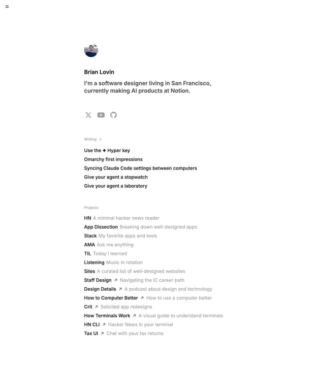
Brian Lovin — Writing + Design
A former GitHub and Buffer designer who treats his portfolio like a product. Clean, fast, and his “Thinking” section is a masterclass in showing your design brain. Notice how the writing is the portfolio.
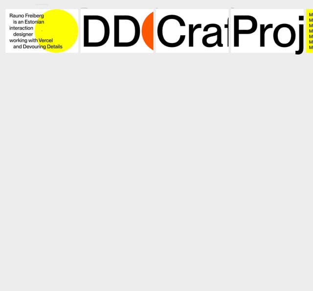
Rauno Freiberg — Craft & Interactions
A Vercel design engineer whose site is a showcase of tasteful microinteractions. Every detail is considered without being excessive. If you want to see what “the right amount” of animation looks like, study this site.
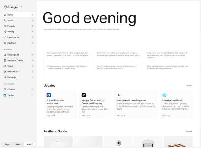
SJ Zhang — Storytelling
Beautiful case study storytelling with a strong editorial feel. Notice how the case studies mix full-bleed imagery with tight text columns — this rhythm keeps you reading and gives the work room to breathe.
Right-click, “View Page Source,” and peek at how these sites are built. Open DevTools and inspect the CSS. This is how you learn — not from tutorials, but from reverse-engineering work you respect.
Everything You Need to Know
Quick answers to help you get started
Share this resource

Written by
Nikki KippleProduct Designer & UX Strategist
Designer, educator, founder of The Crit. I've spent years teaching interaction design and reviewing hundreds of student portfolios. Good feedback shouldn't require being enrolled in my class — so I built a tool that gives it to everyone. Connect on LinkedIn →
Too close to your own work?
Send one screen, case study, or URL. We'll show what's working, what's getting skipped, and what to fix next.
Continue Reading
All resources →Get one actionable portfolio tip every week. No fluff.
Short reads you can use on your site. Unsubscribe anytime.