Fundamentals
Is Infinite Scroll Bad Design? Use it when the task fits.
Infinite scroll can make exploration feel effortless. It can also make finding, comparing, returning, and stopping harder. The right choice depends on what someone came to do.

The short read
Short answer
Infinite scroll is not inherently bad. It is strongest for open-ended browsing and weakest for goal-directed work.
Safer default
Choose pagination or Load More when position, comparison, progress, or control matters.
If you use it
Preserve position, expose stable URLs, announce loading, provide an end, and test beyond the happy path.
The short answer: sometimes
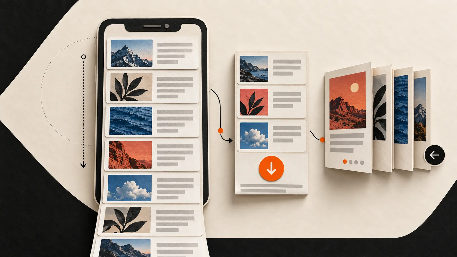
Infinite scroll is a list pattern that automatically loads another group of items as someone approaches the end of the current group. It is not the same as a long article or page that simply has more content below the fold.
The pattern removes the small interruption of choosing a page or pressing a button. That can feel natural when someone is casually exploring a stream of similarly important items. The same lack of interruption becomes a problem when the person needs landmarks, comparison, progress, or a reliable way back.
Start with the task, not the trend
The clearest dividing line is whether people are exploring or trying to complete a bounded task. Real products often contain both, so one pattern does not have to govern every list.
Stronger fit
Open-ended exploration
- Items have similar weight and can be understood quickly.
- The next item may be useful even when it was not requested.
- Exact position and total result count are secondary.
- The experience has a clear way to pause, leave, and return.
Use more control
Goal-directed work
- People need to find, compare, shortlist, or revisit items.
- Order, progress, and the size of the result set matter.
- The footer or content after the list serves a real task.
- A stable URL or return position needs to survive navigation.
Know which tradeoff you are accepting
Infinite scroll does not automatically create these problems, but it makes each one your responsibility to solve.
- Finding something again
- Restore the exact item and scroll position after someone opens a detail view and comes back.Without a durable position, a long feed turns previously seen content into a search problem.
- Understanding progress
- Show how much has loaded, whether more is coming, and when the collection ends.Blank space or a quiet network delay can look like the end even when more content exists.
- Reaching what follows
- Keep essential navigation and actions outside the moving end of the feed, or add a deliberate loading control.A footer that moves away each time more items load is functionally unreliable.
- Keyboard and assistive technology
- Use meaningful list or article structure, communicate loading state, manage focus, and provide a way past the feed.Dynamic insertion changes what people can reach and what an assistive technology knows is present.
- Search discovery
- Expose crawlable links and stable URLs for the content chunks instead of depending on scrolling to reveal them.Google generally does not scroll or press buttons to discover additional content.
- Performance and data
- Load in bounded groups, keep media lightweight, and virtualize long rendered lists when needed.Continuous loading can increase network, memory, and rendering work, especially on mobile connections.
Choose the control that matches the task
- Pagination
- Use it when people need position, comparison, direct navigation, or a stable way to return.It creates clear landmarks and distinct URLs, at the cost of more explicit navigation.
- Load More
- Use it when the list should remain continuous but people benefit from choosing when to fetch another group.It introduces a stopping point and can show progress without splitting the experience into separate screens.
- Infinite scroll
- Use it for low-friction exploration when exact position and completion are not the primary job.The interaction stays quiet, but orientation, recovery, accessibility, and loading all need deliberate support.
If you use infinite scroll, design the recovery
A practical implementation check
- Preserve state: opening an item and going back returns to the same place, with filters and sort order intact.
- Give content stable URLs: loaded groups and important items can be refreshed, shared, and revisited.
- Make loading visible: announce that more items are arriving and distinguish loading, empty, error, and end states.
- Show orientation: use a count, landmarks, date groups, or another cue that helps people understand where they are.
- Provide an exit: keyboard and assistive-technology users can move past the feed to the next part of the page.
- Use real structure: start with semantic lists, headings, and articles; add ARIA only when it improves the tested experience.
- Keep discovery independent of interaction:crawlable links expose content without requiring Google or a user to scroll.
- Test real conditions: include mobile, slower connections, keyboard navigation, screen readers, and long-session return paths.
W3C documents a feed pattern with loading state, focusable articles, position information, and keyboard movement. It also warns that the example is illustrative, that support gaps remain, and that assistive technology testing is essential. In other words, adding role="feed" is not the finish line.
What the EU said, and what it did not
That is materially different from a general ban on the interaction pattern or a ruling that every infinite list is unlawful. The useful design lesson is narrower: when a product combines continuous loading with recommendation and business incentives that reward more time in the feed, risk mitigation has to be part of the design decision.
Test the task before you ship the pattern
- 1Name the jobWrite down whether people are exploring, finding, comparing, monitoring, or returning. If the answer changes by context, test more than one list pattern.
- 2Prototype the meaningful alternativeCompare infinite scroll with the most credible option, usually Load More or pagination. Do not compare a finished design with a weak placeholder.
- 3Include recovery tasksAsk someone to open an item, go back, refind something, change a filter, resume later, and reach content after the list.
- 4Verify the implementationCheck keyboard order, loading announcements, stable URLs, rendered content, mobile behavior, network failure, and the actual end state.
- 5Measure the outcome that mattersUse success, time, errors, abandonment, comparison behavior, or satisfaction for the real task. More scrolling is not automatically a better experience.
Sources and further reading
- European Commission: preliminary TikTok addictive-design finding for the exact scope and status of the February 2026 action.
- Google Search Central: pagination and incremental loading for current crawlability and URL guidance.
- W3C WAI: infinite scrolling feed example for semantics, loading state, keyboard behavior, and the important support caveats.
- Nielsen Norman Group: when to use infinite scrolling for usability tradeoffs and task-fit framing.
QuestionsAnswers
Questions, answered.
A few practical details before you keep going
Share this resource

Written by
Nikki KippleProduct Designer & Design Instructor
Designer, educator, founder of The Crit. I've spent years teaching interaction design and reviewing hundreds of student portfolios. Good feedback shouldn't require being enrolled in my class — so I built a tool that gives it to everyone. Connect on LinkedIn →
Want another read on the interface?
Share a representative screen or URL. Your free First Read can review the visible hierarchy and the next design move; the $9 Full Crit opens the wider review and one revision check. Usability claims still need testing with people.